最近由于比赛,断更了好久,从五一开始不会再断更了。这个每周挑战我分析的较为简单,有兴趣的可以将数据集下载下来试着分析一下,又不会的我们可以讨论一下。
这是数据集:
import pandas as pd
import numpy as np
import matplotlib.pyplot as plt
import seaborn as sns
from pyecharts.charts import Bar
import plotly.express as px


df = pd.read_csv("Best Buy products.csv")
pd.set_option("display.max_columns",1000)
pd.set_option("display.max_rows",1000)
先导入我们所需要用到的库,然后分析数据集
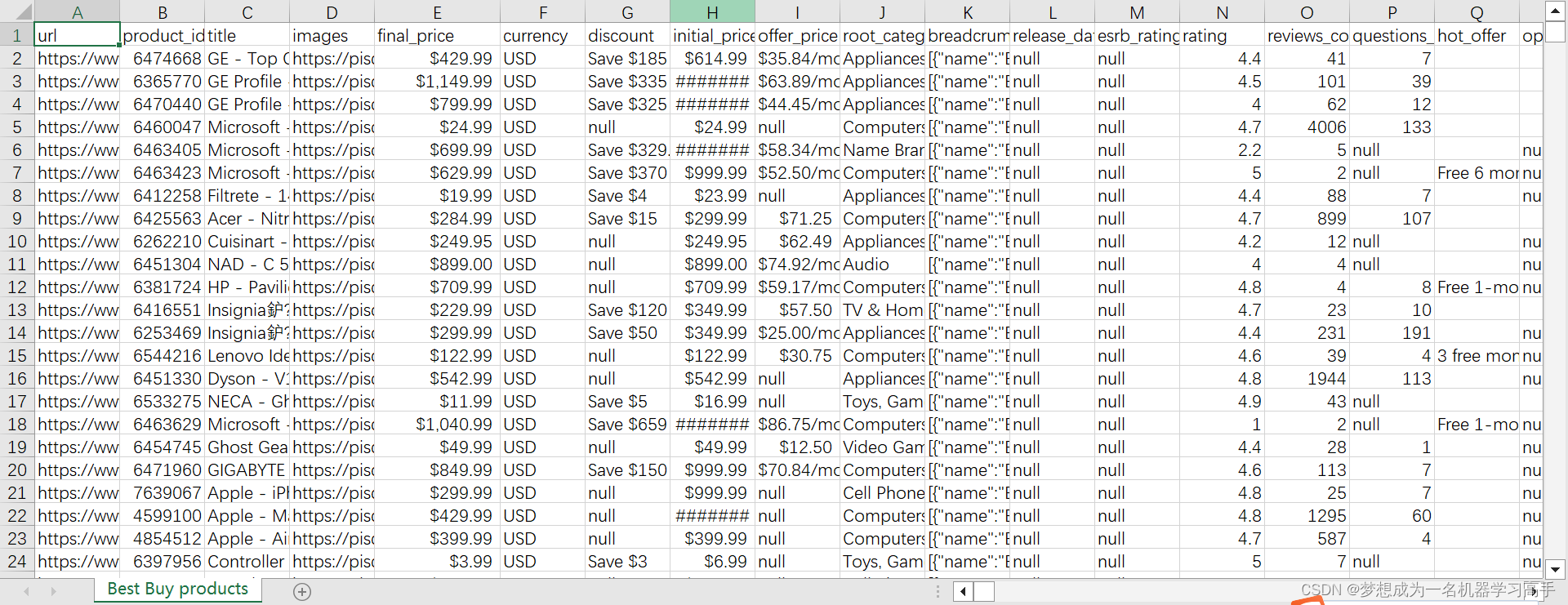
# \字段   说明
# url   链接
# product_id    产品ID
# title 标题
# images    图片链接
# final_price   最终价格
# currency  货币
# discount  折扣
# initial_price 初始价格
# offer_price   促销价格
# root_category 品类
# breadcrumbs   导航栏
# release_date  发布日期
# esrb_rating   ESRB评级("E for Everyone"(适合所有人)、"T for Teen"(适合青少年)、"M for Mature"(适合成年人)等等)
# rating    评分
# reviews_count 评价数量
# questions_count   提问数量
# hot_offer 优惠
# open_box  打开过但未使用的商品(这些商品通常是退货、展示品或者被取消订单的商品。虽然它们可能已经被打开过,但它们通常处于完好状态,并且经过了检查和测试以确保其功能正常。这些商品通常以更低的价格销售,因为它们已经不再是全新的商品,但仍然提供一定程度的折扣。)
# availability  商品可用性(即该商品当前是否可供购买:有货;库存有限;缺货;即将上市;预购)
# you_maight_also_need  你可能还需要
# variations    产品配置选项
# highlights    产品亮点
# product_description   产品描述
# features_summary  功能总结
# features  功能特性
# whats_included    包含的配件
# q_a   用户问答
# product_specifications    产品参数
# amount_of_stars   获得的星数
# customer_images   用户提供的照片
# customers_ultimately_bought   用户最终下单的产品
# deals_on_realated_items   相关其他商品的优惠或特价优惠
# frequently_bought_with    通常一起搭配购买的产品
# recommend_percentage  推荐指数
上面是关于字段的说明,由于这种数据属于电商类型的数据,我们一般会分析评分,折扣,成交价格等特征与交易数量之间的关系,我们还可以从用户回答来做文本分析等来分析商品的好坏,预测交易数量等,这里我就不进行分析了,感兴趣的可以试一试,我后面会更新电商评论的文本类型的分析。
# 促销策略分析
df['final_price'] = df['final_price'].str.replace('$','').str.replace(',','').astype(float)
df['discount'] = df['discount'].str.replace('Save','').str.replace(',','').str.replace('$','').astype(float)
df['discount'] = df['discount'].fillna(0)
# print(df.info())
plt.figure(figsize=(10,8))
final_price = df['final_price'].value_counts().reset_index()
plt.bar(final_price['final_price'][10], final_price['count'][10], color='red', label='final_price')
plt.figure(figsize=(10,8))
discount_price = df['discount'].value_counts().reset_index()
plt.plot(discount_price['discount'], discount_price['count'], color='blue', label='discount_price')
bin = [0,1,2,3,4,5]
label = [1,2,3,4,5]
df['rating'] = pd.cut(df['rating'],bins=bin,labels=label)
sns.countplot(x=df['rating'],color='Blue',dodge=False)
plt.title("评分数据")
plt.tight_layout()
plt.show()
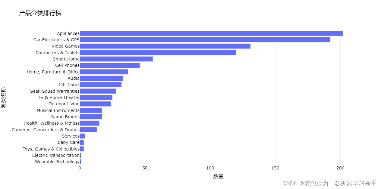
root_category_counts = df['root_category'].value_counts().reset_index()
# print(root_category_counts)
fig = px.bar(root_category_counts,
x='count', y='root_category',
orientation='h',
title='产品分类排行榜',
labels={'count': '数量', 'root_category': '种类名称'})
fig.update_layout(yaxis_categoryorder='total ascending') # 将类别按产品数量升序排列
# 更新字体样式
fig.update_layout(
template="plotly_white",
font=dict(
size=14,
color="#000000"
)
)
fig.show()这里我绘制了折扣和评分之间的关系图,从上面可以看出好的商品是不打折的,就像旭旭宝宝带的货,只便宜一块钱。最后我绘制了各个商品的销售数据。

这篇每周挑战确实简陋了不少,大家如果对电商数据比较感兴趣,后面我在完善一下这篇文章