一. 为什么要清除浮动(清除浮动的方法)
为何:为了解决浮动元素的父级高度坍塌导致的影响布局问题
清除浮动的方法有以下几种
1.父元素设置overflow:hidden
.parent {
  overflow: auto; /* 或 hidden */
}
2.父容器::after 伪元素设置clear:both
.box::after {
    content: '.';
    display: block;
    clear: both;
}
3.空标签法
如下,在父元素的末尾加上一个空标签即可
 <div class="parent">
  <div class="float-box">浮动元素 1</div>
  <div class="float-box">浮动元素 2</div>
  <!-- 关键:清除浮动的空标签 -->
  <div></div>

</div>
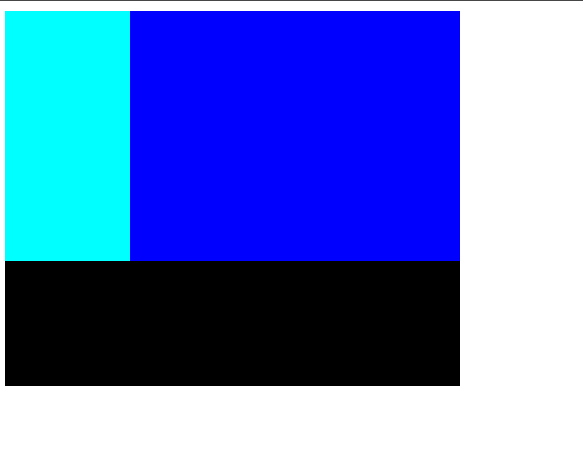
二.怎么实现左边宽度固定右边宽度自适应的布局?
使用flex布局
在其中放置一个笃定大小的盒子在左边
右边边的盒子设置为flex:1;
最终右边盒子会占据剩余的部分即随着父元素变化而变化
代码如下
<!DOCTYPE html>
<html lang="en">
<head>
    <meta charset="UTF-8">
    <meta name="viewport" content="width=device-width, initial-scale=1.0">
    <title>Document</title>
</head>
<body>
    <style>
        .f {
            display: flex;
            width: 200px;
            height: 300px;
            background-color: black;
        }
        .son {
            width: 100px;
            height: 200px;
            background-color: aqua;
        }
        .other {
            flex: 1;
            height: 200px;
            background-color: blue;
        }
    </style>
    <div class="f">
        <div class="son"></div>
        <div class="other"></div>
    </div>
</body>
</html>
效果如图
三.讲讲flex:1;
父级为flex布局时
若该元素设为flex:1;
而同级元素的flex之和为n
则其会占据剩余元素的(1/n)份
(同级元素的flex之和为n)
四.怎么实现移动端适配不同设备?
1.rem布局
rem单位是基于html的font-size的倍数
故我们可以通过媒体查询来设置不同尺寸屏幕的字体大小
进而控制整个布局
2.使用vw单位
vw是以视口大小为标准的 如1vw是屏幕宽度的1%
故可以使用vw单位 在不同大小的设备 ,每个元素都占固定比例
3.响应式布局
通过媒体查询 对不同大小的设备都独立设置一个样式布局
但这样较为麻烦和复杂
案例题
五
细节:超出省略
text-overflow: ellipsis;
<style>
* {
padding: 0;
margin: 0;
}
.big {
width: 1000px;
height: 500px;
position: relative;
}
.head {
background-color: black;
color: aliceblue;
border-radius: 10px;
height: 50px;
width: 100%;
line-height: 50px;
}
.head a {
padding-left: 15px;
text-decoration: none;
color: aliceblue;
}
.right {
float: right;
height: 50px;
}
.right a {
padding-right: 15px;
text-decoration: none;
color: aliceblue;
}
.body {
margin-top: 20px;
width: 100%;
height: auto;
display: flex;
justify-content: space-between;
flex-wrap: wrap;
}
.son {
padding: 10px;
width: 30%;
height: 250px;
box-shadow: black 0px 2px 10px;
border-radius: 10px;
}
.son .top {
width: 95%;
height: 50%;
background-color: silver;
border-radius: 10px;
margin: 0 auto;
}
.son p {
height: 21px;
width: 300px;
text-overflow: ellipsis;
white-space: nowrap;
overflow: hidden;
}
.son h3 {
margin-top: 20px;
}
.bottom {
margin-top: 10px;
}
.bottom p {
color: silver;
}
.last {
width: 100%;
height: 50px;
line-height: 50px;
text-align: center;
color: rgb(152, 152, 152);
position: bottom;
margin-top: 30px;
background-color: rgb(206, 206, 206);
border-radius: 8px;
}
</style>
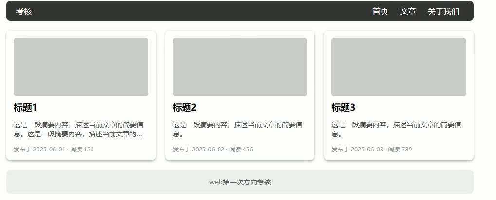
<div class="big">
<div class="head">
<a href="">考核</a>
<div class="right">
<a href="">首页</a>
<a href="">文章</a>
<a href="">关于我们</a>
</div>
</div>
<div class="body">
<div class="son">
<div class="top"></div>
<h3>标题1</h3>
<p>这是一段摘要内容,描述当前文章的简要信息。</p>
<div class="bottom">
<p>发布于 2025-06-03·阅读 789</p>
</div>
</div>
<div class="son">
<div class="top"></div>
<h3>标题2</h3>
<p>这是一段摘要内容,描述当前文章的简要信息。</p>
<div class="bottom">
<p>发布于 2025-06-03·阅读 789</p>
</div>
</div>
<div class="son">
<div class="top"></div>
<h3>标题3</h3>
<p>这是一段摘要内容,描述当前文章的简要信息。</p>
<div class="bottom">
<p>发布于 2025-06-03·阅读 789</p>
</div>
</div>
<div class="last">
web第一次考核
</div>
</div>
六
使用一个盒子将数字列遮盖
用hover使数字列移动即可
(white-space: pre;可实现保留空格)
<!DOCTYPE html>
<html lang="en">
<head>
    <meta charset="UTF-8">
    <meta name="viewport" content="width=device-width, initial-scale=1.0">
    <title>Document</title>
</head>
<body>
    <style>
        * {
            padding: 0;
            margin: 0;
        }
        .num {
            white-space: pre;
            font-size: 18px;
            font-weight: 700;
            transition: all 3s;
            background-color: aquamarine;
        }
        .window {
            height: 22px;
            width: 12px;
            border: 1px solid black;
            overflow: hidden;
        }
        .window:hover  .num{
            transform: translateY(-90%);

        }
    </style>
    <div class="window">
<div class="num">0
1
2
3
4
5
6
7
8
9</div>
</div>
</body>
</html>
七
写一个动画然后设置号延时就好
<!DOCTYPE html>
<html lang="en">
<head>
    <meta charset="UTF-8">
    <meta name="viewport" content="width=device-width, initial-scale=1.0">
    <title>Document</title>
</head>
<body>
    <style>
        .son {
            width: 4px;
            height: 50px;
            border-radius: 2px;
            margin-right: 2px;
            background-color: coral;
            float: left;
        }
        @keyframes sl {
            0% {
                transform: scaleY(100%);
            }
            100% {
                transform: scaleY(0%);
            }
        }
        .column .son:nth-child(1){
            animation: sl 1.8s 0s linear infinite alternate;
        }
        .column .son:nth-child(2){
            animation: sl 1.8s 0.3s linear infinite alternate;
        }
        .column .son:nth-child(3){
            animation: sl 1.8s 0.6s linear infinite alternate;
        }
        .column .son:nth-child(4){
            animation: sl 1.8s 0.9s linear infinite alternate;
        }
        .column .son:nth-child(5){
            animation: sl 1.8s 1.2s linear infinite alternate;
        }
        .column .son:nth-child(6){
            animation: sl 1.8s 1.5s linear infinite alternate;
        }
        .column .son:nth-child(7){
            animation: sl 1.8s 1.8s linear infinite alternate;
        }
    </style>
    <div class="column">
    <div class="son"></div>
    <div class="son"></div>
    <div class="son"></div>
    <div class="son"></div>
    <div class="son"></div>
    <div class="son"></div>
    <div class="son"></div>
    </div>
</body>
</html>
八
和第七题一样,对每一个数列单独设置一个动画即可
<!DOCTYPE html>
<html lang="en">
<head>
    <meta charset="UTF-8">
    <meta name="viewport" content="width=device-width, initial-scale=1.0">
    <title></title>
    <style>
    *{
        margin: 0;
        padding: 0;
        box-sizing: border-box;
    }


    .aixin {
        margin: 0 auto;
        width: 90px;
        height: 200px;
    }
    div[class*="l"]{
        float: left;
        margin-left: 5px;
        width: 5px;
        border-radius: 40px;
        margin-top: 35px;
        height: 5px;
    }
    .l1{
        background-color: red;
        animation: l1 7s linear 0s infinite;
        float: left;
    }
    .l2{
        background-color: aqua;
        animation: l2 7s linear .25s infinite;
        float: left;
    }
    .l3{
        background-color:peachpuff ;
        animation: l3 7s linear .5s infinite;
        float: left;
    }
    .l4{
        background-color: pink;
        animation: l4 7s linear .75s infinite;
        float: left;
    }
    .l5{
        background-color: yellow;
        animation: l5 7s linear 1s infinite;
        float: left;
    }
    .l6{
        background-color: pink;
        animation: l4 7s linear 1.25s infinite;
        float: left;
    }
    .l7{
        background-color:peachpuff ;
        animation: l3 7s linear 1.5s infinite;
        float: left;
    }
    .l8{
        background-color: aqua;
        animation: l2 7s linear 1.75s infinite;
        float: left;
    }
    .l9{
        background-color: red;
        animation: l1 7s linear 2s infinite;
        float: left;
    }

    @keyframes l1{
        0%, 70%, 100%{
            margin-top: 35px;
            height: 5px;
        }
        15%, 55%{
            margin-top: 22px;
            height:20px;
        }

    }

    @keyframes l2 {
        0%, 70%, 100%{
            margin-top: 35px;
            height: 5px;
        }
        15%, 55%{
            margin-top: 10px;
            height: 45px;
        }
    }

    @keyframes l3 {
        0%, 70%, 100%{
            margin-top: 35px;
            height: 5px;;
        }
        15%, 55%{
            margin-top: 5px;
            height: 60px;
        }

    }

    @keyframes l4 {
        0%, 70%, 100%{
            margin-top: 35px;
            height: 5px;
        }
        15%, 55%{
            margin-top: 10px;
            height: 60px;
        }
    }

    @keyframes l5 {
        0%, 70%, 100%{
            margin-top: 35px;
            height: 5px;
        }
        15%, 55%{
            margin-top: 15px;
            height: 65px;
        }
    }
    </style>
</head>

<body>
    <div class="aixin">
        <div class="l1"></div>
        <div class="l2"></div>
        <div class="l3"></div>
        <div class="l4"></div>
        <div class="l5"></div>
        <div class="l6"></div>
        <div class="l7"></div>
        <div class="l8"></div>
        <div class="l9"></div>
    </div>
</body>
</html>