核心Css:clip-path
核心js:计算四个象限的内角路径
前言
设计师搞了一个酷炫的渐变圆角边框。然而,web端的css,边框可以渐变,也可以圆角,却不能渐变+圆角。网络上找了蛮多解决方案的。大体有以下几类:
- 外层+内层。外层border-radius,内层border-radius。内层再填充一个背景色,使得外层看起来像被镂空。缺点就是内部无法透明
- 直接使用边框渐变,然后父级加一个border-radius。缺点就是内圆角是直角。
- 使用mask,实现准备好一个素材图片,这个素材就是你想要的边框轮廓。缺点就是大小固定的,不能自适应。
- 直接使用图片。
总之,找了一圈,没找到符合心意的。自己尝试设想了方案:
- 使用clip-path,把边框路径计算出来,裁剪。
- 使用mix-blend-mode,混合模型下,实现反向选择那样的效果(ps:canvas中可以,但是css中没找到这样的混合模式,改方案嗝屁了)
- 使用element(),但是这个东西,目前主流浏览器没几个实现,本来这个结合mask就很简单。
- html2canvas+mask,要下载插件,就动了个脑子,没有去具体实践。
- canvas或者svg直接绘制,太懒了,想了想就算了。
最后决定使用clip-path先尝试下,毕竟这玩意儿支持calc、%、+、-、*、/。
实现过程
使用clip-path裁剪,我们只要把内角的圆滑度裁剪出来就好了,外层的圆滑使用自带的border-raduis就行。那么,我们就先不考虑内角是否圆滑,把整体的大致轮廓先裁剪出来。效果和裁剪逻辑如下:
clip-path:polygon(
  0 50%,
  0 100%,
  100% 100%,
  100% 0,
  0 0,
  0 50%,
  borderWidth 50%,
  borderRadius borderWidth,
  calc(100% - borderRadius) borderWidth,
  calc(100% - borderWidth) borderRadius,
  calc(100% - borderWidth) calc(100% - borderRadius),
  calc(100% - borderRadius) calc(100% - borderWidth),
  borderRadius calc(100% - borderWidth),
  borderWidth calc(100% - borderRadius),
  borderWidth 50%,
  0 50%
);
可能这么说不太好理解,我把裁剪路线图给描出来,或许就简单很多了。
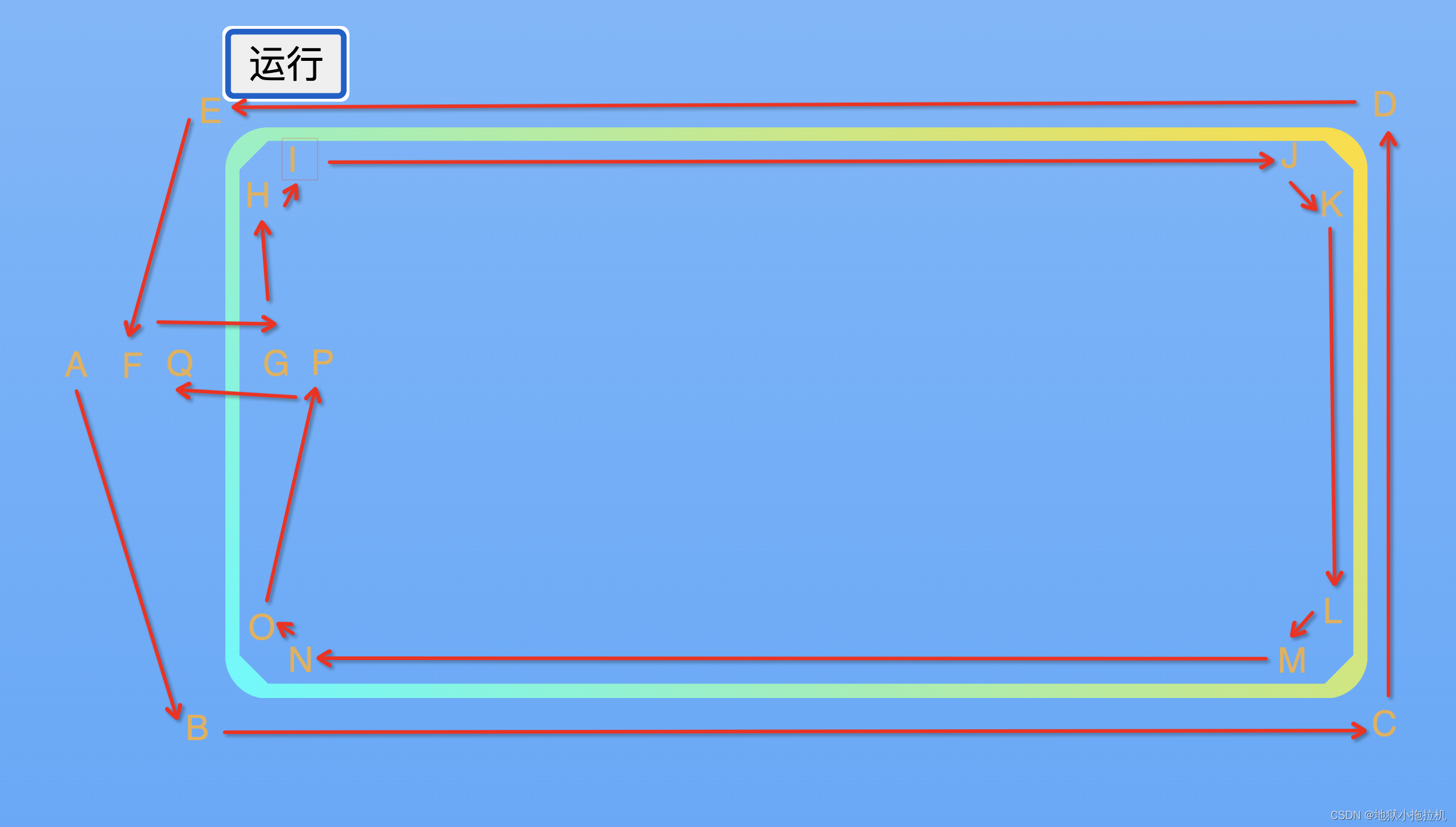 其中,A、F、Q三个点重合,G、P三个重合,裁剪图形看着像反过来的C。只不过渲染效果不是开口的,而是闭口的。
之后,我们需要把HI、JK、LM、NO这四段路径整成圆滑的弧形。我们先来看一个图:
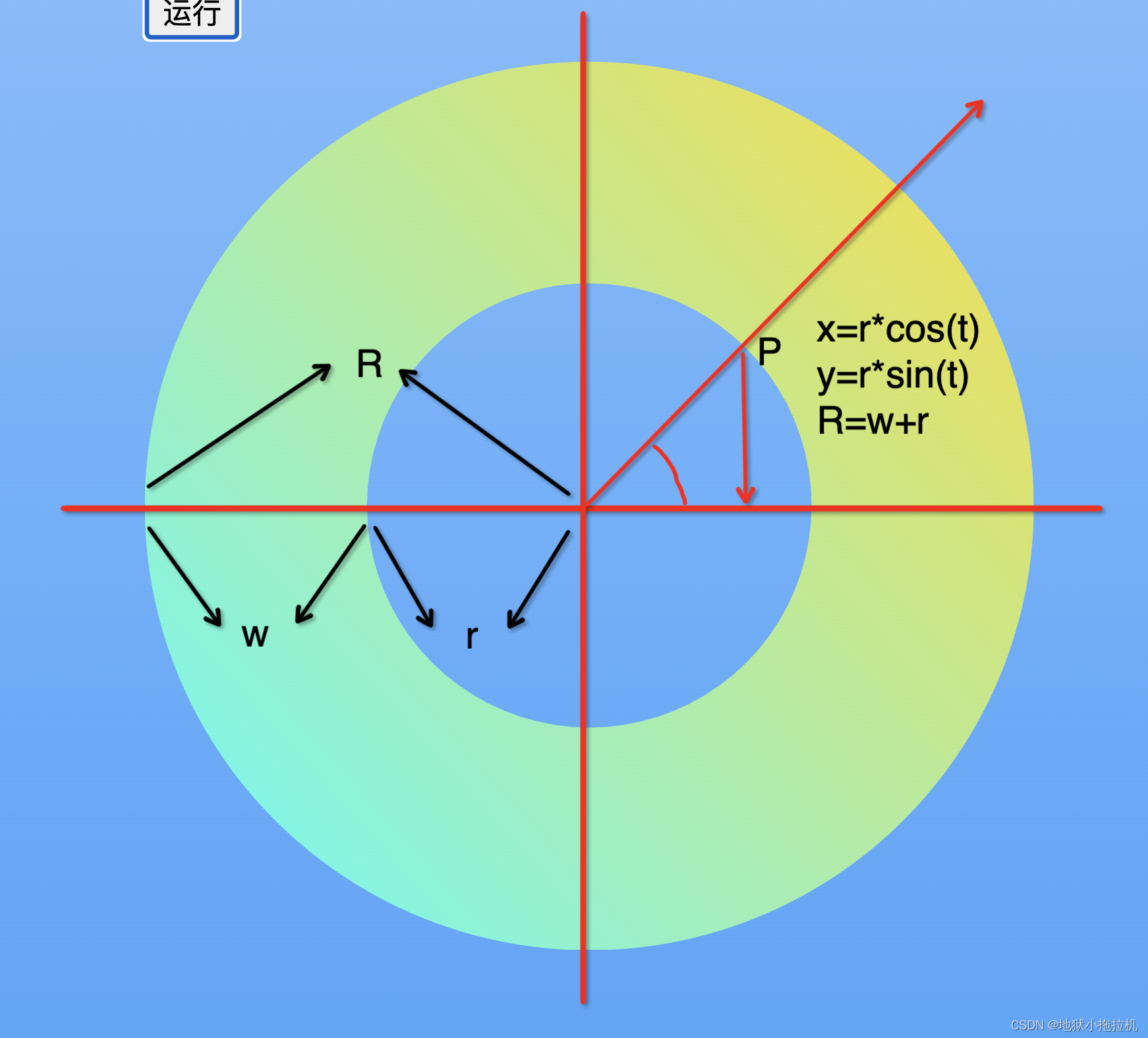

R:border-radius,外层圆的半径
W:border-width,指定的边框宽度
r:内层圆的半径
以第一象限为例
可以计算出x和y的相对偏移位置,以此,我们可以类推出其余三个象限。(ps:夹角我们以射线与x轴最近的那个为准)
第二象限的内圆路径(左上)
x = R - (R - w) * cos(radian)
y = R - (R - w) * sin(radian)
第一象限的内圆路径(右上)
x = 100% - R + (R - w) * cos(PI / 2 - radian)
y = R - (R - w)*sin(PI / 2 - radian)
第四象限的内圆路径(右下)
x = 100% - R + (R - w) * cos(radian)
y = 100% - R + (R - w) * sin(radian)
第三象限的内圆路径(左下)
x = R - (R - w) * cos(PI / 2 - radian)
y = 100% - R + (R - w) * sin(PI / 2 - radian)
  const quadrantFunc = {
    1: {
      getX: (radian, lr, sr) => {
        const swap = sr * Math.cos(Math.PI / 2 - radian) - lr;
        const x = `calc(100% + ${swap}px)`;
        return x;
      },
      getY: (radian, lr, sr) => {
        const y = lr - sr * Math.sin(Math.PI / 2 - radian);
        return `${y}px`;
      }
    },
    2: {
      getX: (radian, lr, sr) => {
        const x = lr - sr * Math.cos(radian);
        return `${x}px`;
      },
      getY: (radian, lr, sr) => {
        const y = lr - sr * Math.sin(radian);
        return `${y}px`;
      }
    },
    3: {
      getX: (radian, lr, sr) => {
        const x = lr - sr * Math.cos(Math.PI / 2 - radian);
        return `${x}px`;
      },
      getY: (radian, lr, sr) => {
        const swap = sr * Math.sin(Math.PI / 2 - radian) - lr;
        const y = `calc(100% + ${swap}px)`;
        return y;
      }
    },
    4: {
      getX: (radian, lr, sr) => {
        const swap = sr * Math.cos(radian) - lr;
        const x = `calc(100% + ${swap}px)`;
        return x;
      },
      getY: (radian, lr, sr) => {
        const swap = sr * Math.sin(radian) - lr;
        const y = `calc(100% + ${swap}px)`;
        return y;
      }
    },
  };
至此,我们的裁剪路径就变为
clip-path: polygon(
0 50%,
0 100%,
100% 100%,
100% 0,
0 0,
0 50%,
borderWidth 50%,
quadrant2,
quadrant1,
quadrant4,
quadrant3,
borderWidth 50%,
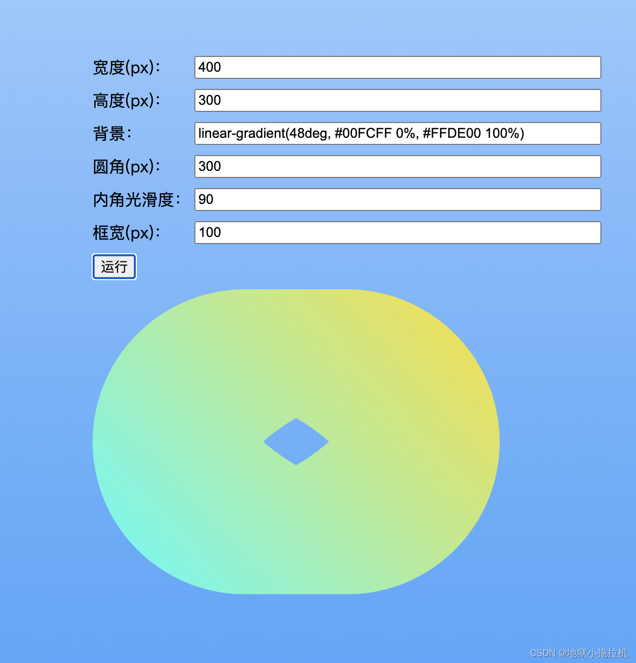
0 50%);最终效果如下:
完整代码
<html>

<head>
  <meta charset="utf-8" />
  <meta name="viewport" content="initial-scale=1,maximum-scale=1,user-scalable=no" />
  <title>渐变-边框-圆角【clip-path】</title>
</head>
<style>
  html,
  body {
    padding: 0;
    margin: 0;
    height: 100%;
    width: 100%;
    background: linear-gradient(0deg, rgba(39, 148, 251, 0.7) 0%, rgba(39, 148, 251, 0.2) 100%);
    display: flex;
    flex-direction: column;
    justify-content: center;
    align-items: center;
  }

  #view {
    position: relative;
  }

  #clip-path {
    position: relative;
    width: 400px;
    height: 200px;
    background: linear-gradient(48deg, #00FCFF 0%, #FFDE00 100%);
  }

  .row {
    display: flex;
    flex-direction: row;
    margin-bottom: 10px;
  }

  .label {
    display: block;
    width: 100px;
  }

  .value {
    width: 400px;
  }
</style>

<body>
  <div id="view">
    <div class="row">
      <span class="label">宽度(px):</span>
      <input type="number" class="value" placeholder="请输入数字" value="400" onchange="handleChange(this,'width')" />
    </div>
    <div class="row">
      <span class="label">高度(px):</span>
      <input type="number" class="value" placeholder="请输入数字" value="200" onchange="handleChange(this,'height')" />
    </div>
    <div class="row">
      <span class="label">背景:</span>
      <input class="value" placeholder="请输入背景色" value="linear-gradient(48deg, #00FCFF 0%, #FFDE00 100%)"
        onchange="handleChange(this,'background')" />
    </div>
    <div class="row">
      <span class="label">圆角(px):</span>
      <input type="number" class="value" placeholder="请输入数字" value="15" onchange="handleChange(this,'borderRadius')" />
    </div>
    <div class="row">
      <span class="label">内角光滑度:</span>
      <input type="number" class="value" placeholder="请输入1~90,数字越大光滑,基本10就够用了" value="10"
        onchange="handleChange(this,'n')" />
    </div>
    <div class="row">
      <span class="label">框宽(px):</span>
      <input type="number" class="value" placeholder="请输入数字,相当于borderWidth" value="5"
        onchange="handleChange(this,'borderWidth')" />
    </div>
    <div class="row">
      <button onclick="start()">运行</button>
    </div>
    <div id="clip-path"></div>
  </div>
</body>

<script>
  const config = {
    borderRadius: 15,
    borderWidth: 5,
    width: 400,
    height: 200,
    background: 'linear-gradient(48deg, #00FCFF 0%, #FFDE00 100%)',
    n: 10
  };
  const quadrantFunc = {
    1: {
      getX: (radian, lr, sr) => {
        const swap = sr * Math.cos(Math.PI / 2 - radian) - lr;
        const x = `calc(100% + ${swap}px)`;
        return x;
      },
      getY: (radian, lr, sr) => {
        const y = lr - sr * Math.sin(Math.PI / 2 - radian);
        return `${y}px`;
      }
    },
    2: {
      getX: (radian, lr, sr) => {
        const x = lr - sr * Math.cos(radian);
        return `${x}px`;
      },
      getY: (radian, lr, sr) => {
        const y = lr - sr * Math.sin(radian);
        return `${y}px`;
      }
    },
    3: {
      getX: (radian, lr, sr) => {
        const x = lr - sr * Math.cos(Math.PI / 2 - radian);
        return `${x}px`;
      },
      getY: (radian, lr, sr) => {
        const swap = sr * Math.sin(Math.PI / 2 - radian) - lr;
        const y = `calc(100% + ${swap}px)`;
        return y;
      }
    },
    4: {
      getX: (radian, lr, sr) => {
        const swap = sr * Math.cos(radian) - lr;
        const x = `calc(100% + ${swap}px)`;
        return x;
      },
      getY: (radian, lr, sr) => {
        const swap = sr * Math.sin(radian) - lr;
        const y = `calc(100% + ${swap}px)`;
        return y;
      }
    },
  };

  function start() {
    console.time('start');
    const node = document.getElementById('clip-path');
    const cssClipPath = getClipPath();
    node.style.cssText = cssClipPath;
    node.style.borderRadius = config.borderRadius + 'px';
    node.style.width = config.width + 'px';
    node.style.height = config.height + 'px';
    node.style.background = config.background;
    console.timeEnd('start');
  }

  function handleChange(e, type) {
    const value = type === 'background' ? e.value : Number(e.value);
    config[type] = value;
  }

  function getClipPath() {
    const innerRadius = config.borderRadius - config.borderWidth;
    const step = Math.PI / 2 / config.n;
    const quadrant1 = getQuadrant(1, config.borderRadius, innerRadius, config.n, step);
    const quadrant2 = getQuadrant(2, config.borderRadius, innerRadius, config.n, step);
    const quadrant3 = getQuadrant(3, config.borderRadius, innerRadius, config.n, step);
    const quadrant4 = getQuadrant(4, config.borderRadius, innerRadius, config.n, step);
    const res =
      `clip-path: polygon(
      0 50%,
      0 100%,
      100% 100%,
      100% 0,
      0 0,
      0 50%,
      ${config.borderWidth}px 50%,
      ${quadrant2},
      ${quadrant1},
      ${quadrant4},
      ${quadrant3},
      ${config.borderWidth}px 50%,
      0 50%
    );`;
    return res;
  }

  function getQuadrant(type, outsideR, innerR, length, interval) {
    const getXY = quadrantFunc[type];
    const res = [];
    for (let i = 0; i <= length; i++) {
      const radian = i * interval;
      const x = getXY.getX(radian, outsideR, innerR);
      const y = getXY.getY(radian, outsideR, innerR);
      res.push(`${x} ${y}`);
    }
    const str = res.join(',');
    return str;
  }
</script>

</html>
最后
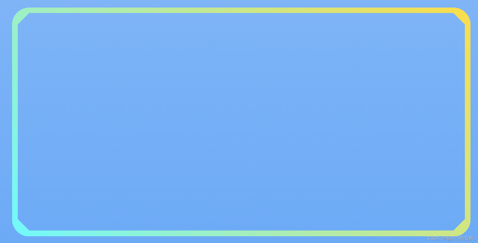
效果是实现了,毕竟还是随手写的版本,bug啥的之类也是有的,这个轨迹算法也不是最牢靠的,这些就留给其他人解决了,哈哈哈哈哈哈。
奇奇怪怪的效果图:
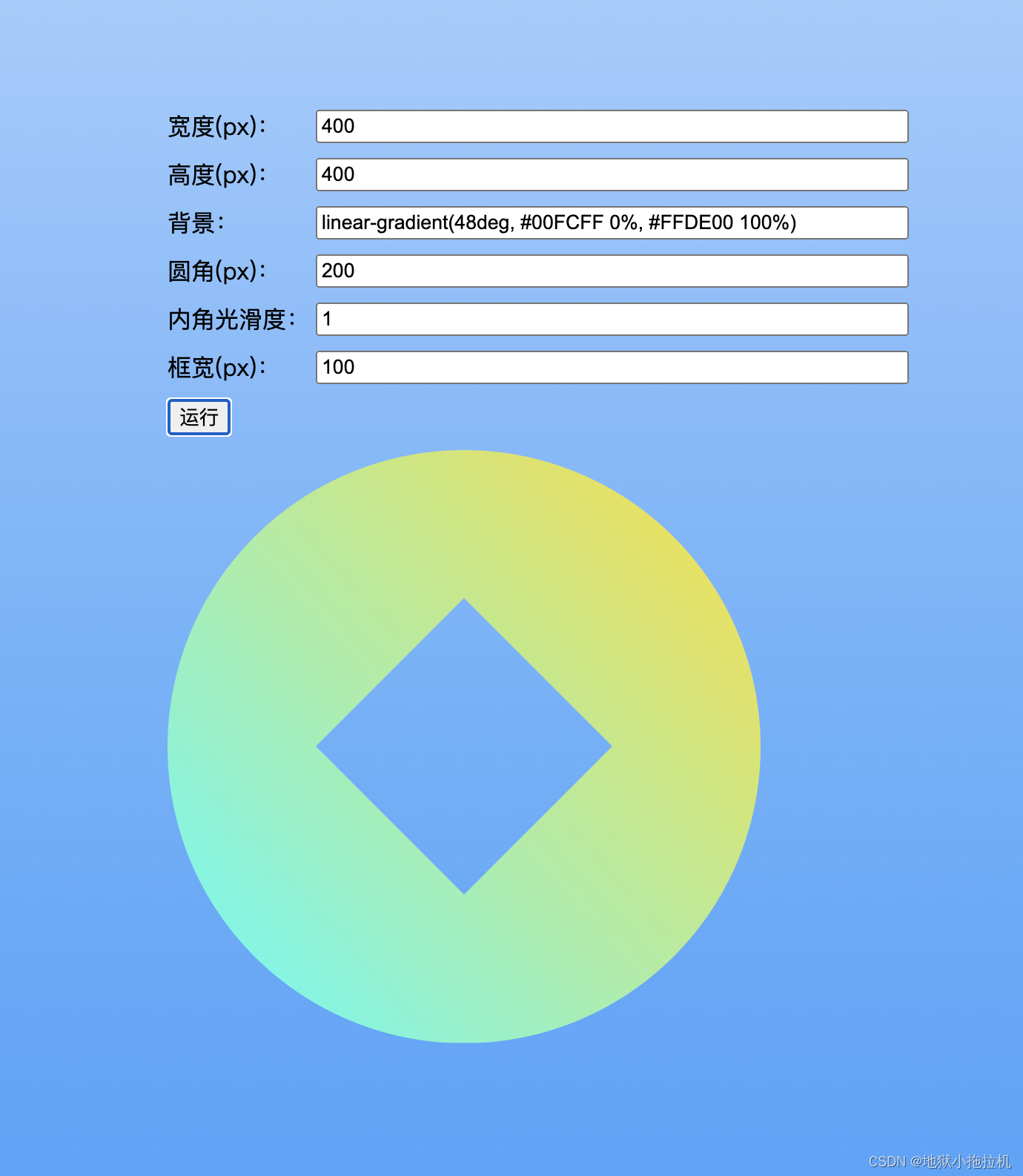
 大家自己慢慢试,如果采用了,记得修bug,我溜了。