一、基本概述
在项目的开发过程中,页面上井场会出现一些通用的内容,例如头部的导航栏,如果我们每一个页面都去写一遍,那实在是太繁琐了,所以,我们使用组件来解决这一难题。
二、基本使用(父传子)
下面的案例中,我们定义一个用户信息展示的组件,通过传递一个对象来展示用户的头像以及姓名。
首先我们需要定义一个用户信息展示的组件user-info,uniapp中定义组件需要定义在根目录下的components中
<template>
  <view class="box">
    <image :src="userImage" mode="aspectFill" class="user-image"></image>
    <view class="user-name">{{userName}}</view>
  </view>
</template>

<script setup>
import { computed } from 'vue';

const props = defineProps({
  userName: {type: String, default: "匿名"},
  userImage: {type: String, default: "../../../static/logo.png"},
  obj: {type: Object, default() {
    return {userName: "匿名", userImage: "../../../static/logo.png"}
  }}
})
const userNameT = computed(() => props.userName + "@")
</script>

<style lang="scss" scoped>
.box {
  margin: 5rpx;
  width: 100%;
  height: 250rpx;
  background-color: #ccc;
  display: flex;
  flex-direction: column;
  align-items: center;
  justify-content: center;
  .user-image {
    width: 200rpx;
    height: 200rpx;
  }
  .user-name {
    margin-top: 5rpx;
    width: 100%;
    text-align: center;
    font-size: 14rpx;
  }
}
</style>
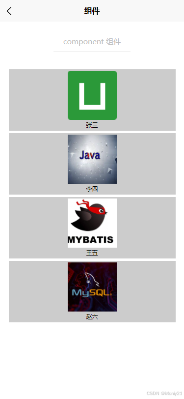
在主页面调用组件,uniapp会自动检索components下面的组件,所以在页面中不需要引入
<template>
  <view class="box">
    <page-head title="component 组件"></page-head>
    <view class="uni-padding-wrap uni-common-mt uni-flex uni-row uni-container">
      <user-info v-for="item in userList" :user-name="item.userName" :user-image="item.userImage"></user-info>
    </view>
  </view>
</template>

<script setup>
import { ref } from 'vue';

const userList = ref([
  {userName: "张三", userImage: "../../../static/logo.png"},
  {userName: "李四", userImage: "../../../static/java.jpeg"},
  {userName: "王五", userImage: "../../../static/mybatis.png"},
  {userName: "赵六", userImage: "../../../static/mysql.jpeg"},
])
</script>

<style lang="scss" scoped>
  .uni-container {
    -webkit-flex-wrap: wrap;
    flex-wrap: wrap;
  }
</style>
三、插槽
我们在定义组件的时候,有的时候个别部分是不通用的,如果都单独创建一个特定的组件,那将会失去组件的真实意义,因此,vue为我们提供了slot插槽标签帮我们解决了这一问题,将单独部分进行定制。
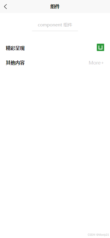
首先我们需要定义一个标题组件,在特定的区域,我们使用slot插槽进行留白。
<template>
  <view class="box">
    <view class="box-title-t">{{title}}</view>
    <view>
      <slot name="icon"></slot>
    </view>
  </view>
</template>

<script setup>
const props = defineProps({
  title: {type: String, default: "这是啥?"}
})

</script>

<style lang="scss" scoped>
.box {
  padding: 0 10rpx;
  width: 100%;
  height: 100rpx;
  display: flex;
  flex-direction: row;
  align-items: center;
  justify-content: space-between;
  .box-title-t {
    color: #000;
    font-weight: 700;
  }
}
</style>
在主页面中我们引入组件,并对组件进行定制,这里需要注意的是,插槽里面的样式要写在主页面中,如果写在组件里面,那会成为公共样式。
<template>
  <view class="box">
    <page-head title="component 组件"></page-head>
    <view class="uni-padding-wrap uni-common-mt uni-flex uni-row uni-container">
      <title-info title="精彩呈现" class="title-class">
        <template #icon>
          <image src="/static/logo.png" mode="aspectFill"></image>
        </template>
      </title-info>
      <title-info title="其他内容" class="title-class">
        <template #icon>
          <text>More+</text>
        </template>
      </title-info>
    </view>
  </view>
</template>

<script setup></script>

<style lang="scss" scoped>
  .title-class {
    image {
      width: 50rpx;
      height: 50rpx;
    }
    text{
      color: #ccc;
    }
  }
</style>
四、子传父
在项目的开发中,我们经常会使用到将子组件的值或者逻辑完成之后调用父组件的方法,vue3提供了defineEmits方法帮助我们完成这一功能。
案例:点击子组件的按钮,修改父组件背景颜色
<template>
  <view class="box">
    <button type="primary" @click="handleClick">点击更换颜色</button>
    <slot></slot>
  </view>
</template>

<script setup>
const emit = defineEmits(['add'])
function handleClick () {
  var hex = Math.floor(Math.random() * 16777216).toString(16);
  while (hex.length < 6) {
    hex = '0' + hex;
  }
  emit("add", '#' + hex)
}
</script>

<style lang="scss" scoped>

</style>
<template>
  <view class="box">
    <page-head title="component 组件"></page-head>
      <color-info class="color-class" :style="{background: background}" @add="handleChangeBackground">
        <view>{{background}}</view>
      </color-info>
    </view>
  </view>
</template>

<script setup>
import { ref } from 'vue';

const background = ref("#fff")
const handleChangeBackground = function(e) {
  background.value = e
}
</script>

<style lang="scss" scoped>
  .color-class {
    margin-bottom: 10rpx;
    width: 100%;
    height: 300rpx;
  }
</style>
五、父调子
在项目的开发中,我们经常会使用到组件,但是子组件里面的值不是固定的,如果只是在页面初始化的时候加载不满足项目需求,vue为我们提供了另外一种方法defineExpose,用于抛出子组件中的变量和方法,在父组件中直接进行调用。
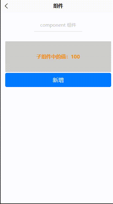
<template>
  <view class="box">
    子组件中的值:{{count}}
  </view>
</template>

<script setup>
import { ref } from 'vue';

const count = ref(100)
const handleAdd = function(){
  count.value++
}

defineExpose({count, handleAdd})
</script>

<style lang="scss" scoped>
.box {
  margin-bottom: 5rpx;
  width: 100%;
  height: 200rpx;
  line-height: 200rpx;
  text-align: center;
  color: #f38b00;
  font-weight: 700;
  background-color: #ccc;
}
</style>
<template>
  <view class="box">
      <!-- 子传父:修改父组件背景颜色 -->
      <color-info class="color-class" :style="{background: background}" @add="handleChangeBackground">
        <view>{{background}}</view>
      </color-info>
      <!-- 父调子:父组件直接调用子组件的属性和方法 -->
      <add-info ref="add_info"></add-info>
      <button type="primary" @click="handleClickAdd" style="width: 100%;">新增</button>
  </view>
</template>

<script setup>
import { ref } from 'vue';

// 注意:这里定义的名称不能与组件的名称一样
const add_info = ref(null)
const handleClickAdd = function(){
  add_info.value.handleAdd()
}
</script>

<style lang="scss" scoped>
</style>