👋 你好!这里有实用干货与深度分享✨✨ 若有帮助,欢迎:
👍 点赞 | ⭐ 收藏 | 💬 评论 | ➕ 关注 ,解锁更多精彩!
📁 收藏专栏即可第一时间获取最新推送🔔。
📖后续我将持续带来更多优质内容,期待与你一同探索知识,携手前行,共同进步🚀。

数据可视化优化
数据可视化是深度学习和数据科学项目中不可或缺的一环,能够帮助研究人员直观理解数据的分布特性、变量之间的关系以及模型的训练过程与性能表现。良好的数据可视化不仅可以揭示数据的分布结构,还能辅助特征工程和模型调优。本文将系统介绍常见的数据可视化方法及其实现方式,涵盖数值数据、图像、文本与模型训练等多个方面。
一、数据分布可视化
数据分布可视化主要用于了解单个特征或多个特征之间的分布情况。这些可视化方法可以帮助识别数据的集中趋势、离群点和变量之间的相关性。
1. 单变量分布
单变量可视化用于展示单个特征的分布情况,包括直方图和箱线图。
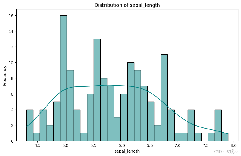
- 直方图:直观展示数据在各区间的频率分布,快速判断数据分布形态,如是否符合正态分布。
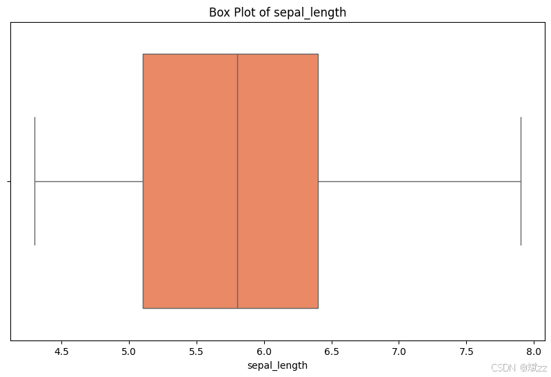
- 箱线图:清晰呈现数据的中位数、四分位数及异常值,便于评估数据稳健性 。
import matplotlib.pyplot as plt
import seaborn as sns

# 单变量分布函数
def plot_feature_distribution(data, feature_name, bins=30, kde=True, color='teal'):
    plt.figure(figsize=(10, 6))
    sns.histplot(data=data, x=feature_name, bins=bins, kde=kde, color=color)
    plt.title(f'Distribution of {feature_name}')
    plt.xlabel(feature_name)
    plt.ylabel('Frequency')
    plt.show()

# 箱线图(适用于发现异常值)
def plot_box(data, feature_name, color='coral'):
    plt.figure(figsize=(10, 6))
    sns.boxplot(data=data, x=feature_name, color=color)
    plt.title(f'Box Plot of {feature_name}')
    plt.show()
示例数据展示
import seaborn as sns
import matplotlib.pyplot as plt

# 加载 Iris 数据集
iris = sns.load_dataset('iris')

# 单变量分布示例
plot_feature_distribution(iris, 'sepal_length')
plot_box(iris, 'sepal_length')
2. 多变量分布
多变量可视化主要用于探索两个或多个特征之间的关系。
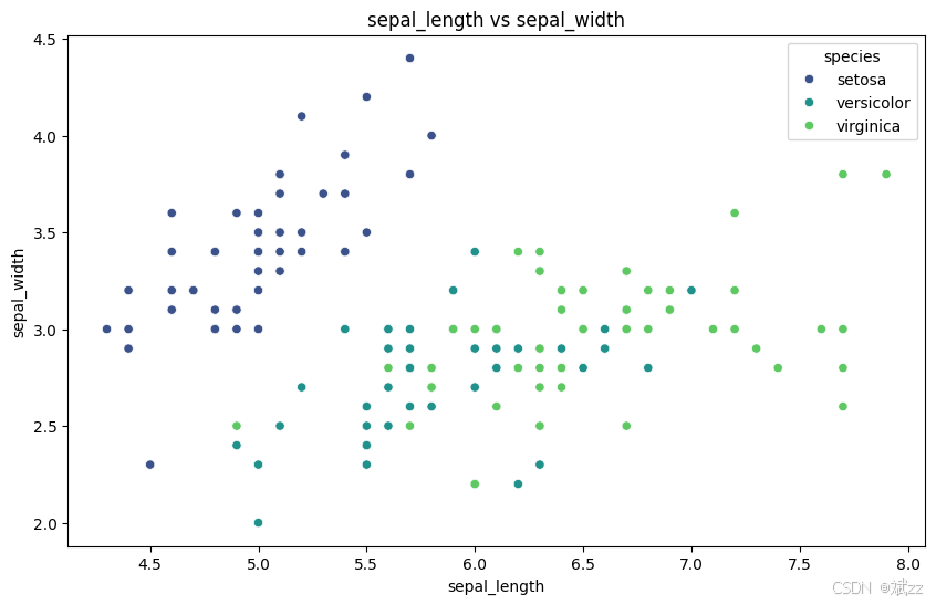
- 散点图:发现变量间的线性或非线性关联,判断数据聚类情况。
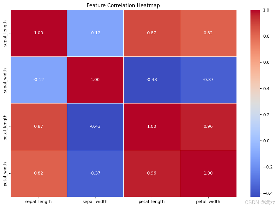
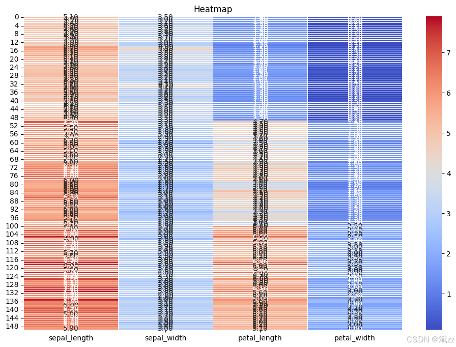
- 热力图:量化展示多个变量间的线性相关程度,快速识别强相关特征,避免特征冗余。
- 相关系数热力图:展示变量间的线性相关程度,便于特征选择和模型构建。
import seaborn as sns
import matplotlib.pyplot as plt

# 散点图(适合分析连续变量的关联)
def plot_scatter_plot(data, x_feature, y_feature, hue=None, palette='viridis'):
    plt.figure(figsize=(10, 6))
    sns.scatterplot(data=data, x=x_feature, y=y_feature, hue=hue, palette=palette)
    plt.title(f'{x_feature} vs {y_feature}')
    plt.show()

# 相关系数热力图(适合展示变量之间的线性相关性)
def plot_correlation_heatmap(data, cmap='coolwarm'):
    plt.figure(figsize=(12, 8))
    sns.heatmap(data.corr(), annot=True, cmap=cmap, fmt='.2f', linewidths=0.5)
    plt.title('Feature Correlation Heatmap')
    plt.show()

# 热力图(适合展示多个变量之间的线性相关程度)
def plot_heatmap(data, cmap='coolwarm'):
    plt.figure(figsize=(12, 8))
    sns.heatmap(data, cmap=cmap, annot=True, fmt='.2f', linewidths=0.5)
    plt.title('Heatmap')
    plt.show()
示例数据展示
import seaborn as sns
import matplotlib.pyplot as plt

# 加载 Iris 数据集
iris = sns.load_dataset('iris')

# 多变量分布示例
plot_scatter_plot(iris, 'sepal_length', 'sepal_width', hue='species')
plot_correlation_heatmap(iris.drop(columns=['species']))
plot_heatmap(iris.drop(columns=['species']))
二、图像数据可视化
图像数据可视化用于展示和分析图片数据,是计算机视觉领域的重要工具。常见的方法包括显示单张图片、构建图片网格以及可视化卷积神经网络的特征。
1. 显示单张图像
直观查看图像内容、分辨率、色彩模式,及时发现噪声、模糊或标注错误等问题。
import matplotlib.pyplot as plt

# 显示单张图片
def show_image(image, title='Sample Image', cmap='gray'):
    plt.figure(figsize=(6, 6))
    plt.imshow(image, cmap=cmap)
    plt.axis('off')
    plt.title(title)
    plt.show()
示例数据展示
from skimage import data

# 读取示例图片
sample_image = data.camera()

# 显示单张图片示例
show_image(sample_image, title='Camera Image')

2. 显示多张图像
对比图像间特征差异,展示数据集多样性,评估数据增强策略有效性。
import matplotlib.pyplot as plt

# 显示多张图片
def show_image_grid(images, labels=None, cols=4, title='Image Grid', cmap='gray'):
    rows = (len(images) + cols - 1) // cols
    plt.figure(figsize=(3 * cols, 3 * rows))
    for i, image in enumerate(images):
        plt.subplot(rows, cols, i + 1)
        plt.imshow(image, cmap=cmap)
        if labels is not None:
            plt.title(f'Label: {labels[i]}')
        plt.axis('off')
    plt.suptitle(title)
    plt.tight_layout()
    plt.show()
示例数据展示
from skimage import data

# 读取示例图片
sample_image = data.camera()
astronaut_image = data.astronaut()
sample_images = [sample_image, astronaut_image, sample_image, astronaut_image]

# 显示多张图片示例
show_image_grid(sample_images, title='Sample Image Grid')

三、文本数据可视化
文本数据可视化可以帮助理解文本的结构、词频分布以及关键词之间的关联。常见的方法包括词云图和词频统计图。
1. 词云图
突出显示文本高频关键词,直观反映文本核心内容,快速抓住主题重点。
from wordcloud import WordCloud
import matplotlib.pyplot as plt

# 词云图
def generate_wordcloud(text, font_path=None):
    wordcloud = WordCloud(width=800, height=400, background_color='white', font_path=font_path).generate(text)
    plt.figure(figsize=(10, 5))
    plt.imshow(wordcloud, interpolation='bilinear')
    plt.axis('off')
    plt.title('Word Cloud')
    plt.show()
示例数据展示
sample_text = '''
To be, or not to be, that is the question:
Whether 'tis nobler in the mind to suffer
The slings and arrows of outrageous fortune,
Or to take arms against a sea of troubles
And by opposing end them.'''

# 词云图示例
generate_wordcloud(sample_text)

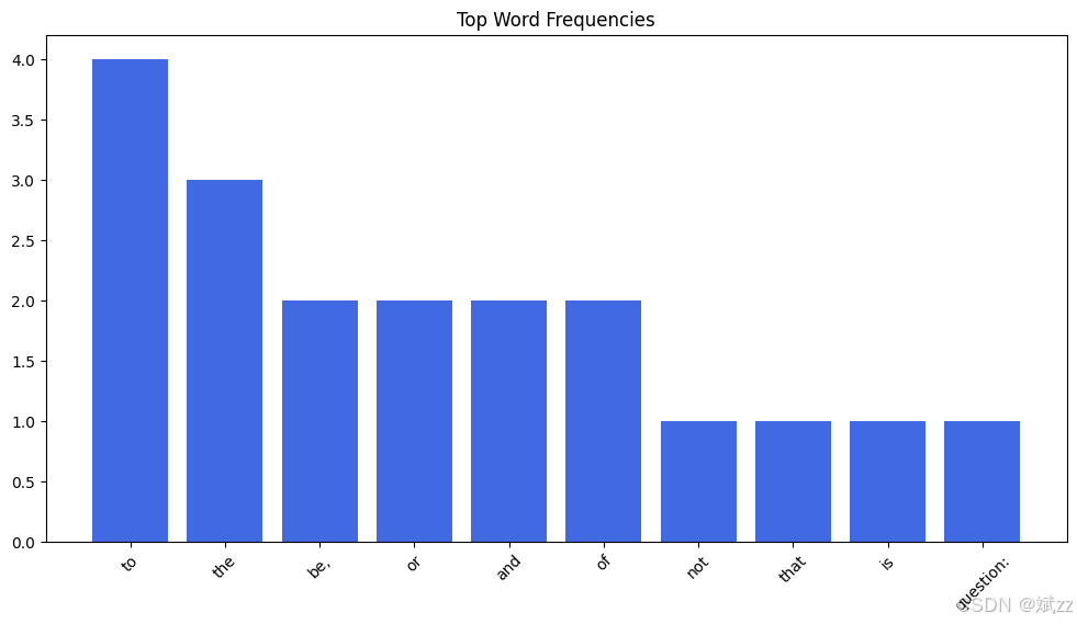
2. 词频统计图
量化展示词汇出现频率,分析文本语言特征,为文本分类、主题建模提供数据支持。
from collections import Counter
import matplotlib.pyplot as plt

# 词频统计
def plot_word_frequency(words, top_n=20, color='royalblue'):
    word_freq = Counter(words).most_common(top_n)
    words, counts = zip(*word_freq)
    plt.figure(figsize=(12, 6))
    plt.bar(words, counts, color=color)
    plt.xticks(rotation=45)
    plt.title('Top Word Frequencies')
    plt.show()
示例数据展示
sample_text = '''
To be, or not to be, that is the question:
Whether 'tis nobler in the mind to suffer
The slings and arrows of outrageous fortune,
Or to take arms against a sea of troubles
And by opposing end them.'''

words = sample_text.lower().replace('\n', ' ').split()

# 词频统计图示例
plot_word_frequency(words, top_n=10)
结语
数据可视化不仅是数据分析的辅助工具,也是深度学习建模与优化的核心环节之一。合理的可视化方法能够帮助研究人员更好地理解数据结构、检测异常、解释模型表现,从而提升整体建模质量。
📌 感谢阅读!若文章对你有用,别吝啬互动~
👍 点个赞 | ⭐ 收藏备用 | 💬 留下你的想法 ,关注我,更多干货持续更新!