本文为《React Agent:从零开始构建 AI 智能体》专栏系列文章。 专栏地址:https://blog.csdn.net/suiyingy/category_12933485.html。项目地址:https://gitee.com/fgai/react-agent(含完整代码示例与实战源)。完整介绍:https://blog.csdn.net/suiyingy/article/details/146983582。
1 内置节点
React Flow 提供了一些默认的节点类型,如简单的矩形节点。这些节点具有基本的样式和功能,适用于大多数常见场景。例如,在一个简单的流程图示例中,默认节点可以直接用于表示各个流程步骤,无需过多的自定义设置。
const defaultNode = {
    id: 'default - node - 1',
    type: 'default',
    data: { label: 'Default Node' },
    position: { x: 100, y: 100 }
};
默认节点效果如下图所示。
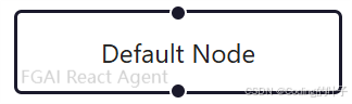
图1 默认节点
输入节点通常用于表示数据或流程的起始点,输出节点则表示终点。这些节点在外观或行为上可能与默认节点有所不同,以突出其特殊功能。例如,输入节点可能会有一个独特的箭头指向内部,表示数据流入;输出节点可能有箭头指向外部,表示数据流出。我们可以使用节点的类型 type 来进行区分,如下所示。
const inputNode = {
    id: 'input - node - 1',
    type: 'input',
    data: { label: 'Input Node' },
    position: { x: 50, y: 150 }
};

const outputNode = {
    id: 'output - node - 1',
    type: 'output',
    data: { label: 'Output Node' },
    position: { x: 250, y: 150 }
};
运行后效果如下图所示。
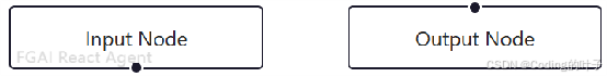
图2 输入与输出节点
React Flow 还可能包含一些具有特殊功能的内置节点类型,如决策节点。决策节点通常用于在流程中引入分支逻辑,根据特定条件决定流程的走向。这种节点可能具有多个输出边,每个边对应不同的条件结果。
const decisionNode = {
    id: 'decision - node - 1',
    type: 'decision',
    data: { label: 'Decision Node' },
    position: { x: 150, y: 200 }
};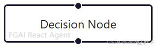
图3 决策节点
2 自定义节点
2.1 加载方式
开发者可以根据项目的特定需求创建自定义节点类型。这需要定义一个 React 组件,该组件接受来自 React Flow 的属性,并渲染出所需的节点外观和行为。例如,创建一个带有自定义图标和样式的节点组件:
const CustomIconNode= ({ data }) => {
  return (
    <div style={{ background: 'lightgreen', padding: '10px', borderRadius: '5px', display: 'flex', alignItems: 'center' }}>
        <img src="https://iconfont.alicdn.com/p/illus/preview_image/6DCpzl5Xujsn/9317c0a3-26fd-464e-bf3b-2a721259fc29.png"
              alt="图标" style={{ width: '20px', height: '20px', marginRight: '5px' }} />
        {data.label}
    </div>
  );
};
在使用自定义节点类型之前,需要将其注册到 React Flow 中。这通过在 React Flow 组件的nodeTypes属性中定义类型名称与组件的映射关系来实现。
import React, { useCallback } from 'react';
import {
  ReactFlow,
  Handle,
  useNodesState,
  useEdgesState,
  addEdge,
} from 'reactflow';
import 'reactflow/dist/style.css';


const CustomIconNode= ({ data }) => {
  return (
    <div style={{ background: 'lightgreen', padding: '10px', borderRadius: '5px', display: 'flex', alignItems: 'center' }}>
        <img src="https://iconfont.alicdn.com/p/illus/preview_image/6DCpzl5Xujsn/9317c0a3-26fd-464e-bf3b-2a721259fc29.png"
              alt="图标" style={{ width: '20px', height: '20px', marginRight: '5px' }} />
        {data.label}
    </div>
  );
};

const nodeTypes = {
  customNode: CustomIconNode,
};

// 节点配置
const customIconNode = {
  id: '1',
  type: 'customNode',       // 指定自定义类型
  data: { label: 'CustomIconNode' },
  position: { x: 100, y: 100 },  // 调整到可见位置
};

const initialNodes = [customIconNode];
const initialEdges = [];

export default function App() {
  const [nodes, setNodes, onNodesChange] = useNodesState(initialNodes);
  const [edges, setEdges, onEdgesChange] = useEdgesState(initialEdges);

  const onConnect = useCallback(
    (params) => setEdges((eds) => addEdge(params, eds)),
    [setEdges]
  );

  return (
    <div style={{ width: '100vw', height: '100vh' }}>
      <ReactFlow
        nodes={nodes}
        edges={edges}
        nodeTypes= {nodeTypes}  // 注册自定义类型
        onNodesChange={onNodesChange}
        onEdgesChange={onEdgesChange}
        onConnect={onConnect}
        fitView
      />
    </div>
  );
}
运行程序后节点如下图所示。

图4 自定义节点示例
2.2 输入输出 Handle
图中自定义节点在初始状态下并没有输入输出位置,若要对其进行设置,需要结合 Handle 组件来进行配置。Handle 组件在配置过程中,可以通过设置相关参数来明确节点的输入输出位置,比如可以将输入位置设定为 top(顶部)、left(左侧)等,输出位置设定为 right(右侧)、bottom(底部)等,以此来精准地定义节点数据的流入和流出方向。同时,Handle 组件中的 type 属性具有重要意义,当 type 为 source 时,表明该 Handle 对应的是节点的输出端,用于向外发送数据或信号;而当 type 为 target 时,则意味着该 Handle 对应的是节点的输入端,用于接收外部传入的数据或信号。Handle 组件通过对输入输出位置的设定以及对 type 的定义,能够实现节点之间的合理连接。
const CustomIconNode= ({ data }) => {
  return (
    <div style={{ background: 'lightgreen', padding: '10px', borderRadius: '5px', display: 'flex', alignItems: 'center' }}>
      <img src="https://iconfont.alicdn.com/p/illus/preview_image/6DCpzl5Xujsn/9317c0a3-26fd-464e-bf3b-2a721259fc29.png"
            alt="图标" style={{ width: '20px', height: '20px', marginRight: '5px' }} />
      {data.label}
      {/* 左侧输入 */}
      <Handle type="target" position="left" id="left"/>
      {/* 顶部输入 */}
      <Handle
        type="target" position="top" id="top" style={{ left: '50%', transform: 'translateX(-50%)' }}
      />
      {/* 右侧输出 */}
      <Handle type="source" position="right" id="right"/>
    </div>
  );
};
运行程序后节点如下图所示。

图 5自定义输入输出位置与类型
我们也可以在一侧设置多个输入或输出。
const CustomIconNode= ({ data }) => {
  return (
    <div style={{ background: 'lightgreen', padding: '10px', borderRadius: '5px', display: 'flex', alignItems: 'center' }}>
      <img src="https://iconfont.alicdn.com/p/illus/preview_image/6DCpzl5Xujsn/9317c0a3-26fd-464e-bf3b-2a721259fc29.png"
            alt="图标" style={{ width: '20px', height: '20px', marginRight: '5px' }} />
      {data.label}
      {/* 左侧输入1 - 顶部位置 */}
      <Handle
        type="target"
        position="left"
        id="left-top"
        style={{ top: '30%' }} // 通过top定位
      />

      {/* 左侧输入2 - 底部位置 */}
      <Handle
        type="target"
        position="left"
        id="left-bottom"
        style={{ top: '70%' }} // 通过top定位
      />

      {/* 顶部输入 */}
      <Handle
        type="target"
        position="top"
        id="top"
        style={{ left: '50%', transform: 'translateX(-50%)' }}
      />

      {/* 右侧输出 */}
      <Handle
        type="source"
        position="right"
        id="right"
      />
    </div>
  );
};
运行程序后节点如下图所示。

图6 一侧设置多个输入输出
自定义节点类型的主要优势在于能够完全根据项目需求定制节点的外观、行为和功能。数据可视化项目中可以创建具有特定图表样式的节点,如柱状图节点、折线图节点等,用于直观展示数据。工作流管理系统可以定义带有审批按钮、进度条等功能的自定义节点,方便用户操作和跟踪流程进度。
除了通过style和className属性进行基本的样式设置外,还可以通过更复杂的 CSS 技巧来自定义节点外观,为节点添加悬停效果、选中效果等。例如,为节点添加悬停时的背景颜色变化:
.custom-node-class:hover {
    background-color: green;
}
2.3 添加自定义图标或图像
添加自定义图标或图像:可以在节点中添加自定义图标或图像,增强节点的可视化效果。这可以通过在自定义节点组件中使用<img>标签或引入图标库来实现。例如,下面程序使用 Font Awesome 图标库在节点中添加一个用户图标。注意使用之前需要安装图标库:npm install @fortawesome/react-fontawesome @fortawesome/free-solid-svg-icons。
import React, { useCallback } from 'react';
import {
  ReactFlow,
  Handle,
  useNodesState,
  useEdgesState,
  addEdge,
} from 'reactflow';
import 'reactflow/dist/style.css';
import { faUser } from '@fortawesome/free-solid-svg-icons';
import { FontAwesomeIcon } from '@fortawesome/react-fontawesome';


const CustomIconNode= ({ data }) => {
  return (
    <div style={{ background: 'lightblue', padding: '10px', borderRadius: '5px' }}>
        <FontAwesomeIcon icon={faUser} /> {data.label}
    </div>
  );
};

const nodeTypes = {
  customNode: CustomIconNode,
};

// 节点配置
const node1 = {
  id: '1',
  type: 'customNode',       // 指定自定义类型
  data: { label: 'Font Awesome Node' },
  position: { x: 100, y: 100 },  // 调整到可见位置
};

const initialNodes = [node1];
const initialEdges = [];

export default function App() {
  const [nodes, setNodes, onNodesChange] = useNodesState(initialNodes);
  const [edges, setEdges, onEdgesChange] = useEdgesState(initialEdges);

  const onConnect = useCallback(
    (params) => setEdges((eds) => addEdge(params, eds)),
    [setEdges]
  );

  return (
    <div style={{ width: '100vw', height: '100vh' }}>
      <ReactFlow
        nodes={nodes}
        edges={edges}
        nodeTypes= {nodeTypes}  // 注册自定义类型
        onNodesChange={onNodesChange}
        onEdgesChange={onEdgesChange}
        onConnect={onConnect}
        fitView
      />
    </div>
  );
}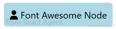
图7 Font Awesome Node
下面是一个更加复杂的节点示例程序,使用 react 自身图标库。
import React from 'react';
import { ReactFlow, Handle, useNodes } from 'reactflow';
import 'reactflow/dist/style.css';
import { FiDatabase, FiCloud } from 'react-icons/fi';

// 自定义节点组件 npm install react-icons
const CustomNode = ({ id, data, selected }) => {
  return (
    <div className={`custom-node ${selected ? 'selected' : ''}`}>
      {/* 顶部输入句柄 */}
      <Handle
        type="target"
        position="top"
        className="!bg-teal-500"
        onConnect={(params) => console.log('handle onConnect', params)}
      />

      {/* 节点内容 */}
      <div className="node-header">
        <FiCloud className="node-icon" />
        <h3 className="node-title">{data.label}</h3>
      </div>
      <div className="node-body">
        <FiDatabase className="node-icon" />
        <span className="node-info">{data.content}</span>
      </div>

      {/* 底部输出句柄 */}
      <Handle
        type="source"
        position="bottom"
        className="!bg-purple-500"
      />

      {/* 右侧第二个输出句柄 */}
      <Handle
        type="source"
        position="right"
        id={`${id}-output-2`}
        className="!bg-pink-500"
        style={{ top: '30%' }}
      />
    </div>
  );
};

const initialNodes = [
  {
    id: '1',
    position: { x: 0, y: 0 },
    data: {
      label: '开始节点',
      content: '输入数据源'
    },
    type: 'custom',
  },
  {
    id: '2',
    position: { x: 200, y: 150 },
    data: {
      label: '处理节点',
      content: '数据处理流程'
    },
    type: 'custom',
  },
];

const initialEdges = [{
  id: 'e1-2',
  source: '1',
  target: '2',
  animated: true,
  style: { stroke: '#94a3b8' },
}];

const nodeTypes = {
  custom: CustomNode,
};

// 节点样式
const nodeStyle = `
  .custom-node {
    background: linear-gradient(145deg, #ffffff, #f1f5f9);
    border-radius: 8px;
    border: 2px solid #cbd5e1;
    box-shadow: 0 4px 6px -1px rgba(0, 0, 0, 0.1);
    padding: 16px;
    min-width: 200px;
    transition: all 0.2s ease;
  }

  .custom-node.selected {
    border-color: #6366f1;
    box-shadow: 0 4px 15px rgba(99, 102, 241, 0.2);
  }

  .custom-node:hover {
    transform: translateY(-2px);
  }

  .node-header {
    display: flex;
    align-items: center;
    margin-bottom: 12px;
    border-bottom: 1px solid #e2e8f0;
    padding-bottom: 8px;
  }

  .node-title {
    margin: 0;
    font-size: 1.1rem;
    color: #1e293b;
    margin-left: 8px;
  }

  .node-body {
    display: flex;
    align-items: center;
    color: #64748b;
  }

  .node-icon {
    font-size: 1.2rem;
    margin-right: 8px;
    color: #6366f1;
  }

  .node-info {
    font-size: 0.9rem;
  }

  .react-flow__handle {
    width: 14px;
    height: 14px;
    border-radius: 3px;
    border: none;
  }
`;

export default function App() {
  return (
    <div style={{ height: '100vh', background: '#f8fafc' }}>
      <style>{nodeStyle}</style>
      <ReactFlow
        nodes={initialNodes}
        edges={initialEdges}
        nodeTypes={nodeTypes}
        fitView
        style={{ background: '#f8fafc' }}
        connectionLineStyle={{ stroke: '#94a3b8', strokeWidth: 2 }}
        defaultEdgeOptions={{
          type: 'smoothstep',
          animated: true,
          style: { strokeWidth: 2 }
        }}
      />
    </div>
  );
}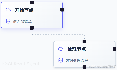
图8 自定义节点示例
2.4 定制节点形状
定制节点形状:通过 CSS 的border - radius、clip - path等属性,可以改变节点的形状。使用border - radius创建圆形节点,或者使用clip - path创建更复杂的形状。例如,创建一个圆形节点:
const CustomIconNode = ({ data }) => {
  return (
    <div style={{
      borderRadius: '50%',
      width: '80px',
      height: '80px',
      display: 'flex',
      justifyContent: 'center',
      alignItems: 'center',
      background: 'lightblue',
      padding: '10px'
    }}>
      <FontAwesomeIcon icon={faUser} /> {data.label}
    </div>
  );
};
运行程序后节点如下图所示。

图9 自定义样式
2.5 实现自定义交互逻辑
实现自定义交互逻辑:除了使用 React Flow 提供的默认交互行为,开发者可以在自定义节点组件中实现完全自定义的交互逻辑。在节点中添加一个可展开 / 折叠的面板,通过点击节点来切换面板的显示状态。
const CustomIconNode = ({ data, id, setNodes }) => {
  const [isExpanded, setIsExpanded] = useState(false);

  const togglePanel = () => {
    setIsExpanded(!isExpanded);
  };

  return (
    <div style={{ background: 'lightblue', padding: '10px', borderRadius: '5px' }}>
      <div onClick={togglePanel} style={{ cursor: 'pointer' }}>
        <FontAwesomeIcon icon={faUser} /> {data.label}
        <FontAwesomeIcon icon={isExpanded ? faChevronUp : faChevronDown} style={{ marginLeft: '10px' }} />
      </div>
      {isExpanded && (
        <div style={{ marginTop: '10px', background: 'white', padding: '10px', borderRadius: '5px' }}>
          This is the expandable panel content.
        </div>
      )}
    </div>
  );
};
运行程序后节点如下图所示。
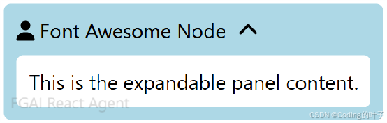
图10 面板交互
2.6 与外部系统集成
与外部系统集成:在实际项目中,节点可能需要与外部系统进行交互,如调用后端 API 获取数据、与其他前端组件进行通信等。通过在自定义节点组件中使用 React 的副作用钩子(如useEffect),可以实现与外部系统的集成。例如,当节点被点击时,向后端发送一个请求获取更多数据:
const ApiCallNode = ({ data }) => {
  const handleClick = async () => {
      try {
          const response = await fetch('https://example.com/api/data');
          const result = await response.json();
          console.log(result);
      } catch (error) {
          console.error('Error fetching data:', error);
      }
  };

  return (
    <div style={{ background: 'lightyellow', padding: '10px', borderRadius: '5px' }} onClick={handleClick}>
        {data.label}
    </div>
  );
};
2.7 扩展默认数据属性
扩展默认数据属性:在某些情况下,默认的data属性可能无法满足项目需求,需要扩展数据结构。可以在自定义节点组件中定义自己的数据结构,并在使用节点时传入相应的数据。例如,定义一个包含进度信息的节点数据结构:
// 进度条节点组件
const ProgressNode = ({ data }) => {
    const { progress, label } = data;
    return (
        <div style={{ background: 'lightblue', padding: '10px', borderRadius: '5px' }}>
            <div style={{ display: 'flex', alignItems: 'center' }}>
                <FontAwesomeIcon icon={faUser} />
                <span style={{ marginLeft: '5px' }}>{label}</span>
            </div>
            <div style={{ marginTop: '10px', background: '#e0e0e0', borderRadius: '5px', overflow: 'hidden' }}>
                <div
                    style={{
                        width: `${progress * 100}%`,
                        height: '20px',
                        background: 'green',
                        borderRadius: '5px',
                    }}
                ></div>
            </div>
        </div>
    );
};
运行程序后节点如下图所示。
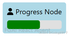
图11 进度条节点
使用复杂嵌套数据结构:对于更复杂的业务场景,节点的数据结构可能包含嵌套对象或数组。在一个项目管理流程图中,节点可能代表一个任务,任务数据包含子任务列表、负责人信息等。
const taskNode = {
    id: 'task - node - 1',
    type: 'task',
    data: {
        label: 'Project Task',
        description: 'This is a main task',
        subTasks: [
            { id:'sub - task - 1', label: 'Sub Task 1', completed: false },
            { id:'sub - task - 2', label: 'Sub Task 2', completed: true }
        ],
        assignee: {
            id: 'user - 1',
            name: 'John Doe',
            role: 'Developer'
        }
    },
    position: { x: 700, y: 700 }
};
数据验证与转换:当使用自定义数据结构时,为了确保数据的正确性和一致性,需要进行数据验证和转换。可以编写辅助函数来验证节点数据的格式是否符合预期,并在必要时对数据进行转换。
const validateNodeData = (data) => {
    if (!data.label) {
        throw new Error('Node data must have a label');
    }
    if (data.progress && (data.progress < 0 || data.progress > 1)) {
        throw new Error('Progress value must be between 0 and 1');
    }
    return true;
};

const transformNodeData = (data) => {
    if (typeof data.progress ==='string') {
        data.progress = parseFloat(data.progress);
    }
    return data;
};
在创建或更新节点数据时,调用这些函数:
let rawNodeData = {
    id: 'new-node-1',
    type: 'default',
    data: {
        label: 'New Node',
        progress: '0.8'
    },
    position: { x: 800, y: 800 }
};

try {
    const validData = transformNodeData(rawNodeData.data);
    if (validateNodeData(validData)) {
        // 可以安全地使用节点数据
    }
} catch (error) {
    console.error(error);
}
数据结构变化对节点的影响:随着项目的发展,节点的数据结构可能会发生变化。这种变化可能会影响节点的渲染和交互逻辑。当数据结构变化时,需要相应地更新自定义节点组件,确保其能够正确处理新的数据格式。同时,开发者还需要考虑如何迁移旧数据,使其符合新的数据结构要求。例如,当节点数据中新增了一个属性priority,可以编写如下迁移函数。在加载旧节点数据时,调用迁移函数进行数据转换。
const migrateNodeData = (oldData) => {
    return {
       ...oldData,
        priority: oldData.priority || 'normal' // 如果旧数据没有priority属性,设置默认值
    };
};
立即关注获取最新动态
点击订阅《React Agent 开发专栏》,每周获取智能体开发深度教程。项目代码持续更新至React Agent 开源仓库,欢迎 Star 获取实时更新通知!FGAI 人工智能平台:FGAI 人工智能平台