Flex布局
能够使用Flex布局模型灵活、快速的开发网页
- 是一种浏览器提倡的布局模型
- 布局网页更简单、灵活
- 避免浮动脱标的问题
- 手机端放心用, pc端ie低版本不兼容
- 技术兼容性查询网站: Can I use... Support tables for HTML5, CSS3, etc
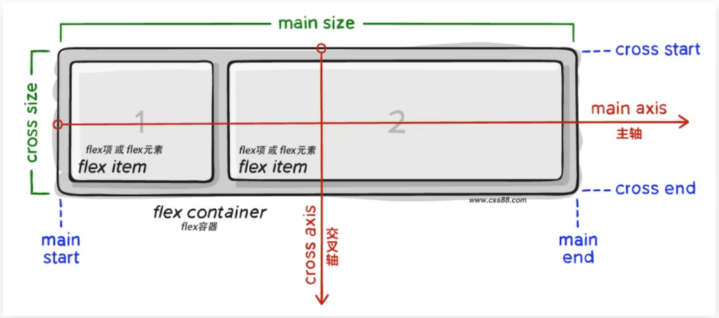
Flex基础概念
- 基于 Flex 精确灵活控制块级盒子的布局方式, 避免浮动布局中脱离文档流现象发生
- Flex布局非常适合结构化布局
- 在父盒子(必须是亲爹)身上添加 display:flex; 就会开启flex布局
- 组成部分
- 弹性容器
- 弹性盒子
- 主轴
- 侧轴/交叉轴
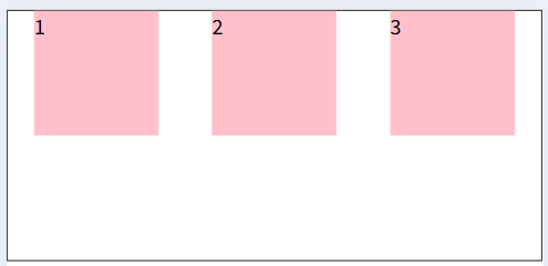
开启Flex布局
<!DOCTYPE html>
<html lang="en">

<head>
    <meta charset="UTF-8">
    <meta http-equiv="X-UA-Compatible" content="IE=edge">
    <meta name="viewport" content="width=device-width, initial-scale=1.0">
    <title>体验flex布局</title>
    <style>
        * {
            margin: 0;
            padding: 0;
        }

        .box {
            /* 视觉效果: 子级在一行水平排列 */
            /* 水平排列的原因: 默认主轴在水平方向, 弹性盒子都是沿着主轴排列 */
            display: flex;
            height: 200px;
            border: 1px solid #000;
        }

        .box div {
            width: 100px;
            height: 100px;
            background-color: pink;
        }
    </style>
</head>

<body>
    <div class="box">
        <div>1</div>
        <div>2</div>
        <div>3</div>
    </div>
</body>

</html>v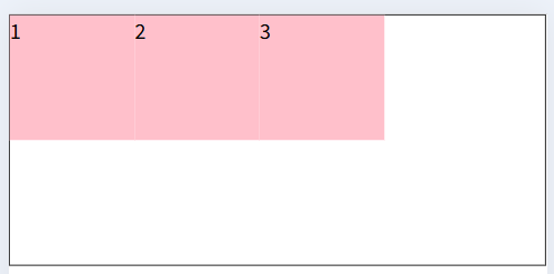
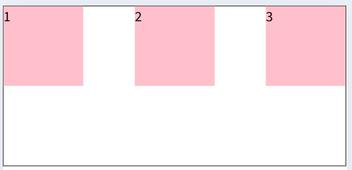
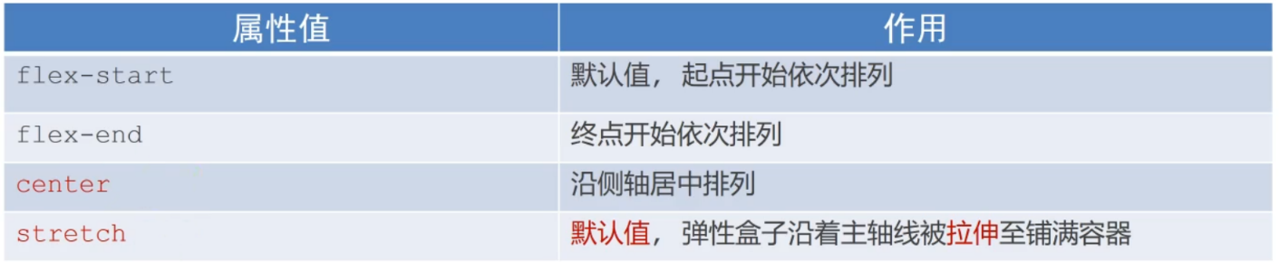
使用justify-content调节元素在主轴的对齐方式
- 通过调整主轴的对其方式可以设置弹性盒子之间的间距
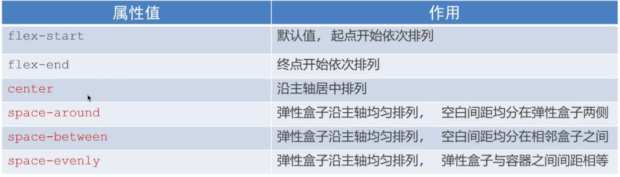
- 示例代码
<!DOCTYPE html>
<html lang="en">

<head>
    <meta charset="UTF-8">
    <meta http-equiv="X-UA-Compatible" content="IE=edge">
    <meta name="viewport" content="width=device-width, initial-scale=1.0">
    <title>主轴对齐方式</title>
    <style>
        * {
            margin: 0;
            padding: 0;
        }

        .box {
            display: flex;

            /* 沿主轴居中排列 */
            justify-content: center;

            /* 空白在子集之间(两侧没有) */
            justify-content: space-between;

            /* 所有盒子的间距都相等 */
            justify-content: space-evenly;

            /* 间距加在子级的两侧 */
            /* 视觉效果: 子集之间的空白是两侧空白的2倍 */
            justify-content: space-around;

            height: 200px;
            margin: auto;
            border: 1px solid #000;
        }

        .box div {
            width: 100px;
            height: 100px;
            background-color: pink;
        }
    </style>
</head>

<body>
    <div class="box">
        <div>1</div>
        <div>2</div>
        <div>3</div>
    </div>
</body>

</html>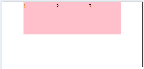
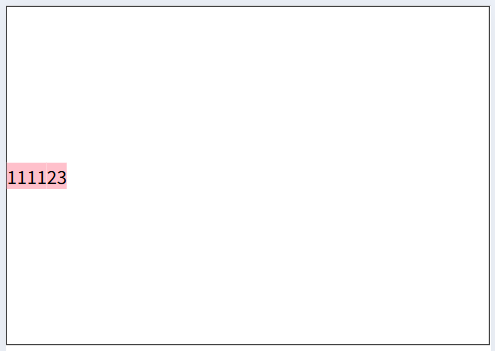
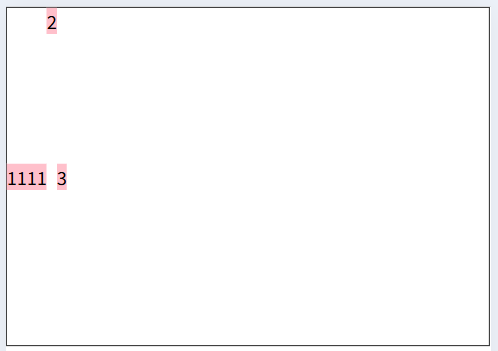
使用align-items调节元素在侧轴的对齐方式
- 通过调整侧轴的对其方式设置弹性盒子之间的间距
- 修改侧轴对齐方式的两种方法:
- align-items (添加到弹性容器)(添加给父元素---控制所有儿子)
- align-self (添加到弹性盒子 )(添加到儿子身上---控制某个子集)
<!DOCTYPE html>
<html lang="en">

<head>
    <meta charset="UTF-8">
    <meta http-equiv="X-UA-Compatible" content="IE=edge">
    <meta name="viewport" content="width=device-width, initial-scale=1.0">
    <title>侧轴对齐方式</title>
    <style>
        * {
            margin: 0;
            padding: 0;
        }

        .box {
            display: flex;

            /* 拉伸,默认值(子集不能设置高度, 否则不拉伸) */
            /* 显示效果: 子集拉伸至撑满父盒子 */
            align-items: stretch;

            /* 居中 */
            /* 由于子集没设置宽高, 就是内容的宽高 */
            /* 没有拉伸效果, 是因覆盖了stretch默认值 */
            align-items: center;


            height: 300px;
            margin: auto;
            border: 1px solid #000;
        }

        .box div {
            /*
              flex布局下, 如果子集设置了宽高, 以设置的值为准
              如果没有设置宽高, 默认会存在拉伸效果
            */
            /* width: 100px; */
            /* height: 100px; */
            background-color: pink;
        }

        /* 单独设置某个弹性盒子的侧轴对齐方式 */
        .box div:nth-child(2) {
            align-self: self-start;
        }
    </style>
</head>

<body>
    <div class="box">
        <div>1111</div>
        <div>2</div>
        <div>3</div>
    </div>
</body>

</html>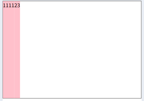
使用flex属性修改弹性盒子伸缩比
- 通过修改弹性盒子的伸缩比控制子集的尺寸
- flex: 值; (取值为整数, 表示占用父级剩余尺寸的比例)
- 属性要添加给儿子
4. 代码示例
<!DOCTYPE html>
<html lang="en">

<head>
    <meta charset="UTF-8">
    <meta http-equiv="X-UA-Compatible" content="IE=edge">
    <meta name="viewport" content="width=device-width, initial-scale=1.0">
    <title>Document</title>
    <style>
        * {
            margin: 0;
            padding: 0;
        }

        .box {
            display: flex;

            height: 300px;
            border: 1px solid #000;
        }

        .box div {
            height: 200px;
            margin: 0 20px;
            background-color: pink;
        }

        .box div:nth-child(1) {
            width: 50px;
        }

        .box div:nth-child(2) {
            /* 占用父级剩余尺寸的份数 */
            flex: 2;
        }

        .box div:nth-child(3) {
            flex: 1;
        }
    </style>
</head>

<body>
    <div class="box">
        <div>1</div>
        <div>2</div>
        <div>3</div>
    </div>
</body>

</html>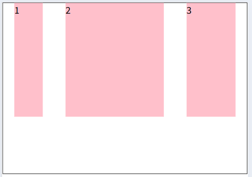
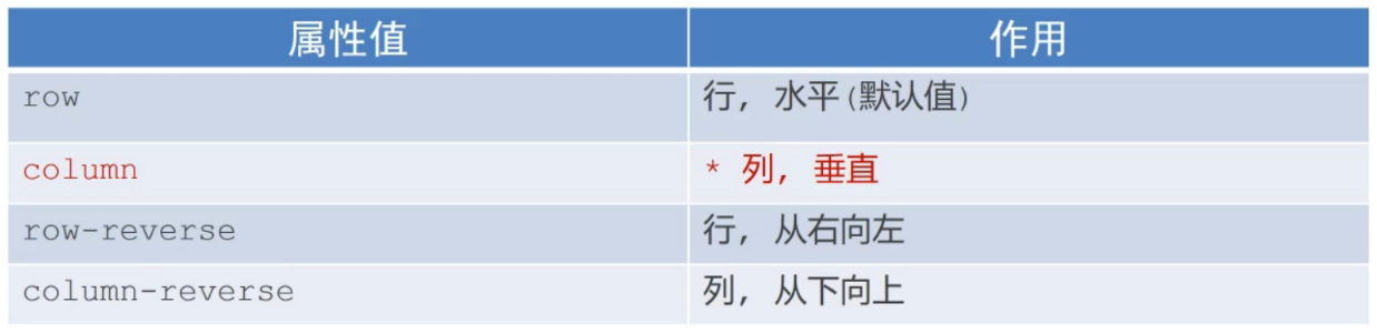
使用flex-direction改变元素排列方向
- 思考: Flex布局模型中,弹性盒子默认沿着哪个方向排列?
- 答: 水平方向, 因为主轴默认是水平方向,侧轴默认是垂直方向
- 思考: 如何实现内容垂直排列 ? 答: 修改主轴方向
- 修改主轴方向属性: flex-direction
- 示例代码
<!DOCTYPE html>
<html lang="en">

<head>
    <meta charset="UTF-8">
    <meta http-equiv="X-UA-Compatible" content="IE=edge">
    <meta name="viewport" content="width=device-width, initial-scale=1.0">
    <title>主轴方向</title>
    <style>
        * {
            margin: 0;
            padding: 0;
        }

        li {
            list-style: none;
        }

        .box li {
            display: flex;
            /* 1. 先确定主轴方向; 2. 再选择对应的属性实现主轴或侧轴的对齐方式 */
            /* 修改主轴方向: 列 */
            flex-direction: column;

            /* 视觉效果: 实现元素水平居中 */
            align-items: center;

            /* 视觉效果: 实现元素垂直居中 */
            justify-content: center;


            width: 80px;
            height: 80px;
            border: 1px solid #ccc;
        }

        .box img {
            width: 32px;
            height: 32px;
        }
    </style>
</head>

<body>
    <div class="box">
        <ul>
            <li>
                <img src="./images/media.png" alt="">
                <span>媒体</span>
            </li>
        </ul>
    </div>
</body>

</html>
使用flex-wrap实现弹性盒子多行排列效果
- 思考: 默认情况下,多个弹性盒子如何显示 ?
<!DOCTYPE html>
<html lang="en">

<head>
    <meta charset="UTF-8">
    <meta http-equiv="X-UA-Compatible" content="IE=edge">
    <meta name="viewport" content="width=device-width, initial-scale=1.0">
    <title>弹性盒子换行</title>
    <style>
        * {
            margin: 0;
            padding: 0;
        }

        .box {
            /* 了解flex布局下, 多行内容的默认展示效果 */
            display: flex;
            height: 500px;
            border: 1px solid #000;
        }

        .box div {
            /* flex布局模型下 */
            /* 元素的尺寸没有超过父元素, 按设置的尺寸展示  */
            /* 元素的尺寸超过父元素, 默认不会换行, 而是压缩子元素, 直到不超过父元素  */
            /* 这就是弹性盒子的特点 */
            width: 100px;
            height: 100px;
            background-color: pink;
        }
    </style>
</head>

<body>
    <div class="box">
        <div>1</div>
        <div>2</div>
        <div>3</div>
        <div>4</div>
        <div>5</div>
        <div>6</div>
        <div>7</div>
        <div>8</div>
    </div>
</body>

</html>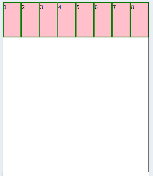
- 弹性盒子换行显示: flex-wrap:wrap;
<!DOCTYPE html>
<html lang="en">

<head>
    <meta charset="UTF-8">
    <meta http-equiv="X-UA-Compatible" content="IE=edge">
    <meta name="viewport" content="width=device-width, initial-scale=1.0">
    <title>弹性盒子换行</title>
    <style>
        * {
            margin: 0;
            padding: 0;
        }

        .box {
            display: flex;

            /* 默认值, 不换行 */
            /* flex-wrap: nowrap; */

            /* 让弹性盒子换行 */
            flex-wrap: wrap;

            height: 500px;
            border: 1px solid #000;
        }

        .box div {
            width: 100px;
            height: 100px;
            background-color: pink;
            border: 2px solid green;
        }
    </style>
</head>

<body>
    <div class="box">
        <div>1</div>
        <div>2</div>
        <div>3</div>
        <div>4</div>
        <div>5</div>
        <div>6</div>
        <div>7</div>
        <div>8</div>
    </div>
</body>

</html>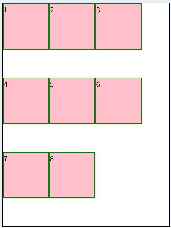
调整行对齐方式: align-content
- 调整换行后, 行的布局(针对换行的盒子)
- 取值与justify-content基本相同
- 示例代码
<!DOCTYPE html>
<html lang="en">

<head>
    <meta charset="UTF-8">
    <meta http-equiv="X-UA-Compatible" content="IE=edge">
    <meta name="viewport" content="width=device-width, initial-scale=1.0">
    <title>弹性盒子换行</title>
    <style>
        * {
            margin: 0;
            padding: 0;
        }

        .box {
            display: flex;
            flex-wrap: wrap;

            /* 调节行对齐方式 */
            align-content: center;
            /* align-content: space-around; */
            /* align-content: space-between; */

            height: 500px;
            border: 1px solid #000;
        }

        .box div {
            width: 100px;
            height: 100px;
            background-color: pink;
            border: 2px solid green;
        }
    </style>
</head>

<body>
    <div class="box">
        <div>1</div>
        <div>2</div>
        <div>3</div>
        <div>4</div>
        <div>5</div>
        <div>6</div>
        <div>7</div>
        <div>8</div>
    </div>
</body>

</html>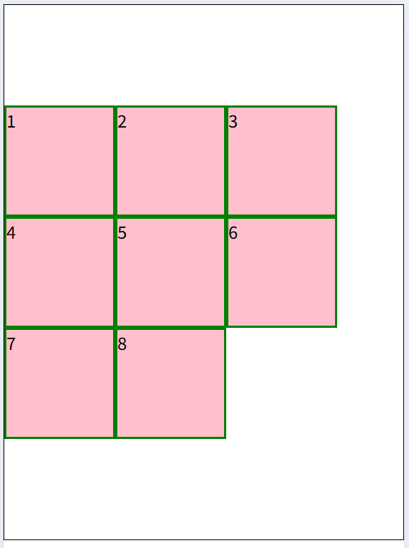
弹性盒子特点
- 设置宽高就是宽高的尺寸, 不设置宽高就由内容撑起宽高,
<!DOCTYPE html>
<html lang="en">

<head>
  <meta charset="UTF-8">
  <meta name="viewport" content="width=device-width, initial-scale=1.0">
  <title>Document</title>
  <style>
    .box {
      background-color: pink;
      display: flex;

      span {
        /* width: 20px; */
        /* height: 20px; */
        background-color: aquamarine;
      }
    }
  </style>
</head>

<body>
  <div class="box">
    <span>1</span>
    <span>2</span>
    <span>3</span>
    <span>4</span>
  </div>
</body>

</html>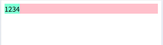
- 侧轴设置了自动拉伸并没有设置高度时,会撑满父级
<!DOCTYPE html>
<html lang="en">

<head>
  <meta charset="UTF-8">
  <meta name="viewport" content="width=device-width, initial-scale=1.0">
  <title>Document</title>
  <style>
    .box {
      display: flex;
      background-color: pink;
      height: 500px;

      span {
        /* 自动拉伸 */
        flex: 1;
        /* 如果设置高度, 以设置的为准, 不设置高度, 就撑满父盒子 */
        /* height: 50px; */
        background-color: aquamarine;
      }
    }
  </style>
</head>

<body>
  <div class="box">
    <span>1</span>
    <span>2</span>
    <span>3</span>
    <span>4</span>
  </div>
</body>

</html>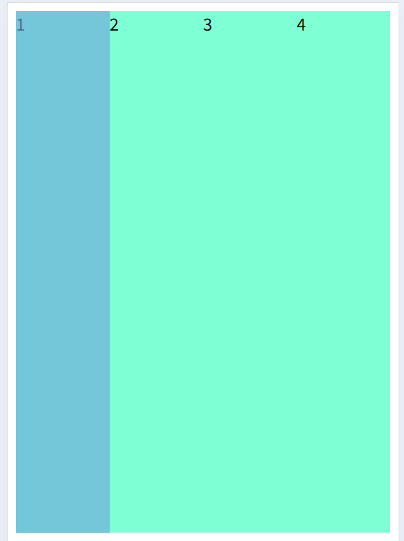
- 行内元素设置宽高也可以生效
<!DOCTYPE html>
<html lang="en">

<head>
  <meta charset="UTF-8">
  <meta name="viewport" content="width=device-width, initial-scale=1.0">
  <title>Document</title>
  <style>
    .box {
      background-color: pink;
      display: flex;

      span {
        margin: 10px;
        padding: 10px;
        width: 50px;
        height: 50px;
        background-color: aquamarine;
      }
    }
  </style>
</head>

<body>
  <div class="box">
    <span>1</span>
    <span>2</span>
    <span>3</span>
    <span>4</span>
  </div>
</body>

</html>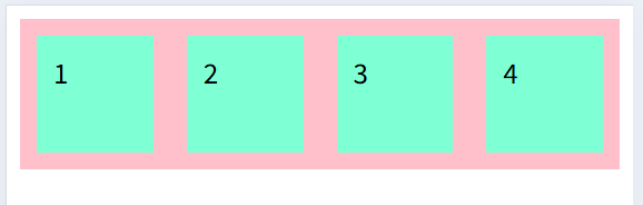
小兔鲜-订单页
准备环境
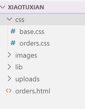
新建orders.html作为页面, 引入字体图标文件, base.css用于清除默认样式
<!DOCTYPE html>
<html lang="en">

<head>
    <meta charset="UTF-8">
    <meta http-equiv="X-UA-Compatible" content="IE=edge">
    <meta name="viewport" content="width=device-width, initial-scale=1.0">
    <title>确认订单</title>
    <link rel="stylesheet" href="./lib/iconfont/iconfont.css">
    <link rel="stylesheet" href="./css/base.css">
    <link rel="stylesheet" href="./css/orders.css">
</head>

<body>

</body>

</html>
* {
margin: 0;
padding: 0;
box-sizing: border-box;
}
body {
font: 16px/1.5 sans-serif;
color: #333;
background-color: #fff;
}
li {
list-style: none;
}
em,
i {
font-style: normal;
}
a {
text-decoration: none;
color: #333;
}
a:hover {
color: #5eb69c;
}
img {
width: 100%;
vertical-align: middle;
}
input {
padding: 0;
border: none;
outline: none;
color: #333;
}
button {
cursor: pointer;
}
/* 清除浮动 */
.clearfix:before,
.clearfix:after {
content: '';
display: table;
}
.clearfix:after {
clear: both;
}
.clearfix {
*zoom: 1;
}
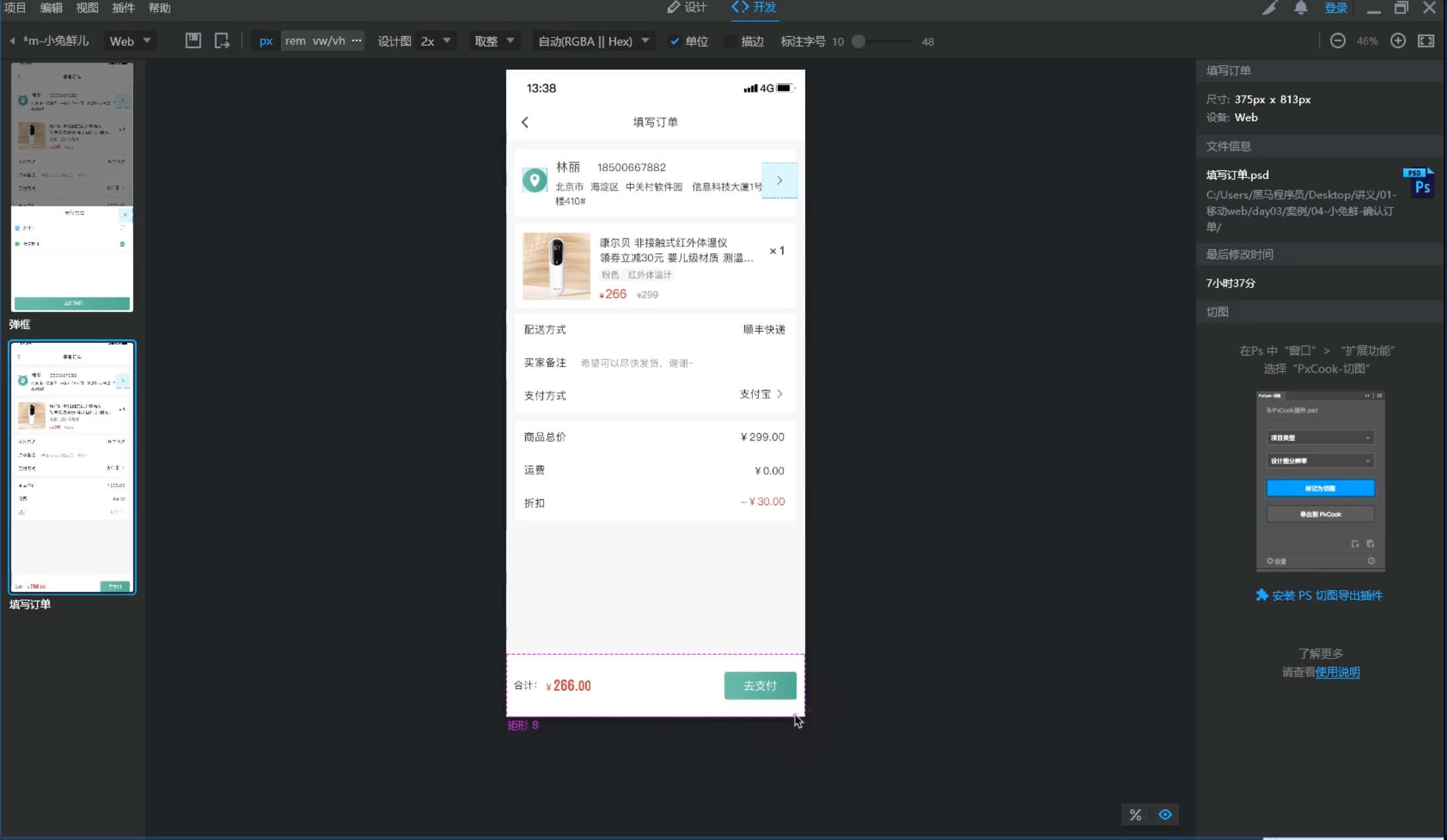
使用像素大厨, 打开移动端设计稿, 调整到2倍图模式, 用于测量尺寸
整体布局
主体内容从上往下, 支付按钮固定在页面底部
<!DOCTYPE html>
<html lang="en">

<head>
    <meta charset="UTF-8">
    <meta http-equiv="X-UA-Compatible" content="IE=edge">
    <meta name="viewport" content="width=device-width, initial-scale=1.0">
    <title>确认订单</title>
    <link rel="stylesheet" href="./lib/iconfont/iconfont.css">
    <link rel="stylesheet" href="./css/base.css">
    <link rel="stylesheet" href="./css/orders.css">
</head>

<body>
    <!-- 主体内容: 滑动查看 -->
    <div class="main">
        1
    </div>
    <!-- 主体内容: 滑动查看 -->

    <!-- 底部支付: 固定定位 -->
    <div class="pay">
        2
    </div>
    <!-- 底部支付: 固定定位 -->
</body>

</html>
body {
background-color: #f7f7f8;
}
/* 主体内容 */
.main {
/* 80px: 为了内容不被底部区域盖住 */
padding: 12px 11px 80px;
}
/* 主体内容 */
/* 底部支付 */
.pay {
position: fixed;
left: 0;
bottom: 0;
/* 定位脱标后, 默认宽度100%失效, 所以重新设置 */
width: 100%;
height: 80px;
background-color: pink;
border-top: 1px solid #ededed;
}
/* 底部支付 */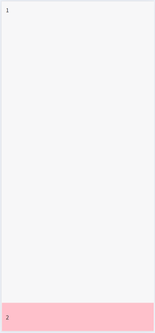
底部支付
完成底部支付模块
<!DOCTYPE html>
<html lang="en">
<head>
<meta charset="UTF-8">
<meta http-equiv="X-UA-Compatible" content="IE=edge">
<meta name="viewport" content="width=device-width, initial-scale=1.0">
<title>确认订单</title>
<link rel="stylesheet" href="./lib/iconfont/iconfont.css">
<link rel="stylesheet" href="./css/base.css">
<link rel="stylesheet" href="./css/orders.css">
</head>
<body>
<!-- 主体内容: 滑动查看 -->
<div class="main">
1
</div>
<!-- 主体内容: 滑动查看 -->
<!-- 底部支付: 固定定位 -->
<div class="pay">
<div class="left">
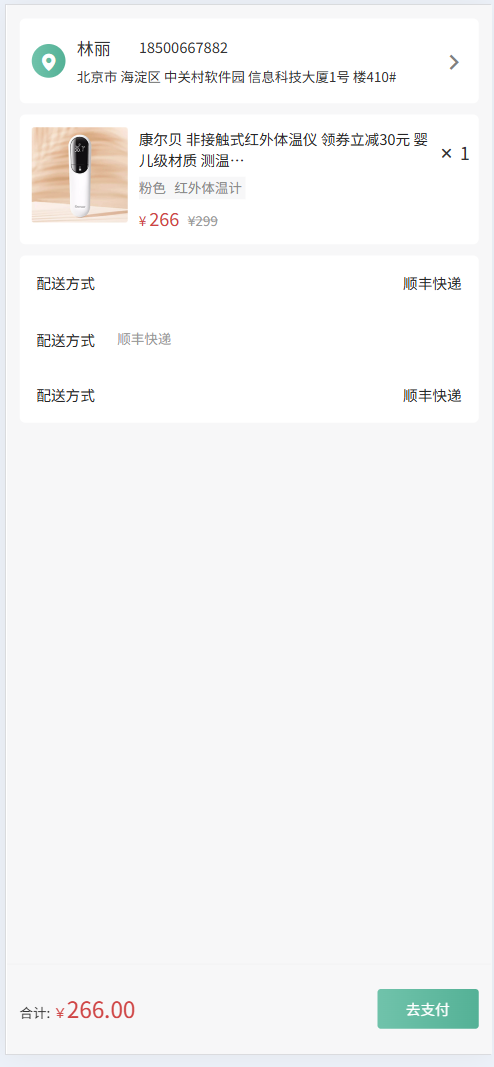
合计: <span class="red">¥<i>266.00</i></span>
</div>
<div class="right">
<a href="#">去支付</a>
</div>
</div>
<!-- 底部支付: 固定定位 -->
</body>
</html>body {
background-color: #f7f7f8;
}
/* 公共样式 */
.red {
color: #cf4444;
}
/* 主体内容 */
.main {
/* 80px: 为了内容不被底部区域盖住 */
padding: 12px 11px 80px;
}
/* 主体内容 */
/* 底部支付 */
.pay {
position: fixed;
left: 0;
bottom: 0;
display: flex;
/* 主轴对齐方式 */
justify-content: space-between;
/* 侧轴对齐方式 */
align-items: center;
/* 定位脱标后, 默认宽度100%失效, 所以重新设置 */
width: 100%;
height: 80px;
padding: 0 11px;
/* background-color: pink; */
border-top: 1px solid #ededed;
}
.pay .left {
font-size: 12px;
}
.pay .left i {
font-size: 20px;
}
.pay .right a {
display: block;
width: 90px;
height: 35px;
background-image: linear-gradient(90deg,
#6fc2aa 5%,
#54b196 100%);
border-radius: 3px;
text-align: center;
line-height: 35px;
font-size: 13px;
color: #fff;
}
/* 底部支付 */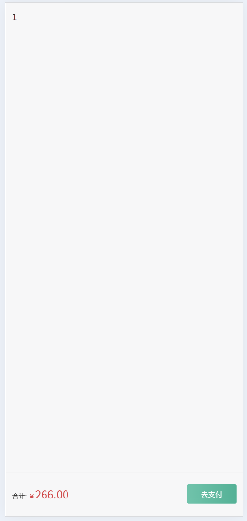
地址区域
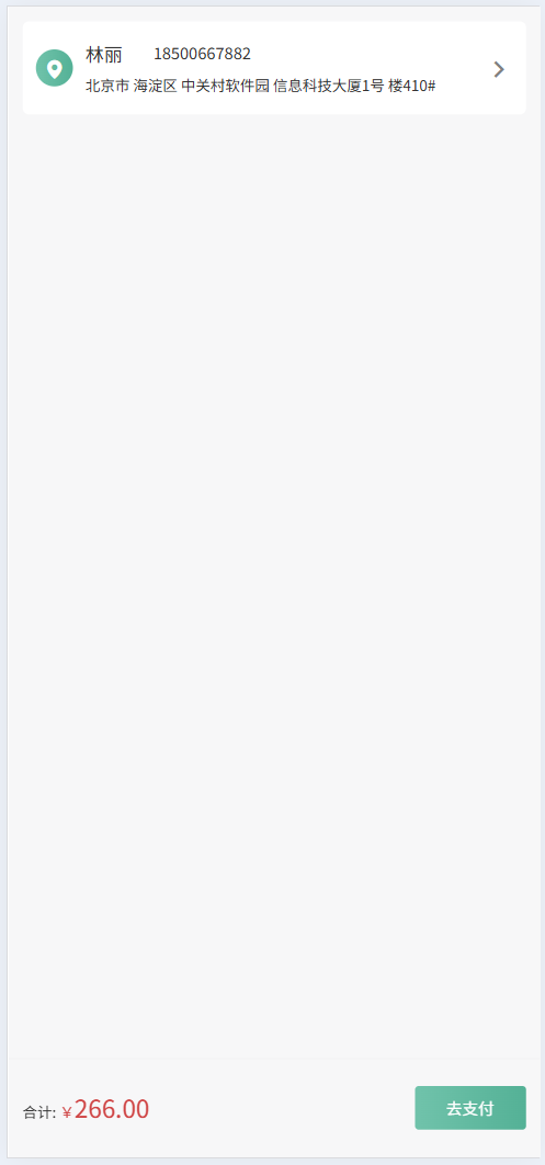
完成地址模块的布局
<!DOCTYPE html>
<html lang="en">

<head>
    <meta charset="UTF-8">
    <meta http-equiv="X-UA-Compatible" content="IE=edge">
    <meta name="viewport" content="width=device-width, initial-scale=1.0">
    <title>确认订单</title>
    <link rel="stylesheet" href="./lib/iconfont/iconfont.css">
    <link rel="stylesheet" href="./css/base.css">
    <link rel="stylesheet" href="./css/orders.css">
</head>

<body>
    <!-- 主体内容: 滑动查看 -->
    <div class="main">
        <!-- 用户信息 -->
        <div class="pannel user_msg">
            <div class="location">
                <i class="iconfont icon-location"></i>
            </div>
            <div class="user">
                <div class="top">
                    <h5>林丽</h5>
                    <p>18500667882</p>
                </div>
                <div class="bottom">北京市 海淀区 中关村软件园 信息科技大厦1号
                    楼410# </div>
            </div>
            <div class="more">
                <i class="iconfont icon-more"></i>
            </div>
        </div>
        <!-- 用户信息 -->
    </div>
    <!-- 主体内容: 滑动查看 -->

    <!-- 底部支付: 固定定位 -->
    ... ...
    <!-- 底部支付: 固定定位 -->
</body>

</html>
body {
background-color: #f7f7f8;
}
/* 公共样式 */
.red {
color: #cf4444;
}
.pannel {
margin-bottom: 10px;
background-color: #fff;
border-radius: 5px;
}
/* 主体内容 */
.main {
/* 80px: 为了内容不被底部区域盖住 */
padding: 12px 11px 80px;
}
/* 主体内容 */
.main {
/* 80px: 为了内容不被底部区域盖住 */
padding: 12px 11px 80px;
}
/* 用户信息 */
.user_msg {
display: flex;
align-items: center;
padding: 15px 0 15px 11px;
}
.user_msg .location {
width: 30px;
height: 30px;
margin-right: 10px;
background-image: linear-gradient(90deg,
#6fc2aa 5%,
#54b196 100%);
border-radius: 50%;
text-align: center;
line-height: 30px;
color: #fff;
}
.user_msg .user {
flex: 1;
}
.user_msg .user .top {
display: flex;
}
.user_msg .user .top h5 {
width: 55px;
font-size: 15px;
font-weight: 400;
}
.user_msg .user .top p {
font-size: 13px;
}
.user_msg .user .bottom {
margin-top: 5px;
font-size: 12px;
}
.user_msg .more {
width: 44px;
height: 44px;
/* background-color: pink; */
text-align: center;
line-height: 44px;
color: #808080;
}
/* 主体内容 */
商品区域
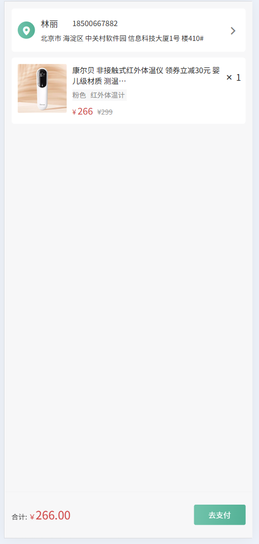
完成商品区域的布局
<!DOCTYPE html>
<html lang="en">
<head>
    <meta charset="UTF-8">
    <meta http-equiv="X-UA-Compatible" content="IE=edge">
    <meta name="viewport" content="width=device-width, initial-scale=1.0">
    <title>确认订单</title>
    <link rel="stylesheet" href="./lib/iconfont/iconfont.css">
    <link rel="stylesheet" href="./css/base.css">
    <link rel="stylesheet" href="./css/orders.css">
</head>
<body>
    <!-- 主体内容: 滑动查看 -->
    <div class="main">
        <!-- 用户信息 -->
        ... ...
        <!-- 用户信息 -->

        <!-- 商品 -->
        <div class="pannel goods">
            <div class="pic">
                <a href="#"><img src="./uploads/pic.png" alt=""></a>
            </div>
            <div class="info">
                <h5>康尔贝 非接触式红外体温仪
                    领券立减30元 婴儿级材质 测温…</h5>
                <p><span>粉色</span>   <span>红外体温计</span></p>
                <div class="price">
                    <span class="red">¥ <i>266</i> </span>
                    <span>¥299</span>
                </div>
            </div>
            <div class="count">
                <i class="iconfont icon-x"></i>
                <span>1</span>
            </div>
        </div>
        <!-- 商品 -->
    </div>
    <!-- 主体内容: 滑动查看 -->

    <!-- 底部支付: 固定定位 -->
    ...
    <!-- 底部支付: 固定定位 -->
</body>
</html>
body {
background-color: #f7f7f8;
}
/* 公共样式 */
.red {
color: #cf4444;
}
.pannel {
margin-bottom: 10px;
background-color: #fff;
border-radius: 5px;
}
/* 主体内容 */
.main {
/* 80px: 为了内容不被底部区域盖住 */
padding: 12px 11px 80px;
}
/* 商品 */
.goods {
display: flex;
padding: 11px 0 11px 11px;
}
.goods .pic {
width: 85px;
height: 85px;
margin-right: 10px;
}
.goods .info {
flex: 1;
}
.goods .info h5 {
font-size: 13px;
color: #262626;
font-weight: 400;
}
.goods .info p {
width: 95px;
height: 20px;
margin: 5px 0;
background-color: #f7f7f8;
font-size: 12px;
color: #888;
}
.goods .info p span:first-child {
margin-right: 5px;
}
.goods .info .price {
font-size: 12px;
}
.goods .info .price i {
font-size: 16px;
}
.goods .info .price span:last-child {
margin-left: 5px;
color: #999;
text-decoration: line-through;
}
.goods .count {
width: 44px;
height: 44px;
/* background-color: pink; */
text-align: center;
line-height: 44px;
}
/* 主体内容 */
配送信息
完成配送信息的布局
<!DOCTYPE html>
<html lang="en">

<head>
    <meta charset="UTF-8">
    <meta http-equiv="X-UA-Compatible" content="IE=edge">
    <meta name="viewport" content="width=device-width, initial-scale=1.0">
    <title>确认订单</title>
    <link rel="stylesheet" href="./lib/iconfont/iconfont.css">
    <link rel="stylesheet" href="./css/base.css">
    <link rel="stylesheet" href="./css/orders.css">
</head>

<body>
    <!-- 主体内容: 滑动查看 -->
    <div class="main">
        <!-- 用户信息 -->
        ... ...
        <!-- 用户信息 -->

        <!-- 商品 -->
        ... ...
        <!-- 商品 -->

        <!-- 其他信息 -->
        <!-- div.pannel   rest   -->
        <!-- header  nav  section footer -->
        <section class="pannel rest">
            <div>
                <h5>配送方式</h5>
                <p>顺丰快递</p>
            </div>
            <div>
                <h5>配送方式</h5>
                <p>顺丰快递</p>
            </div>
            <div>
                <h5>配送方式</h5>
                <p>顺丰快递</p>
            </div>

        </section>
        <!-- 其他信息 -->
    </div>
    <!-- 主体内容: 滑动查看 -->

    <!-- 底部支付: 固定定位 -->
     ... ...
    <!-- 底部支付: 固定定位 -->
</body>

</html>
body {
background-color: #f7f7f8;
}
/* 公共样式 */
.red {
color: #cf4444;
}
.pannel {
margin-bottom: 10px;
background-color: #fff;
border-radius: 5px;
}
/* 其他信息 */
.rest {
padding: 15px;
}
.rest div {
display: flex;
margin-bottom: 30px;
}
.rest div:last-child {
margin-bottom: 0;
}
/* 找到第一个和第三个div设置主轴对齐方式 */
.rest div:nth-child(2n+1) {
justify-content: space-between;
}
/* 第二行标题和p之间的距离 */
.rest div:nth-child(2) h5 {
margin-right: 20px;
}
.rest h5,
.rest p{
font-size: 13px;
color: #262626;
font-weight: 400;
}
/* .rest p {
font-size: 13px;
color: #262626;
} */
.rest div:nth-child(2) p {
font-size: 12px;
color: #989898;
}
/* 主体内容 */