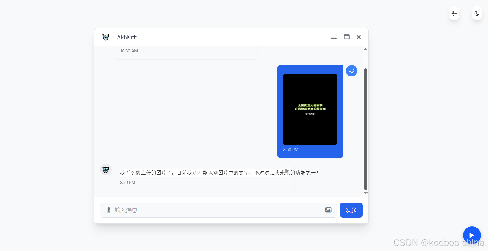
在 《Tailwind CSS 实战:基于 Kooboo 构建 AI 对话框页面(五)》 中,完成了语音交互功能的优化。本文作为该系列教程的第六篇,将聚焦于图片上传功能的开发。通过集成图片上传与预览能力,我们将进一步完善 AI 对话框的交互体验,实现图文混合消息的发送。效果如下:
一、功能需求分析
本次开发需实现以下核心功能:
- 图片上传入口:在语音按钮右侧添加图片上传图标,点击后触发文件选择器。
- 文件验证:限制仅允许上传 JPG/PNG 等图片格式,文件大小不超过 5MB。
- 实时预览:选择图片后,在消息气泡中立即显示预览图。
- 图文混合发送:支持同时发送文本与图片,保持原有对话逻辑。
我们将使用 Tailwind CSS 实现界面布局,通过 原生 JavaScript 处理文件读取和验证,确保功能简洁高效。
二、HTML结构搭建
首先,在 HTML 中添加图片上传相关元素。以下是输入区域的核心代码:
<!-- 输入区域 -->
<div class="bg-[var(--bg-primary)] p-4 border-t border-[var(--border-color)]">
        <div class="flex space-x-2">
            <!-- 输入框包装器 -->
            <div class="input-wrapper relative">
                <!-- 语音按钮(左侧) -->
                <button id="voiceButton" class="voice-button">
                    <i class="fa fa-microphone"></i>
                </button>

                <!-- 新增图片上传按钮(右侧) -->
                <button id="imageUploadButton" class="image-upload-button">
                    <i class="fa fa-image"></i> <!-- Font Awesome图片图标 -->
                </button>

                <input
                    id="messageInput"
                    type="text"
                    placeholder="输入消息..."
                    class="message-input flex-1 w-full p-2 border border-[var(--border-color)] rounded-lg focus:outline-none focus:ring-2 focus:ring-blue-500 bg-[var(--bg-secondary)] text-[var(--text-primary)]"
                >
            </div>
            <!-- 原有发送按钮(省略) -->
  </div>
</div>

<!-- 新增文件上传隐藏输入 -->
<input type="file" id="imageInput" accept="image/*" style="display: none;">关键点解析:
- 图标按钮布局:
- 语音按钮(左)和图片按钮(右)通过
relative定位包裹在输入框两侧。 - 使用 Tailwind 的
flex和space-x-2实现水平排列,relative确保按钮可以绝对定位在输入框两侧。
- 语音按钮(左)和图片按钮(右)通过
- 隐藏文件输入框:
<input type="file">设置display: none隐藏,通过accept="image/*"限制仅图片格式可选。id="imageInput"用于 JavaScript 中获取元素。
三、CSS 样式设计
为了让按钮对称显示并预留空间,需要调整输入框和按钮的样式。在 <head> 中添加以下样式:
<style>
/* 新增图片上传 */
        .image-upload-button {
            position: absolute; /* 绝对定位 */
            right: 8px; /* 右侧间距 */
            top: 50%; /* 垂直居中 */
            transform: translateY(-50%); /* 垂直居中偏移 */
            width: 32px;
            height: 32px;
            display: flex;
            align-items: center;
            justify-content: center;
            cursor: pointer;
            color: var(--text-secondary); /* 次级文本色 */
            background: transparent;
            border: none;
            z-index: 10; /* 确保层级在输入框上方 */
        }

        .image-upload-button:hover {
            color: var(--accent-color); /* 悬停时强调色 */
        }

        /* 输入框宽度调整(为上传按钮腾出空间) */
        .message-input {
            padding-left: 40px !important;  /* 原有左侧语音按钮 */
            padding-right: 40px !important; /* 新增右侧上传按钮 */
        }

        /* 图片预览样式 */
        .image-preview {
        max-width: 200px; /* 最大宽度 */
        max-height: 200px; /* 最大高度 */
        border-radius: 8px; /* 圆角 */
        margin-top: 8px; /* 与文本间距 */
        object-fit: contain; /* 保持比例,避免拉伸 */
        box-shadow: 0 2px 4px rgba(0, 0, 0, 0.1); /* 轻微阴影 */
        }

</style>设计思路:
- 对称布局:通过
position: absolute将图片按钮定位在输入框右侧,与左侧语音按钮对称。 - 交互反馈:悬停时颜色变化(
var(--accent-color))提示用户可点击。 - 预览控制:
max-width/max-height限制图片显示区域,object-fit: contain确保图片完整显示且不变形。
四、图片上传功能的实现解析
接下来编写Javascript核心逻辑代码,实现文件选择、验证、预览和消息展示。
1. 界面元素与事件绑定
// DOM元素获取
const imageUploadButton = document.getElementById('imageUploadButton');
const imageInput = document.getElementById('imageInput');
const messageContainer = document.getElementById('messageContainer');
const messageInput = document.getElementById('messageInput');

// 按钮点击事件绑定
imageUploadButton.addEventListener('click', () => {
    imageInput.click(); // 触发隐藏的文件选择器
});
关键点:
- 使用隐藏的
<input type="file">实现文件选择 - 视觉上通过图标按钮触发,保持界面整洁
accept="image/*"属性在 HTML 中已限制仅允许图片格式
2. 文件验证与预览实现
// 文件选择事件处理
imageInput.addEventListener('change', (e) => {
    const file = e.target.files[0];
    if (!file) return;

    // 类型验证
    const isImage = file.type.startsWith('image/');
    if (!isImage) {
        alert('请选择有效的图片文件');
        return;
    }

    // 大小验证
    const MAX_IMAGE_SIZE = 5 * 1024 * 1024; // 5MB
    if (file.size > MAX_IMAGE_SIZE) {
        alert(`图片大小不能超过 ${MAX_IMAGE_SIZE / (1024 * 1024)}MB`);
        return;
    }

    // 图片预览
    const reader = new FileReader();
    reader.onload = (event) => {
        const imagePreview = document.createElement('img');
        imagePreview.className = 'image-preview'; // 应用Tailwind样式
        imagePreview.src = event.target.result; // Base64 URL

        // 创建包含图片的消息气泡
        const userMessageHtml = `
            <div class="flex items-start space-x-2 justify-end">
                <div class="max-w-[70%]">
                    <div class="bg-blue-600 text-white p-4 rounded-lg rounded-tr-none shadow-sm">
                        <div>${messageInput.value}</div> <!-- 保留输入框文本 -->
                        ${imagePreview.outerHTML} <!-- 插入图片 -->
                        <span class="text-xs text-blue-200 mt-1 block">${getCurrentTime()}</span>
                    </div>
                </div>
                <div class="w-8 h-8 rounded-full bg-blue-500 flex items-center justify-center">
                    <span class="text-white">我</span>
                </div>
            </div>
        `;

        messageContainer.insertAdjacentHTML('beforeend', userMessageHtml);
        messageInput.value = ''; // 清空输入框
        scrollToBottom(); // 滚动到最新消息
    };

    reader.readAsDataURL(file); // 读取文件为Base64
});
技术点详解:
文件验证逻辑:
file.type获取 MIME 类型,验证是否为图片file.size直接获取字节数,与常量比较- 验证失败时通过
alert提供明确反馈
预览机制:
FileReader异步读取文件内容readAsDataURL将图片转为可直接预览的 Base64 格式- 动态创建
<img>元素并设置src属性
样式控制:
.image-preview类限制最大尺寸为 200pxobject-fit: contain保持图片比例不变形rounded-lg实现圆角效果增强视觉体验
3. 图文混合消息处理
// 消息气泡HTML结构
const userMessageHtml = `
    <div class="flex items-start space-x-2 justify-end">
        <div class="max-w-[70%]">
            <div class="bg-blue-600 text-white p-4 rounded-lg rounded-tr-none shadow-sm">
                <div>${messageInput.value}</div> <!-- 文本内容 -->
                ${imagePreview.outerHTML} <!-- 图片预览 -->
                <span class="text-xs text-blue-200 mt-1 block">${getCurrentTime()}</span>
            </div>
        </div>
        <div class="w-8 h-8 rounded-full bg-blue-500 flex items-center justify-center">
            <span class="text-white">我</span>
        </div>
    </div>
`;
设计亮点:
- 文本和图片自然垂直排列,保持视觉层次
- 使用
max-w-[70%]限制消息宽度,避免过宽影响阅读 - 通过
flex items-start确保头像与消息顶部对齐 rounded-tr-none实现对话气泡的尖角效果
4. AI 回复与界面交互
// 模拟AI回复
setTimeout(() => {
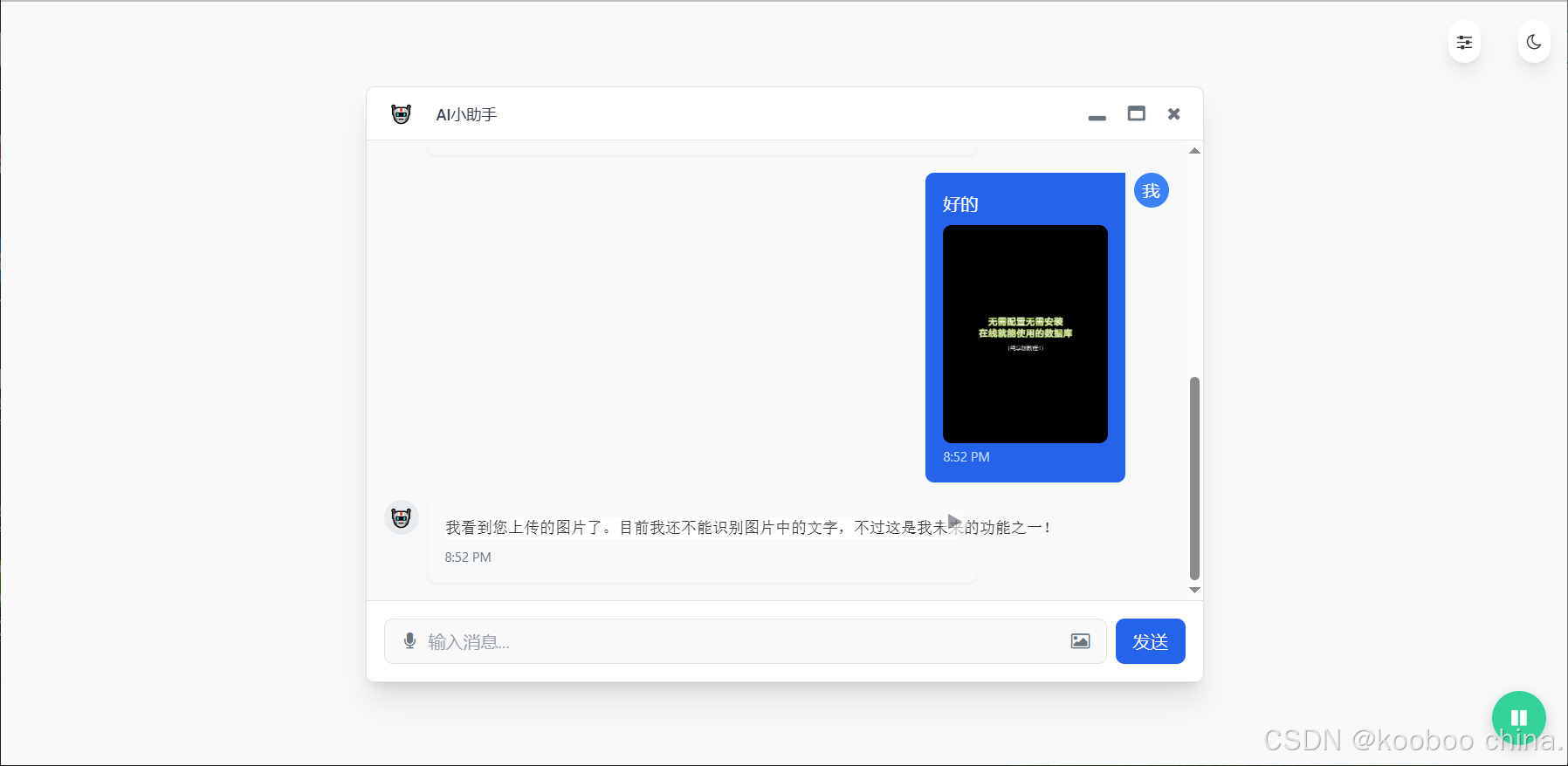
addAIResponse("我看到您上传的图片了。目前我还不能识别图片中的文字,不过这是我未来的功能之一!");
}, 1000);
// 自动滚动到底部
function scrollToBottom() {
messageContainer.scrollTop = messageContainer.scrollHeight;
}
用户体验优化:
- 添加延迟模拟 AI 思考过程
- 自动滚动确保最新消息始终可见
- 保持原有语音合成功能不变,支持 AI 回复的语音播放
5. 错误处理与用户反馈
// 文件验证失败提示
if (!isImage) {
    alert('请选择有效的图片文件');
    return;
}

if (file.size > MAX_IMAGE_SIZE) {
    alert(`图片大小不能超过 ${MAX_IMAGE_SIZE / (1024 * 1024)}MB`);
    return;
}

// 图片预览错误处理(代码中未显式实现,但建议添加)
reader.onerror = () => {
    alert('图片预览失败,请重试');
};
健壮性保障:
- 提供明确的错误类型提示
- 验证失败后立即终止流程
UI 细节:
- 精确控制输入框内边距,为两侧按钮留出空间
- 图片预览区域限制尺寸同时保持比例
- 悬停效果提供明确的交互反馈
五、功能测试
| 操作步骤 | 预期结果 |
|---|---|
| 点击图片图标选择非图片文件 | 弹出提示 “请选择有效的图片文件” |
| 选择超过 5MB 的图片文件 | 弹出提示 “图片大小不能超过 5MB” |
| 选择正常图片文件 | 消息气泡中显示图片预览,AI 回复 “我看到你上传的图片了...” |
| 输入文本并选择图片 | 消息气泡中同时显示文本和图片,文本在上、图片在下 |
五、总结
图标添加:
- 使用 Font Awesome 的
fa-image图标(需确保 Font Awesome 已正确引入) - 按钮位于输入框右侧,与左侧语音按钮对称
- 使用 Font Awesome 的
样式调整:
- 输入框左右两侧添加内边距,为两个按钮腾出空间
- 定义图片预览样式,支持最大 200px 显示区域
- 上传按钮悬停时显示强调色
功能实现:
- 点击图片图标触发隐藏的文件选择输入
- 支持 JPG/PNG 等常见图片格式(通过
accept="image/*"控制) - 上传后在消息气泡中显示图片预览
- 保留原有文本输入内容,支持图文混合消息
交互优化:
- 图片上传后自动滚动到消息底部
- 保持原有语音识别按钮的交互逻辑不变
- 文件输入框隐藏处理,保持界面整洁