flex布局四等分|2×2布局,并且有固定值间隙
- 废话少说,看图:
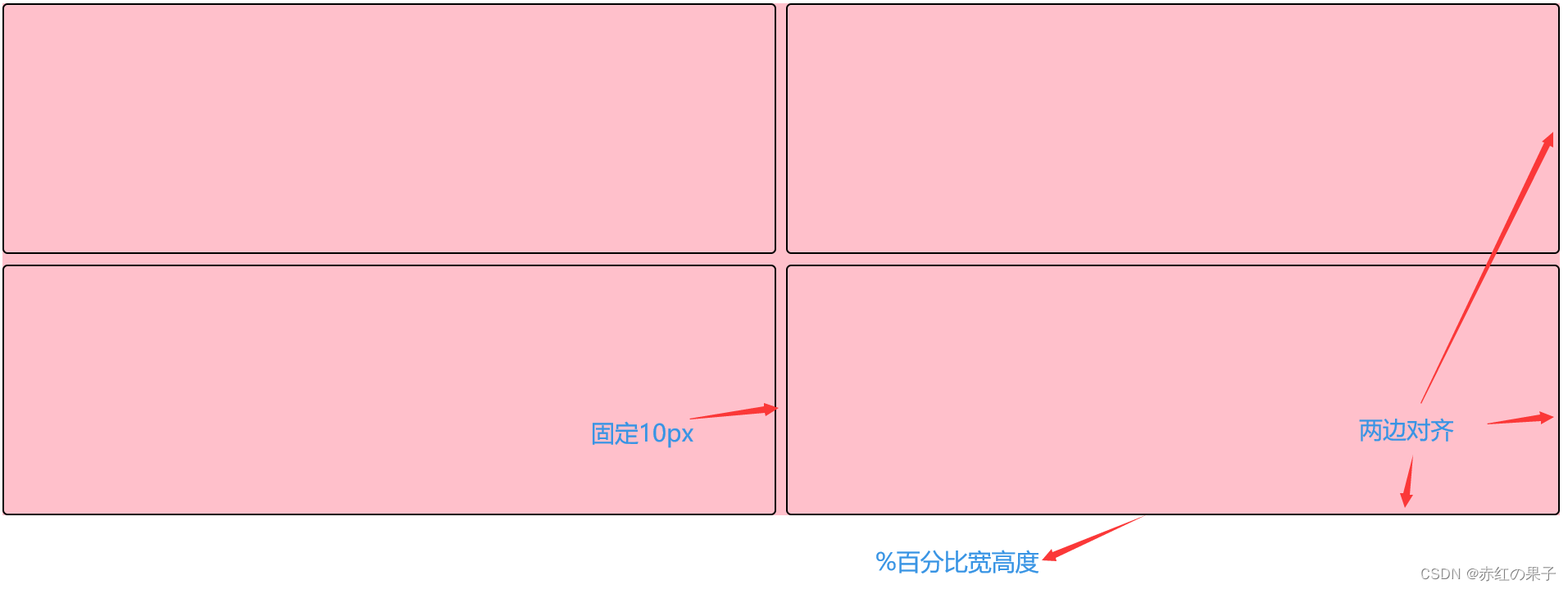
- 难点:
- 如何留下固定10px间隙?
- 如何向四个方向靠拢?
- 如何去除border的影响?
- 如何优雅的写代码?
- 对应上边问题的解决方法:
- CSS3的calc
height:calc(50% - 5px),注意两个5px=10px - flex布局,给主轴,副轴都设置
space-between - 给子元素
box-sizing: border-box;让百分比等于实际大小,(相当于把border放在了盒子内部) - 以上所有技巧均为CSS3
- CSS3的calc
- 全部代码
<!DOCTYPE html>
<html lang="en">
  <head>
    <meta charset="UTF-8" />
    <meta http-equiv="X-UA-Compatible" content="IE=edge" />
    <meta name="viewport" content="width=device-width, initial-scale=1.0" />
    <title>Document</title>
    <style>
      body {
        height: 500px;
      }
      .temp {
        /* basic */
        margin: 0 auto;
        padding: 0;
        height: 100%;
        width: 100%;
        background-color: pink;
        /* flex布局 */
        display: flex;
        /* 主轴居中(由于) */
        /* justify-content: center; */
        /* 设定主轴为横轴 默认row,还可以column |row-reverse|column-reverse */
        flex-direction: row;
        /* 主轴上的对齐方式 */
        justify-content: space-between;
        /* 换行(类似浮动布局) */
        flex-wrap: wrap;
        /* 副轴居中 */
        /* align-items: center; */
        align-content: space-between;
      }
      .box {
        border: 2px solid black;
        border-radius: 5px;
        box-sizing: border-box;
        width: calc(50% - 5px);
        height: calc(50% - 5px);
      }
    </style>
  </head>
  <body>
    <div class="temp">
      <div class="box"></div>
      <div class="box"></div>
      <div class="box"></div>
      <div class="box"></div>
    </div>
  </body>
</html>
- 简写版代码
<!DOCTYPE html>
<html lang="en">
  <head>
    <meta charset="UTF-8" />
    <meta http-equiv="X-UA-Compatible" content="IE=edge" />
    <meta name="viewport" content="width=device-width, initial-scale=1.0" />
    <title>Document</title>
    <style>
      body {
        height: 500px;
      }
      .temp {
        /* basic */
        margin: 0 auto;
        padding: 0;
        height: 100%;
        width: 100%;
        background-color: pink;

        /* flex布局 */
        display: flex;
        /* 主轴上的对齐方式 */
        justify-content: space-between;
        /* 换行(类似浮动布局) */
        flex-wrap: wrap;
        /* 副轴上的对齐方式 */
        align-content: space-between;
      }
      .box {
        border: 2px solid black;
        border-radius: 5px;
        box-sizing: border-box;
        /* calc为CSS3内容 */
        width: calc(50% - 5px);
        height: calc(50% - 5px);
      }
    </style>
  </head>
  <body>
    <div class="temp">
      <div class="box"></div>
      <div class="box"></div>
      <div class="box"></div>
      <div class="box"></div>
    </div>
  </body>
</html>
本文含有隐藏内容,请 开通VIP 后查看