前言
UI 设计给的切图是 .png 格式。但想与 Element UI icon 用法类似,方案如下。
实现
步骤一
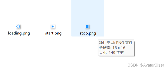
准备图片
步骤二
新建文件,可使用 CSS 预处理语言 styl 或 scss。
stylus 方式
文件 icon.styl
/* 定义一个混合 */
cfgIcon(w, h) {
    display: inline-block;
    width: w;
    height: h;
    background-size: w h;
    margin-right: 8px;
}

.my-icon-loading {
    background: url(./images/loading.png);
    cfgIcon(10px,10px);
}
.my-icon-stop {
    background: url(./images/stop.png);
    cfgIcon(10px,10px);
}
.my-icon-start {
    background: url(./images/start.png);
    cfgIcon(10px,10px);
}
scss 方式
文件 icon.scss
/* 定义一个混合 */
@mixin cfgIcon($w, $h) {
    display: inline-block;
    width: $w;
    height: $h;
    background-size: $w $h;
    margin-right: 8px;
}

.cfg-icon-loading {
    background: url(./images/loading.png);
    @include cfgIcon(10px,10px);
}
.cfg-icon-stop {
    background: url(./images/stop.png);
    @include cfgIcon(10px,10px);
}
.cfg-icon-start {
    background: url(./images/start.png);
    @include cfgIcon(10px,10px);
}
步骤三
全局导入。在 Vue 框架中直接导入即可。
<template>
  <div id="app">
    <router-view/>
  </div>
</template>
<style lang="stylus">
@import './css/icon.styl'
</style>
使用
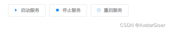
el-button
<el-button icon="my-icon-start" class="el-button--active">启动服务</el-button>
<el-button icon="my-icon-stop">停止服务</el-button>
<el-button icon="my-icon-loading">重启服务</el-button>
直接用 <i>
<i class="cfg-icon-start"/>
<i class="cfg-icon-file"/>
<i class="cfg-icon-file"/>