总结
本系列是数据可视化基础与应用的第04篇seaborn,是seaborn从入门到精通系列第3篇。本系列主要介绍基于seaborn实现数据可视化。
参考
参考:我分享了一个项目给你《seaborn篇人口普查分析–如何做人口年龄层结构金字塔》,快来看看吧
数据集地址
https://www.kesci.com/mw/project/5fde03b883e4460030a8dc3d/dataset
数据集介绍
2010年各地区分年龄,性别人口数据
背景描述
数据为中国2010年人口普查资料,包含2010年各地区分年龄、性别的人口,各地区分性别的户籍人口, 2010年(城市,乡村,镇)各地区分年龄、性别的人口
数据说明
1-7c 各地区分年龄、性别的人口(乡村).csv
1-7b 各地区分年龄、性别的人口(镇).csv
1-7a 各地区分年龄、性别的人口(城市).csv
1-3 各地区分性别的户籍人口.csv
各地区分年龄、性别的人口.csv
数据来源
中国2010年人口普查资料
问题描述
20年来出生男女比例变化?
男女找对象的合适年龄假设?初婚和再婚?
基于以上假设,哪个省份的男生以后找女朋友会越来越难?
结合结婚率、离婚率、民族、地域等信息,进一步猜测00后找女朋友的趋势变化
案例
#导入包
import pandas as pd
import numpy as np
import matplotlib.pyplot as plt
import seaborn as sns
%matplotlib inline
plt.style.use('fivethirtyeight')

from warnings import filterwarnings
filterwarnings('ignore')
#读取各地区分年龄、性别的人口
pcount = pd.read_csv('/home/kesci/input/GENDER8810/各地区分年龄、性别的人口.csv',skiprows=2)
"""
2010年各地区分年龄,性别人口数据
背景描述

数据为中国2010年人口普查资料,包含2010年各地区分年龄、性别的人口,各地区分性别的户籍人口, 2010年(城市,乡村,镇)各地区分年龄、性别的人口
数据说明

1-7c 各地区分年龄、性别的人口(乡村).csv
1-7b 各地区分年龄、性别的人口(镇).csv
1-7a 各地区分年龄、性别的人口(城市).csv
1-3 各地区分性别的户籍人口.csv
各地区分年龄、性别的人口.csv
"""
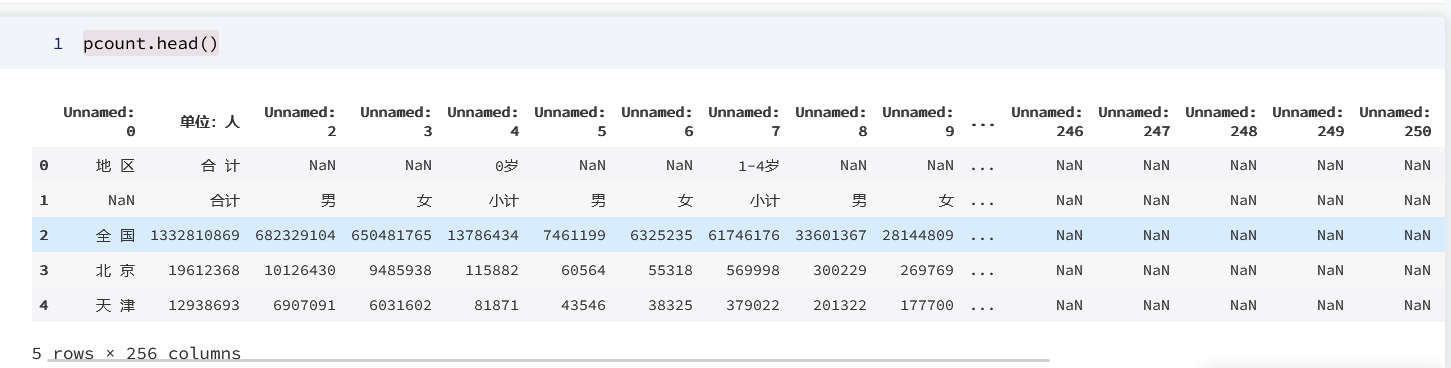
1. 探索性分析并处理数据
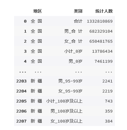
pcount.head()
输出为:
pcount.info()
输出为:

1.1 删除多余的列
#删除所有值为na的列
pcount=pcount.dropna(axis=1,how='all')
1.2 处理表头
def rename(frame):
for i in range(frame.shape[1]):
frame.iloc[1,0]='地区'
if frame.iloc[1,i]=='小计':
frame.iloc[1,i]='小计'+ '_'+str(frame.iloc[0,i])
elif frame.iloc[1,i]=='男':
frame.iloc[1,i]='男' + '_' + str(frame.iloc[0,i-1])
elif frame.iloc[1,i]=='女':
frame.iloc[1,i]='女' + '_' + str(frame.iloc[0,i-2])
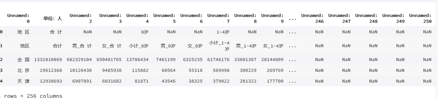
rename(pcount)
pcount.head()
输出为:
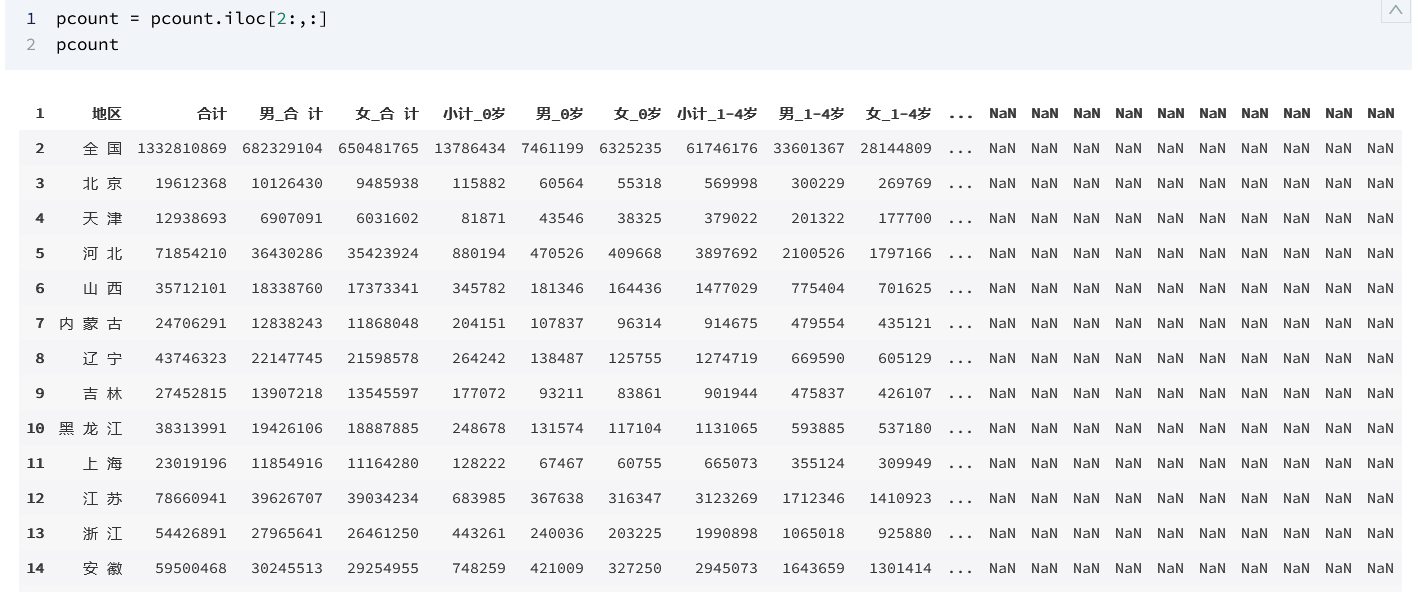
1.3 透视数据
pcount.columns = pcount.iloc[1,]
pcount.columns
输出为:

pcount = pcount.iloc[2:,:]
pcount
输出为:
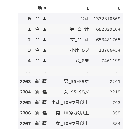
pcounts = pcount.set_index("地区").stack().reset_index()
pcounts
输出为:
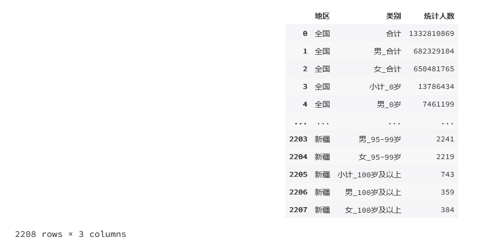
pcounts.columns = ['地区','类别','统计人数']
pcounts
输出为:
1.4 处理空格(数据量大的话不建议这么做)
def replace_r(frame):
    for i in range(frame.shape[0]):
        frame.iloc[i,0] = frame.iloc[i,0].replace(" ",'')
        frame.iloc[i,1] = frame.iloc[i,1].replace(" ",'')

replace_r(pcounts)
pcounts
输出为:
1.5 增加统计列
pcounts['年龄段'] = pcounts['类别'].str.split('_').str[-1]
pcounts['性别'] = pcounts['类别'].str.split('_').str[0]
#将统计人数转换为数值
pcounts['统计人数']=pcounts['统计人数'].astype('int')
2. 可视化部分
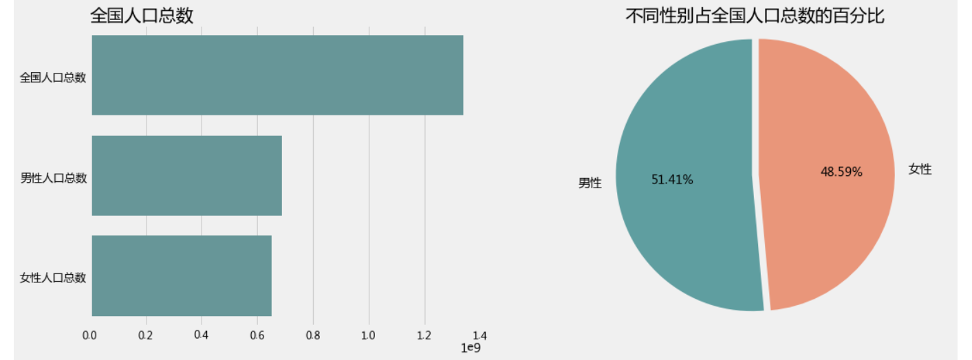
2.1 我国人口总数
plt.figure(1,figsize=(16,6))
plt.subplot(1,2,1)
sns.barplot(y=['全国人口总数','男性人口总数','女性人口总数'],x=[1337376754,687562046,649814708],color='CadetBlue')
plt.title("全国人口总数",loc='left')
plt.xticks(fontsize=12)
plt.yticks(fontsize=13)

plt.subplot(1,2,2)
patches,l_text,p_text=plt.pie([687562046,649814708],labels=['男性','女性'],
       autopct='%.2f%%',colors=['CadetBlue','DarkSalmon'],explode=[0,0.05],startangle=90)
plt.title('不同性别占全国人口总数的百分比')
plt.axis('equal')
plt.show()
输出为:
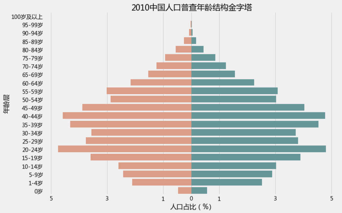
2.1 人口年龄结构金字塔(左边女右边男)
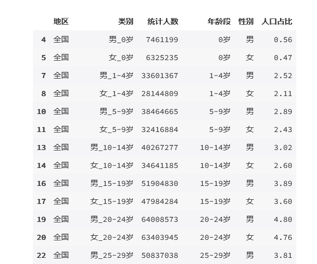
result = pcounts[(pcounts['性别'].isin(['男','女']))&(pcounts['地区']=='全国')&(pcounts['年龄段']!='合计')]
result
输出为:
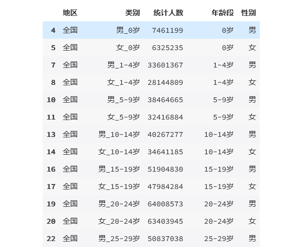
result['人口占比'] =( result['统计人数']/result['统计人数'].sum()*100).round(2)
result
输出为:
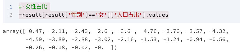
# 女性占比
-result[result['性别']=='女']['人口占比'].values
输出为:
plt.figure(figsize=(12,8))

bar_plot = sns.barplot(y = result['年龄段'].unique(), x = -result[result['性别']=='女']['人口占比'].values, color = "DarkSalmon",
                       data = result,order = result['年龄段'].unique()[::-1],)
bar_plot = sns.barplot(y = result['年龄段'].unique(), x = result[result['性别']=='男']['人口占比'].values, color = "CadetBlue",
                       data = result,order = result['年龄段'].unique()[::-1],)

plt.xticks([-5,-3,-1,0,1,3,5])
# plt.rcParams['font.sans-serif'] = ['SimHei']
plt.rcParams['font.sans-serif'] = ['Microsoft YaHei']
plt.rcParams['axes.unicode_minus'] = True
bar_plot.set(xlabel="人口占比(%)", ylabel="年龄层", title = "2010中国人口普查年龄结构金字塔")
plt.show()
输出为:
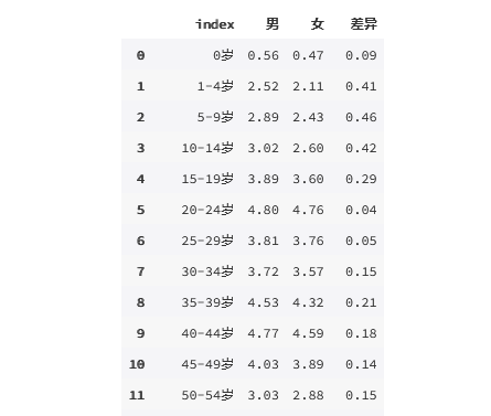
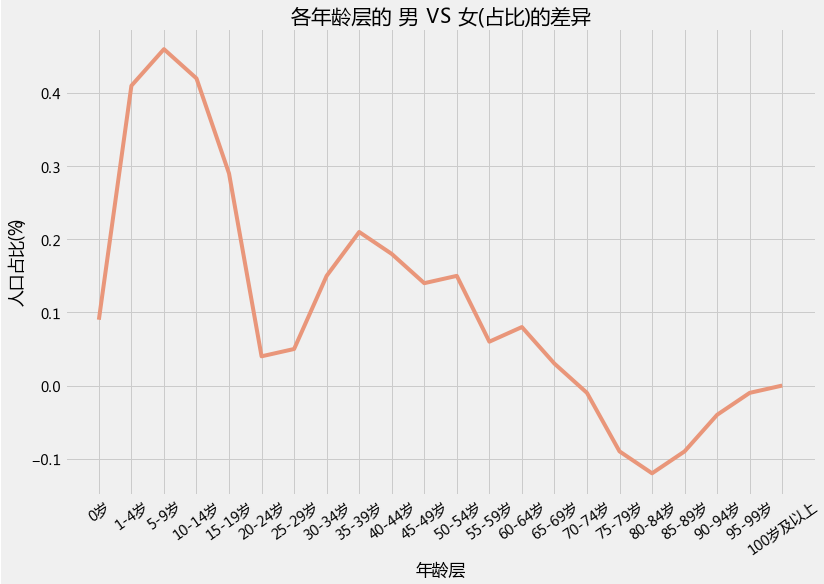
2.2 差异
data = {'index': result['年龄段'].unique(),
        '男': result[result['性别']=='男']['人口占比'].values,
        '女': result[result['性别']=='女']['人口占比'].values,
        }
Data = pd.DataFrame(data)
Data['差异']=Data['男']-Data['女']
Data
输出为:
plt.figure(1,figsize=(12,8))
sns.lineplot(x=Data['index'],y=Data['差异'],color='DarkSalmon',sort=False)
plt.xlabel("年龄层")
plt.ylabel("人口占比(%)")
plt.title("各年龄层的 男 VS 女(占比)的差异")
plt.xticks(rotation=35)
plt.show()
输出为:
2.3 北京、上海、广东地区的人口年龄结构金字塔(左边女右边男)
plt.figure(1,figsize=(18,16))
n = 0
for x in ['北京','上海','广东']:
    result = pcounts[(pcounts['性别'].isin(['男','女']))&(pcounts['地区'] == x )&(pcounts['年龄段']!='合计')]
    result['人口占比'] =( result['统计人数']/result['统计人数'].sum()*100).round(2)
    n +=1
    plt.subplot(2,3,n)
    bar_plot = sns.barplot(y = result['年龄段'].unique(), x = -result[result['性别']=='女']['人口占比'].values, color = "DarkSalmon",
                       data = result,order = result['年龄段'].unique()[::-1],)
    bar_plot = sns.barplot(y = result['年龄段'].unique(), x = result[result['性别']=='男']['人口占比'].values, color = "CadetBlue",
                       data = result,order = result['年龄段'].unique()[::-1],)

    plt.xticks([-7,-5,-3,-1,0,1,3,5,7],[7,5,3,1,0,1,3,5,7])
    plt.rcParams['font.sans-serif'] = ['Microsoft YaHei']
    plt.rcParams['axes.unicode_minus'] = True
    bar_plot.set(xlabel="人口占比(%)", ylabel="年龄层", title = x )
    plt.ylabel('')
plt.show()
输出为:
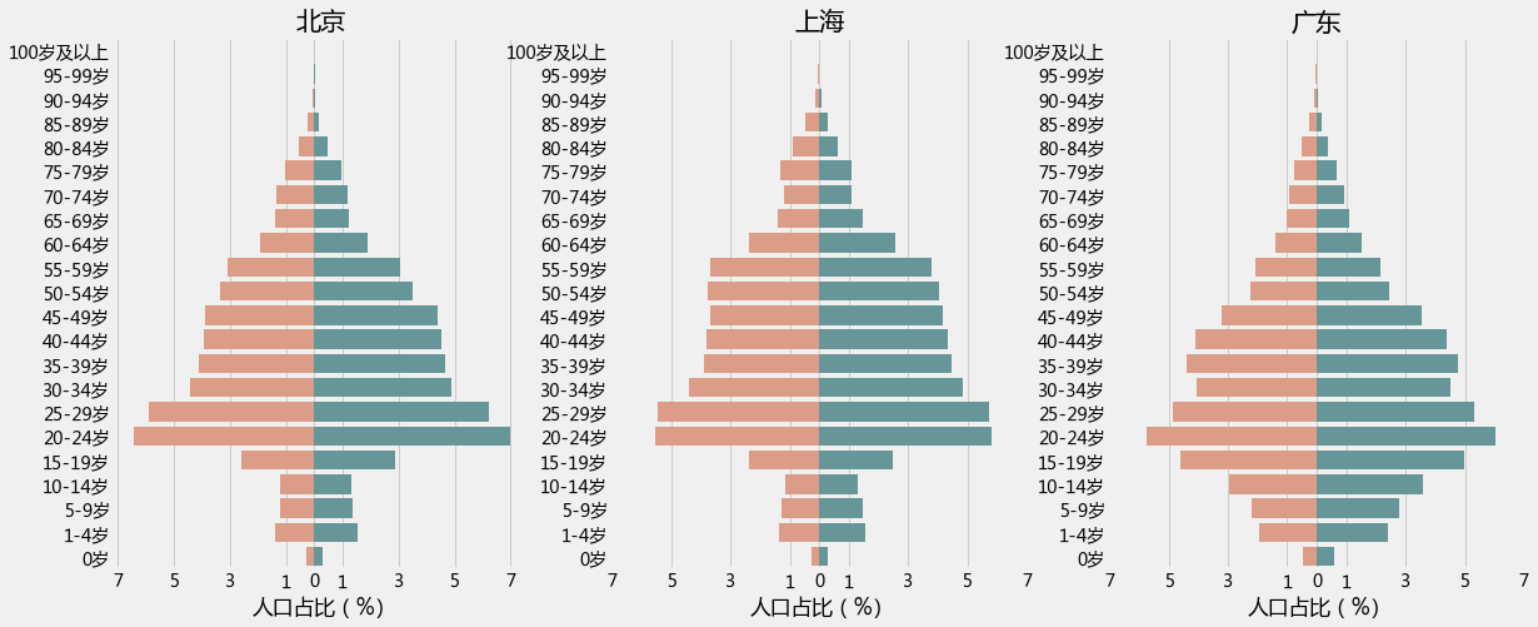
上图这三个地区还是比较突出的但不容易看出男女差异,我们再来一个性别的对比图
plt.figure(1,figsize=(18,16))
n = 0
for x in ['北京','上海','广东']:
    result = pcounts[(pcounts['性别'].isin(['男','女']))&(pcounts['地区'] == x )&(pcounts['年龄段']!='合计')]
    n +=1
    plt.subplot(2,3,n)
    sns.barplot(x='统计人数',y='年龄段',hue='性别',data=result,palette=['CadetBlue','DarkSalmon'],order=result['年龄段'].unique()[::-1])
    plt.title(x)
    plt.xticks(rotation=35)
    plt.ylabel('')
plt.show()
输出为:
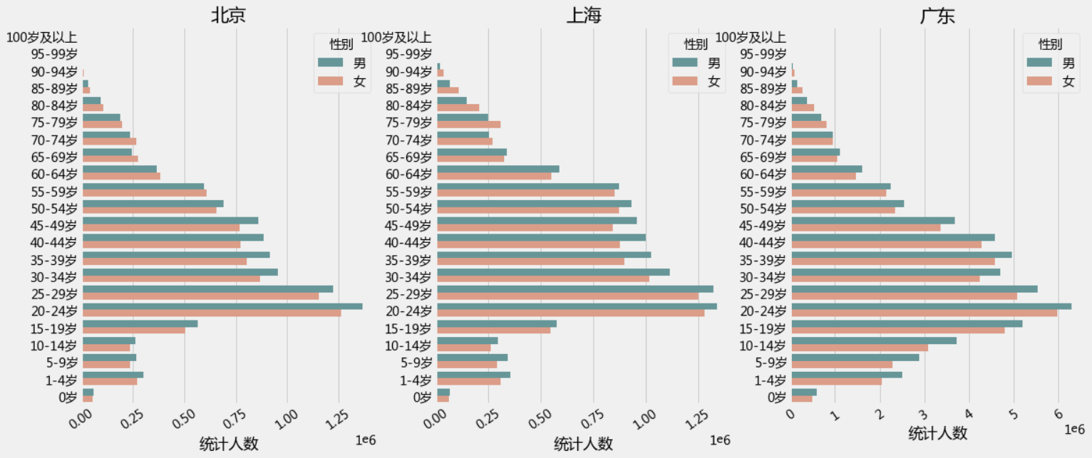
不难发现这三个地区的男女比例失衡,在中青年这个年龄段较为严重
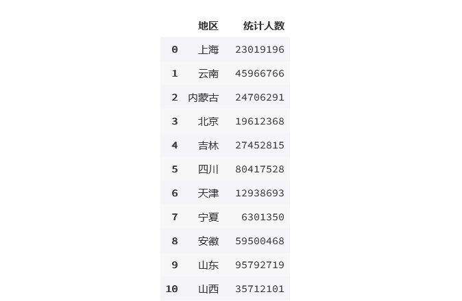
2.4 人口分布地图
result1 = pcounts[(pcounts['性别']=='小计')&(pcounts['地区']!='全国')&(pcounts['年龄段']!='合计')]
result1
输出为:

result2 = result1.groupby('地区')['统计人数'].sum().reset_index(name='统计人数')
result2
输出为:
# pip install pyecharts
# from pyecharts.globals import CurrentConfig,OnlineHostType
# CurrentConfig.ONLINE_HOST = OnlineHostType.NOTEBOOK_HOST
from pyecharts.charts import Map
from pyecharts import options as opts
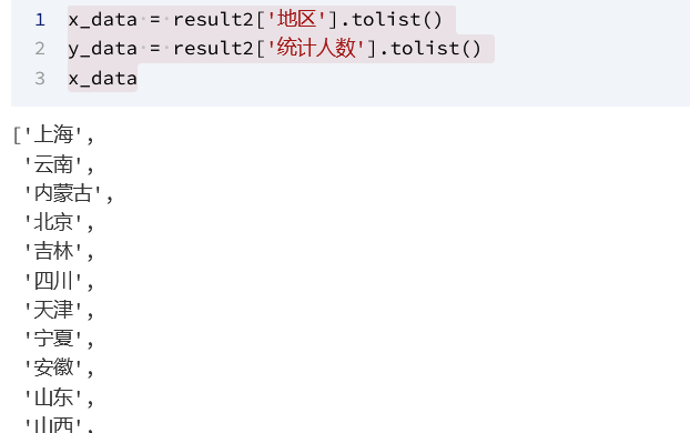
x_data = result2['地区'].tolist()
y_data = result2['统计人数'].tolist()
x_data
输出为:
name_translate = {"宁夏回族自治区":"宁夏","河南省":"河南","北京市":"北京","河北省":"河北","辽宁省":"辽宁","江西省":"江西",
"上海市":"上海","安徽省": "安徽","江苏省":"江苏","湖南省":"湖南","浙江省":"浙江","海南省":"海南",
"广东省":"广东","湖北省":"湖北", "黑龙江省": "黑龙江","陕西省":"陕西","四川省":"四川","内蒙古自治区":"内蒙古",
"重庆市":"重庆","广西壮族自治区":"广西","云南省":"云南","贵州省":"贵州","吉林省":"吉林","山西省":"山西",
"山东省":"山东","福建省":"福建","青海省":"青海","天津市":"天津","新疆维吾尔自治区":"新疆","西藏自治区":"西藏",
"甘肃省":"甘肃","大连市":"大连", "东莞市":"东莞","宁波市":"宁波","青岛市":"青岛","厦门市":"厦门","台湾省":" ","澳门特别行政区":" ",
"香港特别行政区":" ","南海诸岛":" "}
# 地图
map1 = Map()
map1.add("", [list(z) for z in zip(x_data, y_data)],"china",name_map=name_translate)
map1.set_series_opts(label_opts=opts.LabelOpts(is_show=True))
map1.set_global_opts(title_opts=opts.TitleOpts(title='全国各地区人口分布'),
visualmap_opts=opts.VisualMapOpts( max_=result2['统计人数'].max(),
min_ =result2['统计人数'].min(),is_piecewise=False))
map1.render_notebook()
输出为:
2010年的人口普查数据显示:广东省、山东省、河南省、四川省、江苏省 是总人口数前 5 的地区