需求
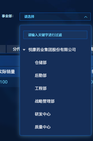
实现一个如图带搜索框的下拉树形组件。
解决方案
利用el-input+el-tree实现自定义带搜索的下拉树形组件。
具体实现步骤
1、创建TreeSelect组件
<template>
  <div class="tree-select-wrapper" v-clickoutside="handleClose">
    <el-input
      class="common-simple-input tree-select-input"
      v-model="selectedText"
      :placeholder="placeholder"
      :clearable="clearable"
      :disabled="disabled"
      :style="styleAttr"
      readonly
      @click.native="handleClick"
      @clear="handleClear"
    >
      <i
        class="el-input__icon"
        :class="['el-icon-arrow-down', visible ? 'is-reverse' : '']"
        slot="suffix"
      ></i>
    </el-input>
    <div v-show="visible" class="tree-select-dropdown" :style="styleAttr">
      <el-input
        v-if="filterable"
        v-model="filterText"
        class="tree-select-filter common-simple-input"
        placeholder="请输入关键字进行过滤"
        clearable
        @click.native.stop
      ></el-input>
      <el-tree
        ref="tree"
        :data="options"
        :props="defaultProps"
        :node-key="nodeKey"
        :default-expand-all="defaultExpandAll"
        :expand-on-click-node="expandOnClickNode"
        :filter-node-method="handleFilterNode"
        @node-click="handleNodeClick"
      ></el-tree>
    </div>
  </div>
</template>

<script>
export default {
  name: 'TreeSelect',
  props: {
    value: {
      type: [String, Number],
      default: ''
    },
    textValue: {
      type: String,
      default: ''
    },
    placeholder: {
      type: String,
      default: '请选择'
    },
    options: {
      type: Array,
      default: () => []
    },
    defaultProps: {
      type: Object,
      default: () => ({
        children: 'children',
        label: 'label',
        value: 'value'
      })
    },
    nodeKey: {
      type: String,
      default: 'value'
    },
    defaultExpandAll: {
      type: Boolean,
      default: false
    },
    expandOnClickNode: {
      type: Boolean,
      default: true
    },
    filterable: {
      type: Boolean,
      default: true
    },
    clearable: {
      type: Boolean,
      default: true
    },
    disabled: {
      type: Boolean,
      default: false
    },
    styleAttr: {
      type: Object,
      default: () => ({})
    }
  },
  data() {
    return {
      visible: false,
      filterText: '',
      selectedText: this.textValue
    }
  },
  watch: {
    filterText(val) {
      this.$refs.tree.filter(val)
    },
    textValue(val) {
      this.selectedText = val
    },
    visible: {
      immediate: true,
      deep: true,
      handler(val) {
        if (val && this.$refs.tree) {
          this.$refs.tree.setCurrentKey(this.value)
        }
      }
    }
  },
  mounted() {
    if (this.value && this.$refs.tree) {
      this.$refs.tree.setCurrentKey(this.value)
    }
  },
  methods: {
    handleClick() {
      if (this.disabled) return
      this.visible = !this.visible
    },
    handleClose() {
      this.visible = false
    },
    handleClear() {
      this.$emit('input', '')
      this.$emit('update:textValue', '')
      this.$emit('change', '')
      this.selectedText = ''
    },
    handleNodeClick(node) {
      if (!node[this.nodeKey]) return
      this.$emit('input', node[this.nodeKey])
      this.$emit('update:textValue', node[this.defaultProps.label])
      this.$emit('change', node[this.nodeKey])
      this.selectedText = node[this.defaultProps.label]
      this.visible = false
    },
    handleFilterNode(value, data) {
      if (!value) return true
      const label = data[this.defaultProps.label] || ''
      return label.indexOf(value) !== -1
    }
  },
  directives: {
    clickoutside: {
      bind(el, binding) {
        function documentHandler(e) {
          if (el.contains(e.target)) {
            return false
          }
          if (binding.value) {
            binding.value()
          }
        }
        el.__vueClickOutside__ = documentHandler
        document.addEventListener('click', documentHandler)
      },
      unbind(el) {
        document.removeEventListener('click', el.__vueClickOutside__)
        delete el.__vueClickOutside__
      }
    }
  }
}
</script>

<style lang="scss" scoped>
.tree-select-wrapper {
  position: relative;
  width: 100%;

  .tree-select-input {
    cursor: pointer;

    :deep(.el-input__suffix) {
      margin-right: vw(5);
      margin-top: vh(2);
      font-size: vw(14);
    }

    :deep(.el-input__icon) {
      transition: transform 0.3s;

      &.is-reverse {
        transform: rotateZ(180deg);
      }
    }
  }

  .tree-select-dropdown {
    width: 100%;
    position: absolute;
    top: 100%;
    left: 0;
    z-index: 1000;
    margin-top: 5px;
    padding: 5px 0;
    background-color: #152e58;
    border: 1px solid #0d59b4;
    border-radius: 4px;
    box-shadow: 0 2px 12px 0 rgba(112, 177, 218, 0.5);
    max-height: 400px;
    overflow-y: auto;
    cursor: pointer;

    .tree-select-filter {
      margin: 0 5px 5px;
      width: 90%;
    }

    :deep(.el-tree) {
      border: none;
      background: none !important;

      .el-tree__empty-text {
        color: #fff;
        font-size: vw(14);
      }

      .el-tree-node__label {
        cursor: pointer;
        color: #fff;
        font-size: vw(14) !important;
      }

      .el-tree-node__content {
        background: none !important;
        &:hover {
          color: #6cd9ff;
          background-color: rgba(27, 40, 61, 0.3) !important;
        }
      }

      .el-icon-caret-right:before {
        content: "\E791" !important;
      }

      .el-tree-node__expand-icon.expanded {
        transform: rotate(90deg) !important;
        -webkit-transform: rotate(90deg) !important;
      }

      .el-tree-node.is-current.is-focusable {
        background-color: rgba(27, 40, 61, 0.5) !important;
        .el-tree-node__label {
          color: #6cd9ff !important;
        }
      }
    }
  }
}
</style>
2、使用TreeSelect组件
// 引入TreeSelect组件
import TreeSelect from "@/components/TreeSelect/index.vue";

// 使用示例
  <TreeSelect
      v-model="searchForm.orgCode"
      :text-value.sync="searchForm.orgName"
      :options="orgTreeData"
      placeholder="请选择"
      :default-props="{
        children: 'children',
        label: 'orgName',
        value: 'orgCode',
      }"
      node-key="orgCode"
      :filterable="true"
      :clearable="true"
      :styleAttr="{ width: '200px' }"
    />

data() {
	orgTreeData: [],
},
mounted() {
	// 获取树形数据
    this.getOrgTreeData();},
methods: {
	// 获取树形数据方法
    async getOrgTreeData() {
      try {
	        const res = await this.getOrgTreeListApi();
	        this.orgTreeData = res.data || [];
	      } catch (error) {
	        console.error("获取事业部树形数据失败:", error);
	      }
    },
    getOrgTreeListApi async(data) {
     	return axios.post(`/api/org/tree`, data).then((resp) => resp.data)
    }
}
写在最后
TreeSelect组件可以直接Copy进行使用,其中common-simple-input为图中el-input输入框的蓝底亮框样式,可根据自身需求进行样式自定义开发。