本文为《React Agent:从零开始构建 AI 智能体》专栏系列文章。 专栏地址:https://blog.csdn.net/suiyingy/category_12933485.html。项目地址:https://gitee.com/fgai/react-agent(含完整代码示例与实战源)。完整介绍:https://blog.csdn.net/suiyingy/article/details/146983582。
在 React Flow 的语境中,节点是代表图表中特定元素的组件。它们可以直观地表示各种实体,如流程步骤、数据对象、操作单元等。每个节点都有唯一的标识符(id),用于在图表中进行区分和引用。它通过其属性和方法来定义自身的外观、行为以及与其他节点和边的交互方式。节点通过 React 的组件化机制,与整个 React 生态系统紧密结合,使得开发者可以利用 React 的各种特性,如状态管理、组件复用等,来构建复杂的图表应用。
1 id 属性
每个节点都必须有一个唯一的 id 属性。这个 id 用于在 React Flow 中识别和管理节点,确保节点的唯一性和可操作性。复杂的图表通过 id 可以方便地查找、更新或删除特定节点。
const nodeWithId = {
    id: 'unique - node - id - 1',
    type: 'default',
    data: { label: 'Node with ID' },
    position: { x: 120, y: 120 }
};
2 type 属性
type 属性用于指定节点的类型,可以是内置类型或自定义类型。通过设置 type 属性,React Flow 能够正确地渲染节点,并应用相应的样式和行为逻辑。例如,对于一个自定义节点,设置type: 'custom - special',然后在nodeTypes中注册该类型,以确保正确渲染。
const customTypeNode = {
    id: 'custom - type - node - 1',
    type: 'custom - special',
    data: { label: 'Custom Type Node' },
    position: { x: 180, y: 180 }
};
3 data 属性
data 属性是节点承载信息的主要方式。它可以是一个包含任意数据的对象,例如节点的标签文本、描述信息、关联的数据模型等。节点组件的渲染过程中可以从 data 属性中提取所需信息进行展示或处理。
const dataRichNode = {
    id: 'data - rich - node - 1',
    type: 'default',
    data: {
        label: 'Data - Rich Node',
        description: 'This node contains additional data',
        associatedData: { key: 'value' }
    },
    position: { x: 220, y: 220 }
};
4 position 属性
position 属性用于指定节点在图表中的位置,通常包含x和y坐标。通过设置 position 属性,可以精确控制节点的布局。在动态布局场景中,节点的 position 属性可能会根据用户操作或其他逻辑进行实时更新。
const positionedNode = {
    id: 'positioned - node - 1',
    type: 'default',
    data: { label: 'Positioned Node' },
    position: { x: 250, y: 250 }
};
5 style 属性
style 属性允许直接为节点设置内联样式,可以自定义节点的背景颜色、字体样式、边框等。例如,将节点背景设置为红色:
const styledNode = {
    id:'styled - node - 1',
    type: 'default',
    data: { label: 'Styled Node' },
    position: { x: 300, y: 300 },
    style: { background:'red', color: 'white' }
};
6 className 属性
className 属性用于为节点添加 CSS 类名,通过外部 CSS 文件(例如 App.css)来定义节点的样式。这种方式比内联样式更适合管理复杂的样式逻辑,提高样式的可维护性。在 CSS 文件中定义一个类名:
.custom-node-class {
  background-color: #0ff166; /* 浅蓝色背景 */
  border: 2px solid #007bff; /* 蓝色边框 */
  border-radius: 10px; /* 圆角边框 */
  color: #ff0000; /* 字体颜色 */
  font-weight: bold; /* 字体加粗 */
  font-size: 10px; /* 设置文本大小为10px */
  padding: 10px; /* 内边距 */
  box-shadow: 2px 2px 8px rgba(0, 0, 0, 0.2); /* 阴影效果 */
  text-align: cenleter; /* 文本居中 */
}
然后在节点中使用该类名:
import './App.css';
const classBasedStyledNode = {
    id: 'class - based - styled - node - 1',
    type: 'default',
    data: { label: 'Class - Based Styled Node' },
    position: { x: 350, y: 350 },
    className: 'custom - node - class'
};
7 draggable 属性
draggable 属性决定节点是否可以被用户拖动。设置为true时,节点可以在图表中自由拖动;设置为false时,节点将固定在当前位置。
const draggableNode = {
    id: 'draggable - node - 1',
    type: 'default',
    data: { label: 'Draggable Node' },
    position: { x: 400, y: 400 },
    draggable: true
};

const fixedNode = {
    id: 'fixed - node - 1',
    type: 'default',
    data: { label: 'Fixed Node' },
    position: { x: 450, y: 450 },
    draggable: false
};
8 selectable 属性
selectable 属性控制节点是否可以被用户选中。当节点被选中时,可以应用特定的样式或触发相关操作。例如,在一个多选场景中,用户可以通过点击节点来选择多个节点,然后对选中的节点进行批量操作。
const selectableNode = {
    id:'selectable - node - 1',
    type: 'default',
    data: { label: 'Selectable Node' },
    position: { x: 500, y: 500 },
    selectable: true
};
9 事件属性
节点还可以通过设置onClick、onDoubleClick等事件属性来绑定相应的事件处理函数。当用户执行对应的操作时,这些函数将被触发,从而实现节点的交互功能。例如,当用户点击节点时,弹出一个提示框:
const clickableNode = {
    id: 'clickable - node - 1',
    type: 'default',
    data: { label: 'Clickable Node' },
    position: { x: 550, y: 550 },
    onClick: () => {
        alert('You clicked the node!');
    }
};
项目地址“https://gitee.com/fgai/react-agent”,节点属性控制程序位于“project/chapter_02/exp03-nodes/src/App_property.js”。将此文件内容复制到App.js运行即可得到如下图所示的各个节点。此外,App.css 文件内容也需复制,以显示下面“Class - Based Styled Node”节点的样式效果。
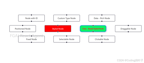
图1 节点列表
立即关注获取最新动态
点击订阅《React Agent 开发专栏》,每周获取智能体开发深度教程。项目代码持续更新至React Agent 开源仓库,欢迎 Star 获取实时更新通知!FGAI 人工智能平台:FGAI 人工智能平台