实验7:高级绘图(上)
一:实验目的与要求
1:了解R语言中各种图形元素的添加方法,并能够灵活应用这些元素。
2:了解R语言中的各种图形函数,掌握常见图形的绘制方法。
二:实验内容
【lattice包绘图】
Eg.1:以mtcars数据集为例,绘制车身重量(wt)与每加仑汽油行驶的英里数(mpg)的散点图
library('lattice') xyplot(wt ~ mpg, data = mtcars, xlab = 'Weight', ylab = 'Miles per Gallon', main = 'lattice包绘制散点图') |

Eg.2:查看参数列表名称
names(trellis.par.get()) |

Eg.3:fontsize查看字体大小和散点大小的参数
op <- trellis.par.get() trellis.par.get('fontsize') trellis.par.set(fontsize = list(text = 20, points = 20)) xyplot(wt ~ mpg, data = mtcars, xlab = 'Weight', ylab = 'Miles per Gallon', main = 'lattice包绘制散点图') trellis.par.set(op) |


Eg.4:图形化显示所有参数
show.settings() |
Eg.5:以Species(鸢尾花种类)为条件变量绘制Sepal.Length(花萼长度)与Sepal.Width(花萼宽度)的散点图
library(lattice) attach(iris) xyplot(Sepal.Length ~ Sepal.Width | Species) detach(iris) |

Eg.6:面板函数
my_panel <- function(x,y){ panel.lmline(x, y, col = "red", lwd = 1, lty = 2) panel.loess(x,y) panel.grid(h = -1, v = -1) panel.rug(x, y) panel.xyplot(x, y) } xyplot(mpg ~ wt, data = mtcars, xlab = "Weight", ylab = "Miles per Gallon",main = "Miles per Gallon on Weight", panel = my_panel) |

Eg.7:分组变量
xyplot(Sepal.Length ~ Sepal.Width, group = Species, data = iris,pch = 1:3, col = 1:3, main = 'Sepal.Length VS Sepal.Width', key = list(space = "right", title = "Species", cex.title = 1, cex = 1, text = list(levels(factor(iris$Species))), points=list(pch = 1:3, col= 1:3))) |

Eg.8:图形组合
graph1 <- xyplot(Sepal.Length ~ Sepal.Width | Species, data = iris, main = '栅栏图') graph2 <- xyplot(Sepal.Length ~ Sepal.Width, group = Species, data = iris, main = '散点图1') graph3 <- xyplot(Petal.Length ~ Petal.Width, group = Species, data = iris, main = '散点图2') # split函数 plot(graph1, split = c(1,1,3,1)) plot(graph2, split = c(2,1,3,1),newpage=F) plot(graph2, split = c(3,1,3,1),newpage=F) # position函数 plot(graph1, position = c(0, 0, 1/3, 1)) plot(graph2, position = c(1/3, 0, 2/3, 1), newpage = F) plot(graph3, position = c(2/3, 0, 1, 1), newpage = F) |

Eg.9:条形图
barchart(VADeaths, main = 'Death Rates in 1940 Virginia(By Group)') barchart(VADeaths, groups = FALSE, main = list("Death Rates in 1940 Virginia", cex = 1.2)) |


Eg.10:泰塔尼克号航行中不同人群获救与否的人数情况
str(Titanic) as.data.frame(Titanic) pic1 <- barchart(Class ~ Freq|Age + Sex, data = as.data.frame(Titanic), groups = Survived, stack = TRUE, auto.key = list(title = "Survived", columns = 2)) pic2 <- barchart(Class ~ Freq|Age + Sex, data = as.data.frame(Titanic), groups = Survived, stack = TRUE, auto.key = list(title = "Survived", columns = 2), scales = list(x = "free")) pic3 <- update(pic2, panel=function(...){ panel.grid(h=0,v=-1) panel.barchart(...,border = "Transparent") }) plot(pic1, split = c(1,1,3,1)) plot(pic2, split = c(2,1,3,1), newpage = FALSE) plot(pic3, split = c(3,1,3,1), newpage = FALSE) |


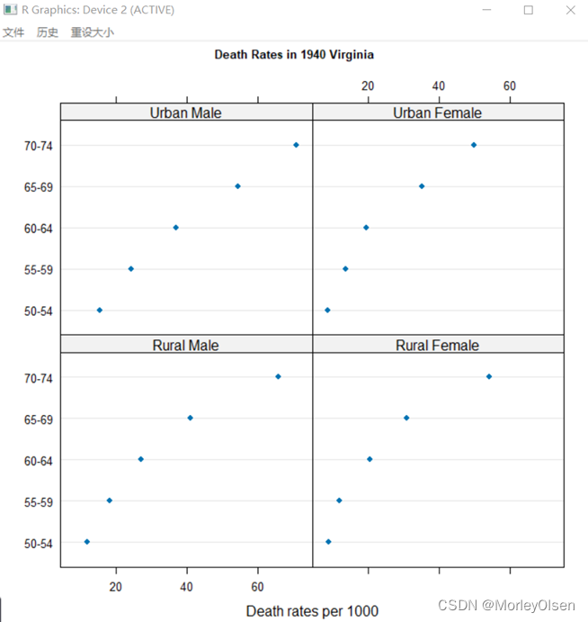
Eg.11:点图
dotplot(VADeaths, pch = 1:4, xlab = 'Death rates per 1000', main = list('Death Rates in 1940 Virginia (By Group)', cex = 0.8), key = list(column = 4, text = list(colnames(VADeaths)), points = list(pch = 1:4, col =1:4))) dotplot(VADeaths, group = FALSE, xlab = 'Death rates per 1000',main = list('Death Rates in 1940 Virginia', cex = 0.8)) |

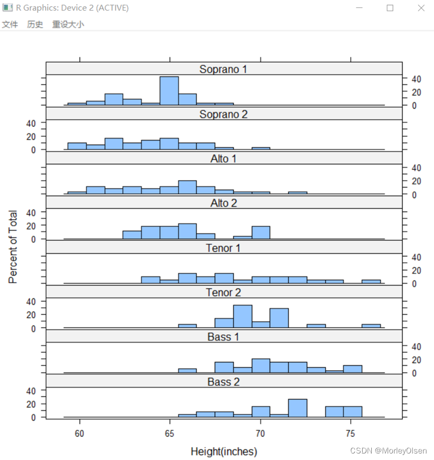
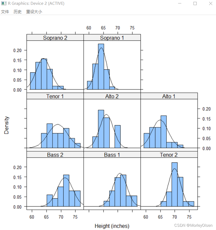
Eg.12:直方图
histogram( ~ height | voice.part, data = singer, nint = 17, layout = c(1,8), xlab = "Height(inches)") |
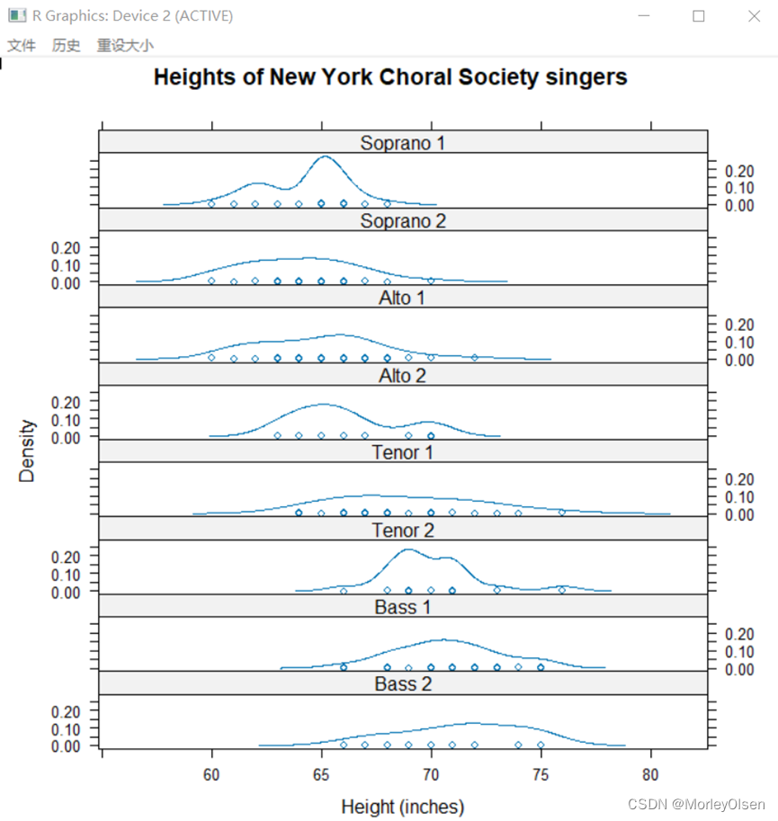
Eg.13:核密度图
densityplot( ~ height | voice.part, data = singer, layout=c(1, 8), xlab = "Height (inches)",main = "Heights of New York Choral Society singers") |
Eg.14:叠加核密度图
densityplot( ~ height, group = voice.part, data = singer, xlab = "Height (inches)" , plot.points = FALSE,main = "Heights of New York Choral Society singers", lty = 1:8, col = 1:8, lwd = 1.5,key = list(text = list(levels(singer$voice.part)), column = 4, lines = list(lty = 1:8, col = 1:8))) |

Eg.15:添加核密度图
histogram( ~ height | voice.part, data = singer, xlab = "Height (inches)", type = "density", panel = function(x, ...) { panel.histogram(x, ...) panel.mathdensity(dmath = dnorm, col = "black", args = list(mean=mean(x),sd=sd(x))) }) |
Eg.16:带状图
nrow(singer[singer$voice.part == 'Bass 2', ]) stripplot(~ height, group = voice.part, data = singer, xlab = "Height (inches)", main = "Heights of New York Choral Society singers", subset = (voice.part == "Bass 2"),jitter.data=T) |

Eg.17:QQ图
qqmath(~ height | voice.part, data = singer, prepanel = prepanel.qqmathline, panel = function(x, ...) { panel.qqmathline(x, ...) panel.qqmath(x, ...) }) qq(voice.part ~ height, aspect = 1, data = singer,subset = (voice.part == "Bass 2" | voice.part == "Tenor 2")) |


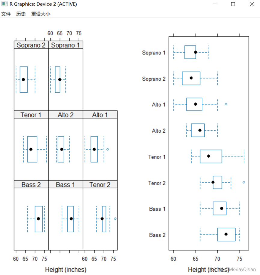
Eg.18:箱线图
pic1 <- bwplot( ~ height | voice.part, data=singer, xlab="Height (inches)") pic2 <- bwplot(voice.part ~ height, data=singer, xlab="Height (inches)") plot(pic1, split = c(1, 1, 2, 1)) plot(pic2, split = c(2, 1, 2, 1), newpage = FALSE) |
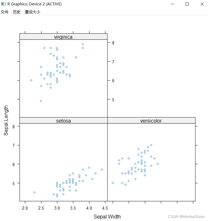
Eg.19:散点图
xyplot(Sepal.Length~Sepal.Width|Species,data=iris) |
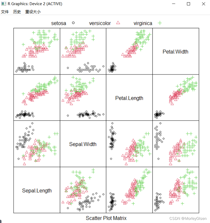
Eg.20:散点矩阵图
splom(iris[, 1:4], groups = iris$Species, pscales = 0, pch = 1:3, col = 1:3, varnames = colnames(iris)[1:4],key = list(columns = 3, text = list(levels(iris$Species)), points = list(pch = 1:3, col = 1:3))) |
Eg.21:三维水平图
data(Cars93, package = "MASS") cor.Cars93 <-cor(Cars93[, !sapply(Cars93, is.factor)], use = "pair") levelplot(cor.Cars93, scales = list(x=list(rot=90))) |

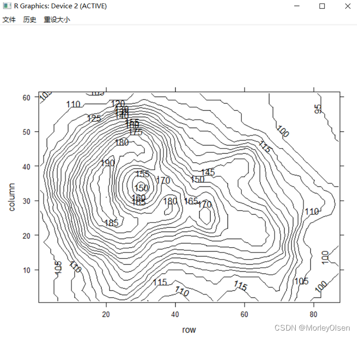
Eg.22:三维等高线
contourplot(volcano, cuts = 20) |
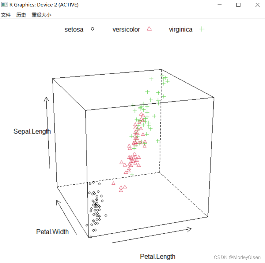
Eg.23:三维散点图
par.set <-list(axis.line = list(col = "transparent"), clip = list(panel = "off")) # 去除边框,不削减面板范围 cloud(Sepal.Length ~ Petal.Length * Petal.Width, data = iris, groups = Species, pch = 1:3,col= 1:3, # 点颜色及样式 screen = list(z = 20, x = -70, y =0), # 调节三维散点图的展示角度 par.settings = par.set, scales = list(col = "black"), # 加箭头指示 key=list(column=3, text=list(levels(iris$Species)), points = list(pch = 1:3, col = 1:3))) |
Eg.24:三维曲面图
par.set <-list(axis.line = list(col = "transparent"), clip = list(panel = "off")) # 去除边框,不削减面板范围 wireframe(volcano, shade = TRUE, par.settings = par.set, aspect = c(61/87, 0.4)) |

【ggplot2包绘图】
Eg.1:qplot函数
library(ggplot2) qplot(Species, Sepal.Length, data = iris, geom = "boxplot", fill = Species,main = "依据种类分组的花萼长度箱线图") qplot(Species, Sepal.Length, data = iris, geom = c("violin", "jitter"), fill = Species,main = "依据种类分组的花萼长度小提琴图") qplot(Sepal.Length, Sepal.Width, data = iris, colour = Species, shape = Species,main = "绘制花萼长度和花萼宽度的散点图") qplot(Sepal.Length, Sepal.Width, data = iris, geom = c("point", "smooth"), facets = ~Species,colour = Species, main = "绘制分面板的散点图") |


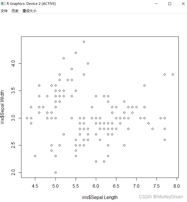
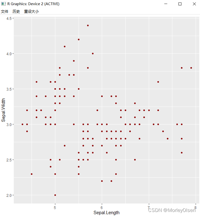
Eg.2:语言逻辑
plot(iris$Sepal.Length, iris$Sepal.Width) library(ggplot2) ggplot(data= iris, aes(x = Sepal.Length, y = Sepal.Width)) + #绘制底层画布 geom_point(color = "darkred") #在画布上添加点 |
Eg.3:绘制画布
ggplot(data = iris, aes(x = Sepal.Length, y = Sepal.Width, colour = Species, shape = Species)) |

Eg.4:几何对象
# 方法1 ggplot(data = iris, aes(x = Sepal.Length, y = Sepal.Width, colour = Species, shape = Species))+geom_point() # 方法2 ggplot(data = iris) + geom_point(aes(x = Sepal.Length, y = Sepal.Width, colour = Species, shape = Species)) |

Eg.5:统计变换
# 方法1 ggplot(iris) + geom_bar(aes(x=Sepal.Length), stat="bin", binwidth = 0.5) # 方法2 ggplot(iris) + stat_bin(aes(x=Sepal.Length), geom="bar", binwidth = 0.5) |

Eg.6:标尺设置
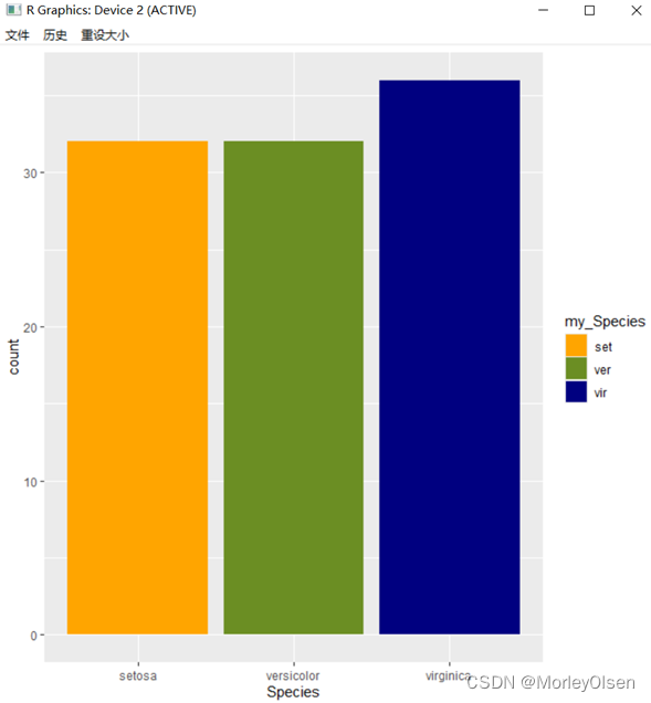
set.seed(1234) # 设置随机种子 my_iris <- iris[sample(1:150, 100, replace = FALSE),] # 随机抽样 p <- ggplot(my_iris) + geom_bar(aes(x = Species, fill = Species)) p # 左图 p$scales # 查看p的标尺参数 p + scale_fill_manual( values = c("orange", "olivedrab", "navy"), # 颜色设置 breaks = c("setosa", "versicolor", "virginica"), # 图例和轴要显示的分段点 name = "my_Species", # 图例和轴使用的名称 labels = c("set", "ver", "vir") # 图例使用的标签 ) # 右图 |

Eg.7:修改图形的颜色
ggplot(iris, aes(x = Sepal.Length, y = Sepal.Width, colour = Species))+ scale_color_manual(values = c("orange", "olivedrab", "navy"))+ geom_point(size = 2) ggplot(iris,aes(x = Sepal.Length, y = Sepal.Width, colour = Species))+ scale_color_brewer(palette = "Set1")+ geom_point(size=2) |


Eg.8:坐标系转换
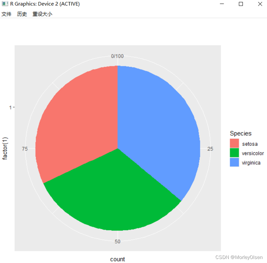
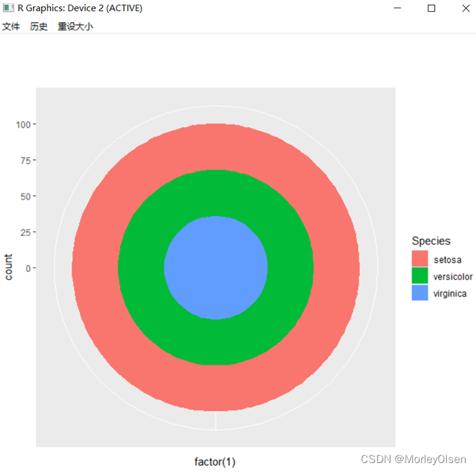
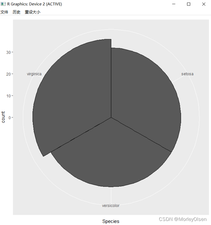
# 饼图 = 堆叠长条图 + polar coordinates pie <- ggplot(my_iris, aes(x = factor(1), fill = Species)) +geom_bar(width = 1) pie + coord_polar(theta = "y") # 靶心图 = 饼图 + polar coordinates pie + coord_polar() #锯齿图 = 柱状图 + polar coordinates cxc <- ggplot(my_iris, aes(x = Species)) +geom_bar(width = 1, colour = "black") cxc + coord_polar() |
Eg.9:分面
library(ggplot2) library(tidyr) library(dplyr) my_iris1 <- iris %>% gather(feature_name, feature_value, one_of(c("Sepal.Length", "Sepal.Width", "Petal.Length", "Petal.Width"))) # 数据变换 ggplot(my_iris1) +geom_violin(aes(x = Species, y = feature_value)) + facet_grid(feature_name ~ Species, scales = "free") # 分面 |

Eg.10:facet-wrap函数
ggplot(my_iris1) + geom_violin(aes(x = Species, y = feature_value)) + facet_wrap(~ feature_name + Species, scales = "free") |

Eg.11:保存图形
ggplot(iris, aes(x = Sepal.Length, y = Sepal.Width, colour = Species))+geom_point(size = 2) ggsave(file = "mygraph.pdf", width = 5, height = 4) |