本内容来自网络,仅学习使用
这段代码构建了一个 HTML5 切积木益智游戏的前端界面,结合了 HTML、CSS 技术。HTML 部分定义了游戏的基本结构,包括游戏画布、游戏信息显示区(HUD)和菜单系统;CSS 部分则负责页面的样式设计,如背景、字体、按钮效果等。
代码详细分析
1. HTML 部分
<!DOCTYPE html>
<html lang="en">
<head>
<meta charset="UTF-8">
<title>HTML5切积木益智游戏</title>
<meta name="viewport" content="width=device-width, initial-scale=1">
<link rel="stylesheet" href="css/style.css">
</head>
<body>
<!-- Game canvas -->
<canvas id="c"></canvas>
<!-- Gameplay HUD -->
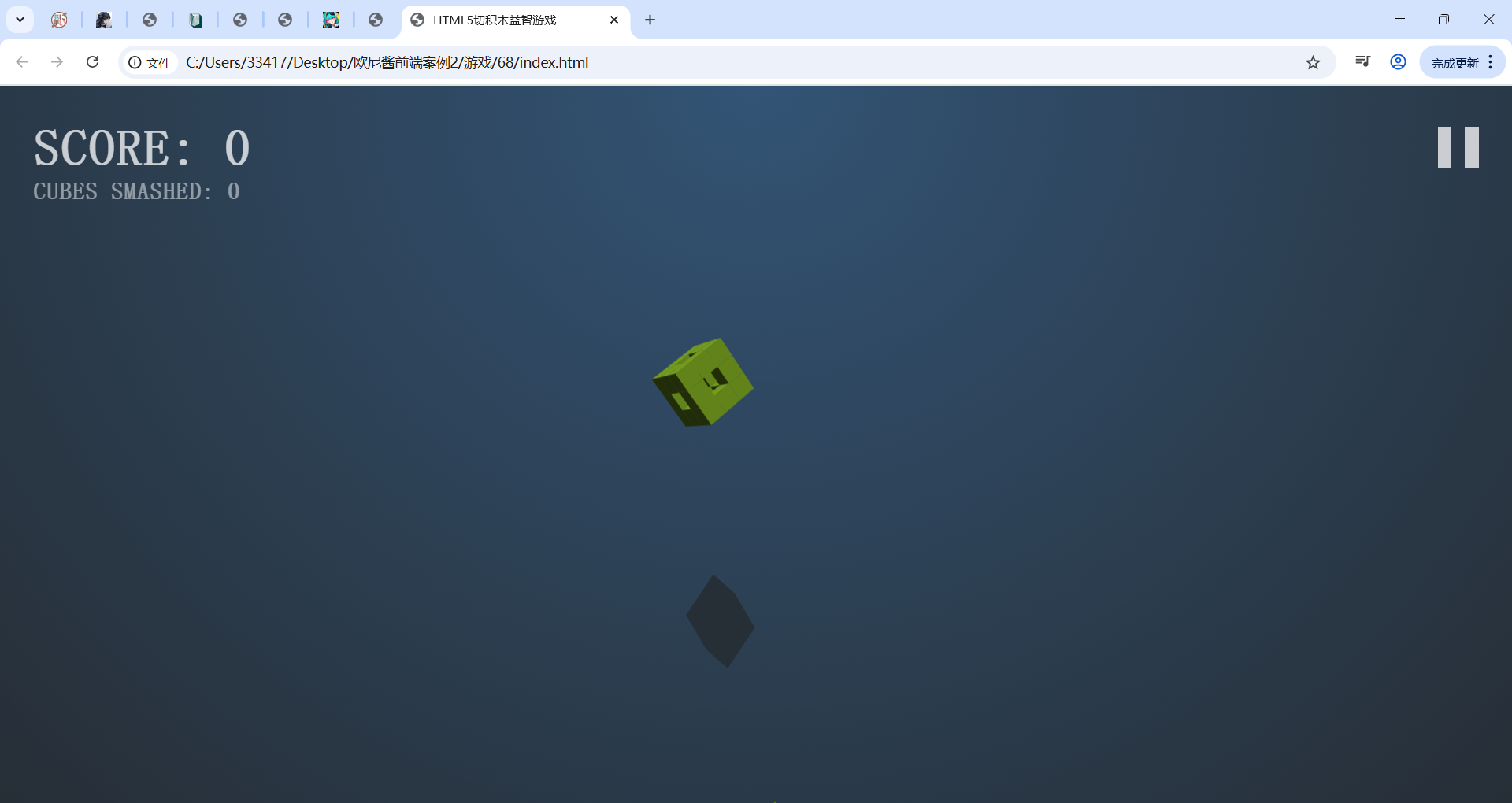
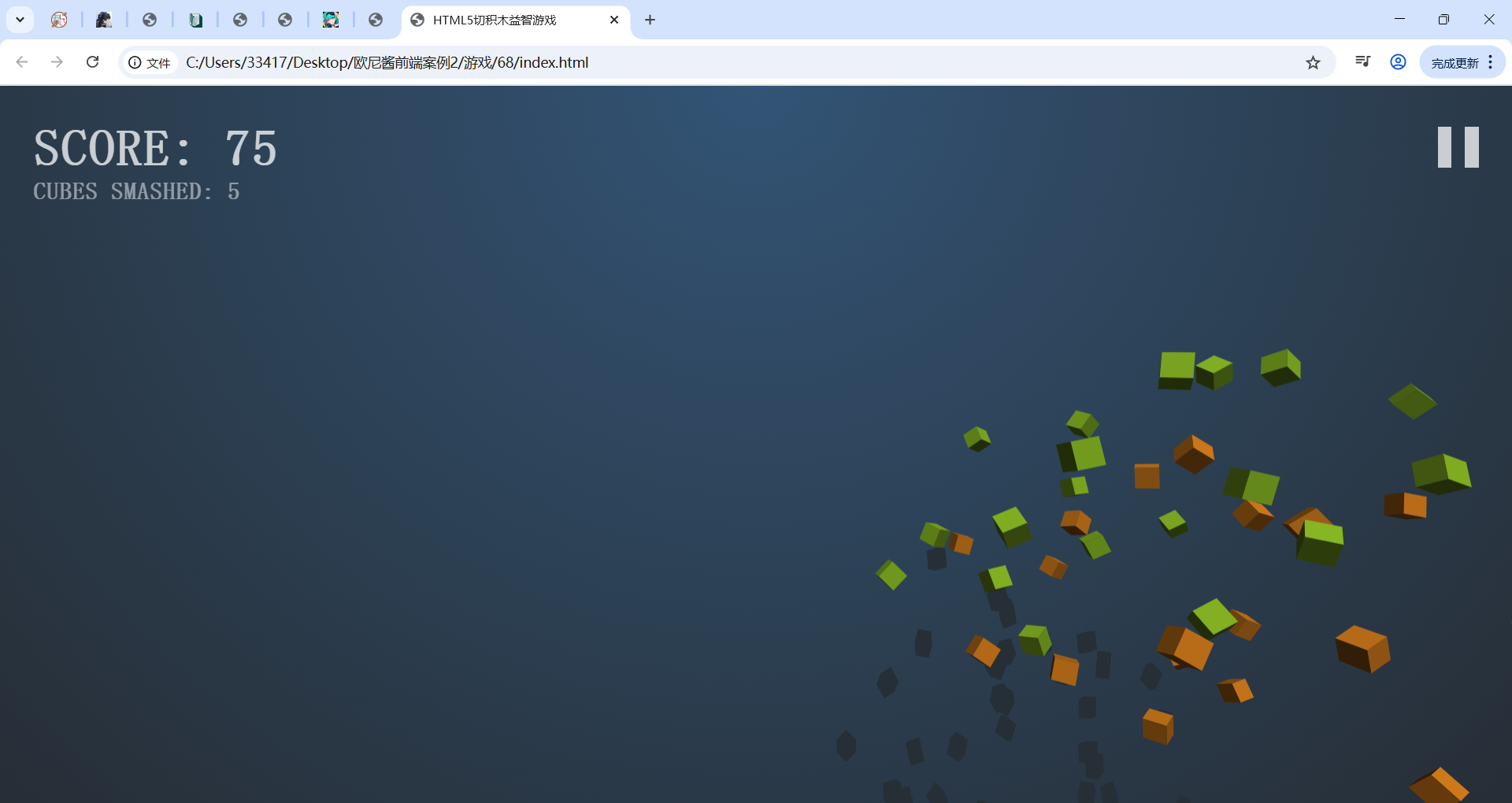
<div class="hud">
<div class="hud__score">
<div class="score-lbl"></div>
<div class="cube-count-lbl"></div>
</div>
<div class="pause-btn"><div></div></div>
<div class="slowmo">
<div class="slowmo__bar"></div>
</div>
</div>
<!-- Menu System -->
<div class="menus">
<div class="menu menu--main">
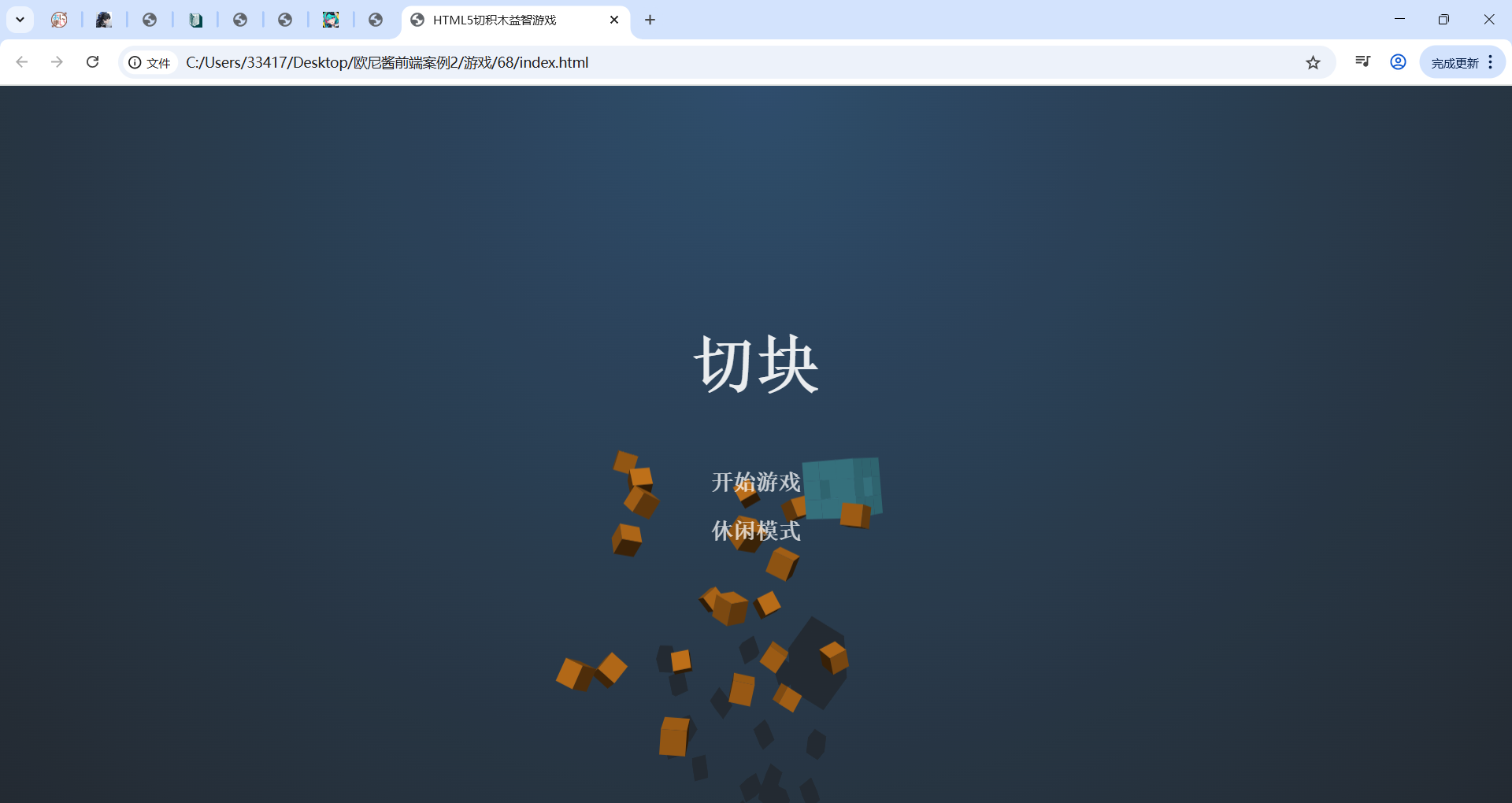
<h1>切块</h1>
<button type="button" class="play-normal-btn">开始游戏</button>
<button type="button" class="play-casual-btn">休闲模式</button>
</div>
<div class="menu menu--pause">
<h1>暂停</h1>
<button type="button" class="resume-btn">重新开始</button>
<button type="button" class="menu-btn--pause">主菜单</button>
</div>
<div class="menu menu--score">
<h1>游戏结束</h1>
<h2>分数:</h2>
<div class="final-score-lbl"></div>
<div class="high-score-lbl"></div>
<button type="button" class="play-again-btn">再玩一次</button>
<button type="button" class="menu-btn--score">主菜单</button>
</div>
</div>
<script src="js/index.js"></script>
</body>
</html>- 主体(
<body>):- 游戏画布(
<canvas>):id为c,用于绘制游戏画面。 - 游戏信息显示区(
.hud):.hud__score:包含分数显示区(.score - lbl)和方块数量显示区(.cube - count - lbl)。.pause - btn:暂停按钮。.slowmo:慢动作条,其中.slowmo__bar表示慢动作进度。
- 菜单系统(
.menus):.menu.menu--main:主菜单,包含 “开始游戏” 和 “休闲模式” 按钮。.menu.menu--pause:暂停菜单,包含 “重新开始” 和 “主菜单” 按钮。.menu.menu--score:游戏结束菜单,显示最终分数、最高分数,包含 “再玩一次” 和 “主菜单” 按钮。
- 脚本引入:引入外部 JavaScript 文件
js/index.js,可能包含游戏的核心逻辑。
- 游戏画布(
2. CSS 部分
body {
    margin: 0;
    background-color: #000;
    background-image: radial-gradient(ellipse at top, #335476 0.0%, #31506e 11.1%, #304b67 22.2%, #2f4760 33.3%, #2d4359 44.4%, #2c3f51 55.6%, #2a3a4a 66.7%, #293643 77.8%, #28323d 88.9%, #262e36 100.0%);
    height: 100vh;
    overflow: hidden;
    font-family: monospace;
    font-weight: bold;
    letter-spacing: 0.06em;
    color: rgba(255, 255, 255, 0.75);
}

#c {
    display: block;
    touch - action: none;
    transform: translateZ(0);
}

/*/
//        HUD        //
/*/
.hud__score,
.pause-btn {
    position: fixed;
    font-size: calc(14px + 2vw + 1vh);
}

.hud__score {
    top: 0.65em;
    left: 0.65em;
    pointer - events: none;
    user - select: none;
}

.cube-count-lbl {
    font-size: 0.46em;
}

.pause-btn {
    position: fixed;
    top: 0;
    right: 0;
    padding: 0.8em 0.65em;
}

.pause-btn>div {
    position: relative;
    width: 0.8em;
    height: 0.8em;
    opacity: 0.75;
}

.pause-btn>div::before,
.pause-btn>div::after {
    content: '';
    display: block;
    width: 34%;
    height: 100%;
    position: absolute;
    background-color: #fff;
}

.pause-btn>div::after {
    right: 0;
}

.slowmo {
    position: fixed;
    bottom: 0;
    width: 100%;
    pointer - events: none;
    opacity: 0;
    transition: opacity 0.4s;
    will - change: opacity;
}

.slowmo::before {
    content: 'SLOW - MO';
    display: block;
    font-size: calc(8px + 1vw + 0.5vh);
    margin-left: 0.5em;
    margin-bottom: 8px;
}

.slowmo::after {
    content: '';
    display: block;
    position: fixed;
    bottom: 0;
    width: 100%;
    height: 1.5vh;
    background-color: rgba(0, 0, 0, 0.25);
    z - index: -1;
}

.slowmo__bar {
    height: 1.5vh;
    background-color: rgba(255, 255, 255, 0.75);
    transform - origin: 0 0;
}

/*/
//       MENUS       //
/*/
.menus::before {
    content: '';
    pointer - events: none;
    position: fixed;
    top: 0;
    right: 0;
    bottom: 0;
    left: 0;
    background-color: #000;
    opacity: 0;
    transition: opacity 0.2s;
    transition - timing - function: ease - in;
}

.menus.has - active::before {
    opacity: 0.08;
    transition - duration: 0.4s;
    transition - timing - function: ease - out;
}

.menus.interactive - mode::before {
    opacity: 0.02;
}

/* Menu containers */
.menu {
    pointer - events: none;
    position: fixed;
    top: 0;
    right: 0;
    bottom: 0;
    left: 0;
    display: flex;
    flex - direction: column;
    justify - content: center;
    align - items: center;
    user - select: none;
    text - align: center;
    color: rgba(255, 255, 255, 0.9);
    opacity: 0;
    visibility: hidden;
    transform: translateY(30px);
    transition - property: opacity, visibility, transform;
    transition - duration: 0.2s;
    transition - timing - function: ease - in;
}

.menu.active {
    opacity: 1;
    visibility: visible;
    transform: translateY(0);
    transition - duration: 0.4s;
    transition - timing - function: ease - out;
}

.menus.interactive - mode .menu.active {
    opacity: 0.6;
}

.menus:not(.interactive - mode) .menu.active>* {
    pointer - events: auto;
}

/* Common menu elements */
h1 {
    font - size: 4rem;
    line - height: 0.95;
    text - align: center;
    font - weight: bold;
    margin: 0 0.65em 1em;
}

h2 {
    font - size: 1.2rem;
    line - height: 1;
    text - align: center;
    font - weight: bold;
    margin: -1em 0.65em 1em;
}

.final - score - lbl {
    font - size: 5rem;
    margin: -0.2em 0 0;
}

.high - score - lbl {
    font - size: 1.2rem;
    margin: 0 0 2.5em;
}

button {
    display: block;
    position: relative;
    width: 200px;
    padding: 12px 20px;
    background: transparent;
    border: none;
    outline: none;
    user - select: none;
    font - family: monospace;
    font - weight: bold;
    font - size: 1.4rem;
    color: #fff;
    opacity: 0.75;
    transition: opacity 0.3s;
}

button::before {
    content: '';
    position: absolute;
    top: 0;
    right: 0;
    bottom: 0;
    left: 0;
    background - color: rgba(255, 255, 255, 0.15);
    transform: scale(0, 0);
    opacity: 0;
    transition: opacity 0.3s, transform 0.3s;
}

/* No `:focus` styles because this is a mouse/touch game! */
button:active {
    opacity: 1;
}

button:active::before {
    transform: scale(1, 1);
    opacity: 1;
}

.credits {
    position: fixed;
    width: 100%;
    left: 0;
    bottom: 20px;
}

a {
    color: white;
}

/* Only enable hover state on large screens */
@media (min - width: 1025px) {
    button:hover {
        opacity: 1;
    }

    button:hover::before {
        transform: scale(1, 1);
        opacity: 1;
    }
}- 全局样式(
body):- 设置页面边距为 0,背景颜色为黑色,并添加径向渐变背景。
- 设置页面高度为 100vh,隐藏溢出内容。
- 设置字体、字体粗细、字母间距和文字颜色。
- 游戏画布(
#c):- 显示为块级元素,禁用触摸操作,开启硬件加速。
- 游戏信息显示区(
.hud):- 设置
.hud__score和.pause - btn的字体大小为响应式。 - 设置
.hud__score的位置和禁用指针事件、用户选择。 - 设置
.pause - btn的位置和样式,通过伪元素创建按钮图标。 - 设置
.slowmo的位置、透明度和过渡效果,通过伪元素添加提示文字和背景条。 - 设置
.slowmo__bar的高度和背景颜色。
- 设置
- 菜单系统(
.menus):- 通过伪元素设置菜单背景的透明度和过渡效果。
- 设置
.menu的初始状态为隐藏,通过.active类显示菜单,并添加过渡效果。 - 设置菜单标题、分数显示区和按钮的样式,包括字体大小、边距、背景等。
- 设置按钮的悬停和激活效果,仅在大屏幕上启用悬停效果。
总结
这段代码通过 HTML 构建了游戏的基本结构,包括游戏画布、信息显示区和菜单系统;通过 CSS 设置了页面的样式,包括背景、字体、按钮效果等,为游戏提供了一个美观且交互性良好的界面。而游戏的核心逻辑则由外部 JavaScript 文件 js/index.js 实现。
源码可联系QQ:3341742487
效果如图