1.成果展示
1.1n8n的工作流
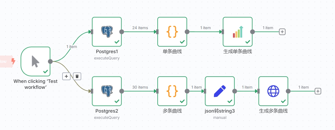
牵涉节点:Postgres、Code、QuickChart、Edit Fields、HTTP Request
12.显示效果
2.实操过程
2.1节点说明
2.1.1Postgres节点:
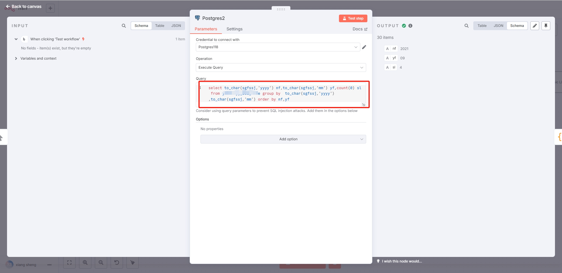
注:将明细数据进行汇总。
2.1.2code节点:
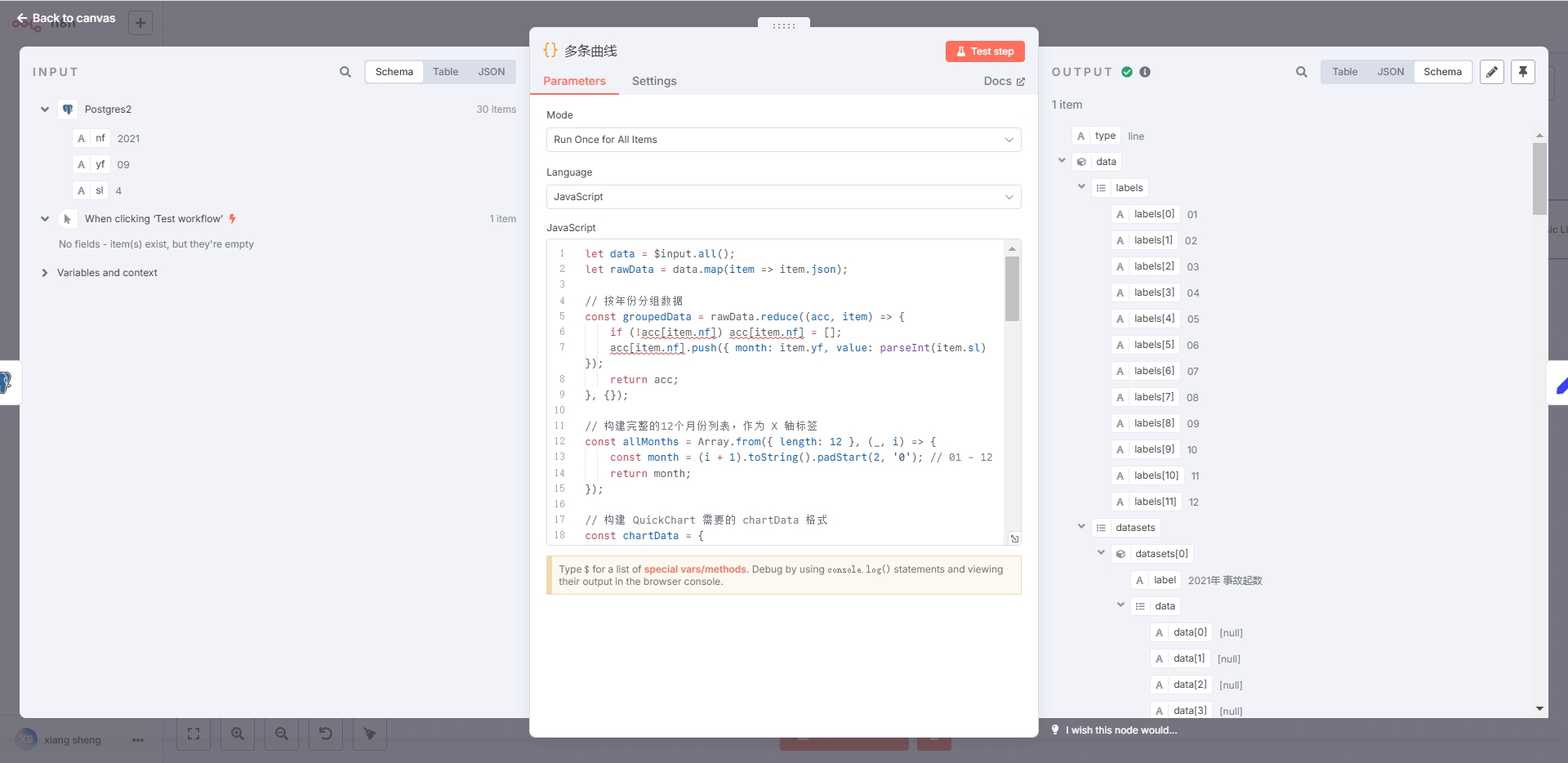
注:将 查询的数据转换成QuickChart需要的格式,代码如下:
let data = $input.all();
let rawData = data.map(item => item.json);

// 按年份分组数据
const groupedData = rawData.reduce((acc, item) => {
    if (!acc[item.nf]) acc[item.nf] = [];
    acc[item.nf].push({ month: item.yf, value: parseInt(item.sl) });
    return acc;
}, {});

// 构建完整的12个月份列表,作为 X 轴标签
const allMonths = Array.from({ length: 12 }, (_, i) => {
    const month = (i + 1).toString().padStart(2, '0'); // 01 - 12
    return month;
});

// 构建 QuickChart 需要的 chartData 格式
const chartData = {
    type: 'line',
    data: {
        labels: allMonths, // 使用完整12个月作为 X 轴
        datasets: Object.keys(groupedData).map(year => {
            // 补全缺失月份的数据为 null(图表上该点为空)
            const values = allMonths.map(month => {
                const found = groupedData[year].find(d => d.month === month);
                return found ? found.value : null;
            });

            return {
                label: `${year}年 事故起数`,
                data: values,
                borderColor: getRandomColor(),
                fill: false,
                pointRadius: values.map(v => v !== null ? 3 : 0), // 可选:隐藏空值点
            };
        })
    },
    options: {
        responsive: true,
        scales: {
            xAxes: [{
                scaleLabel: {
                    display: true,
                    labelString: '月份'
                }
            }],
            yAxes: [{
                ticks: {
                    beginAtZero: true
                },
                scaleLabel: {
                    display: true,
                    labelString: '事故起数'
                }
            }]
        }
    }
};

// 随机颜色生成函数
function getRandomColor() {
    const r = Math.floor(Math.random() * 256);
    const g = Math.floor(Math.random() * 256);
    const b = Math.floor(Math.random() * 256);
    return `rgba(${r},${g},${b},1)`;
}

return chartData;
2.1.3Edit Fields节点:
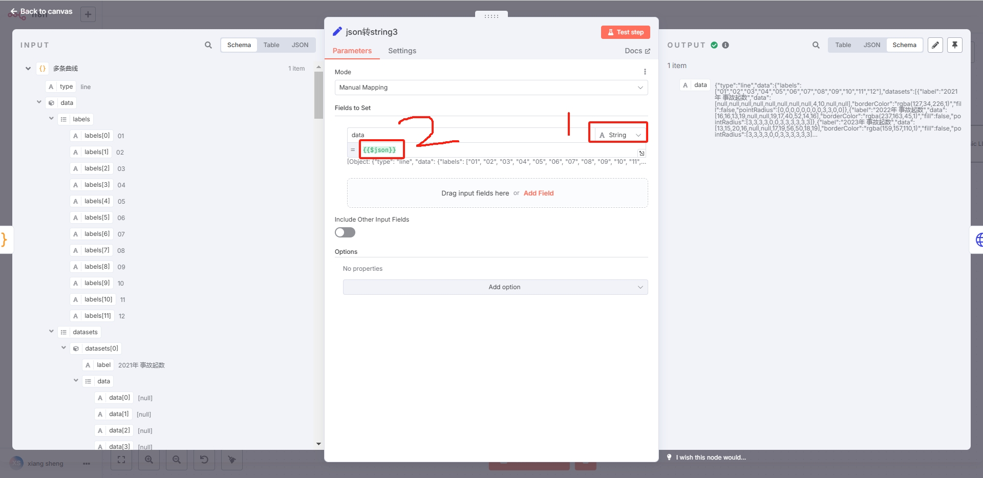
注:将json对象转换成字符串,主要图中的红框。
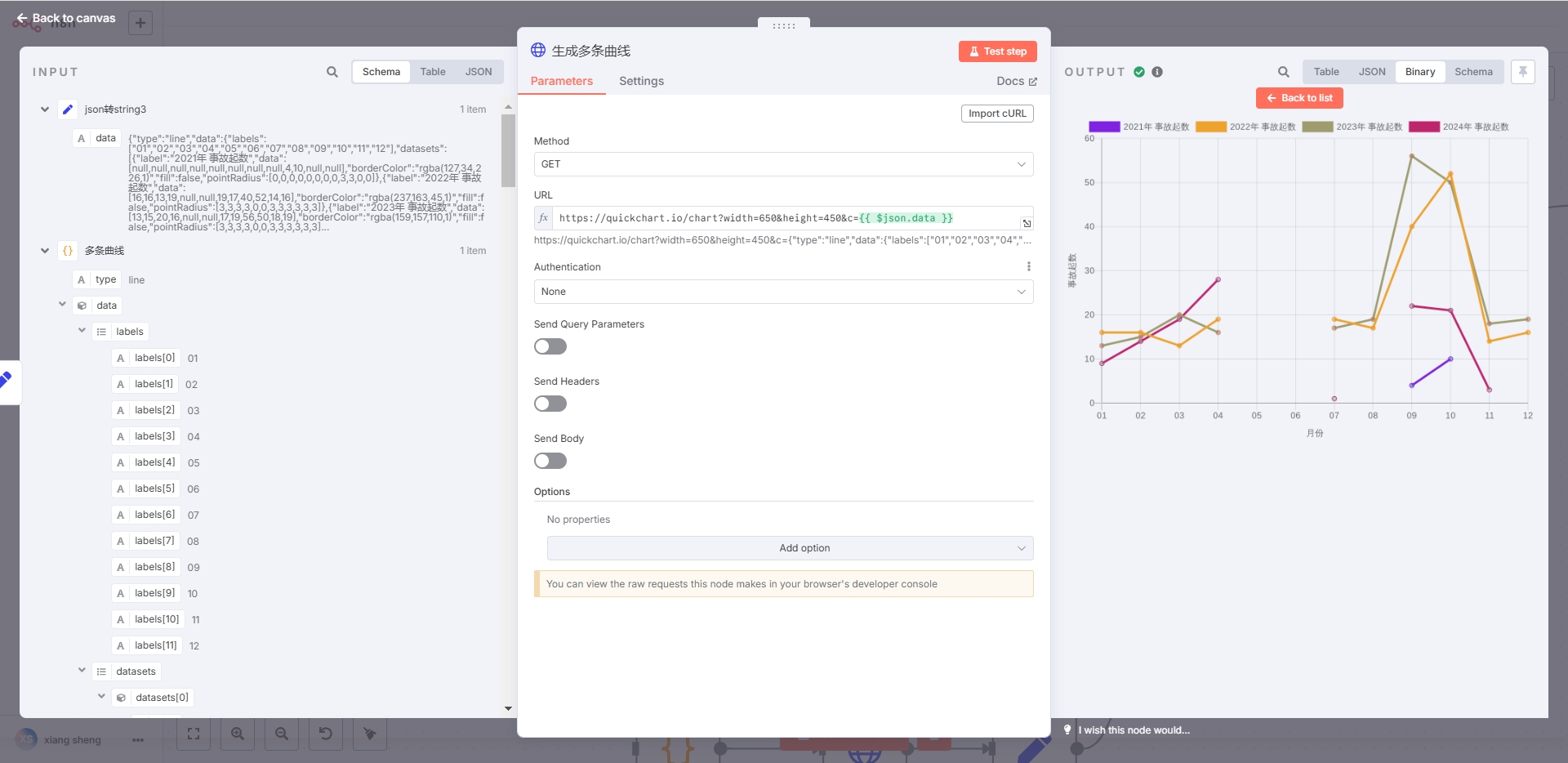
2.1.4HTTP Request节点:
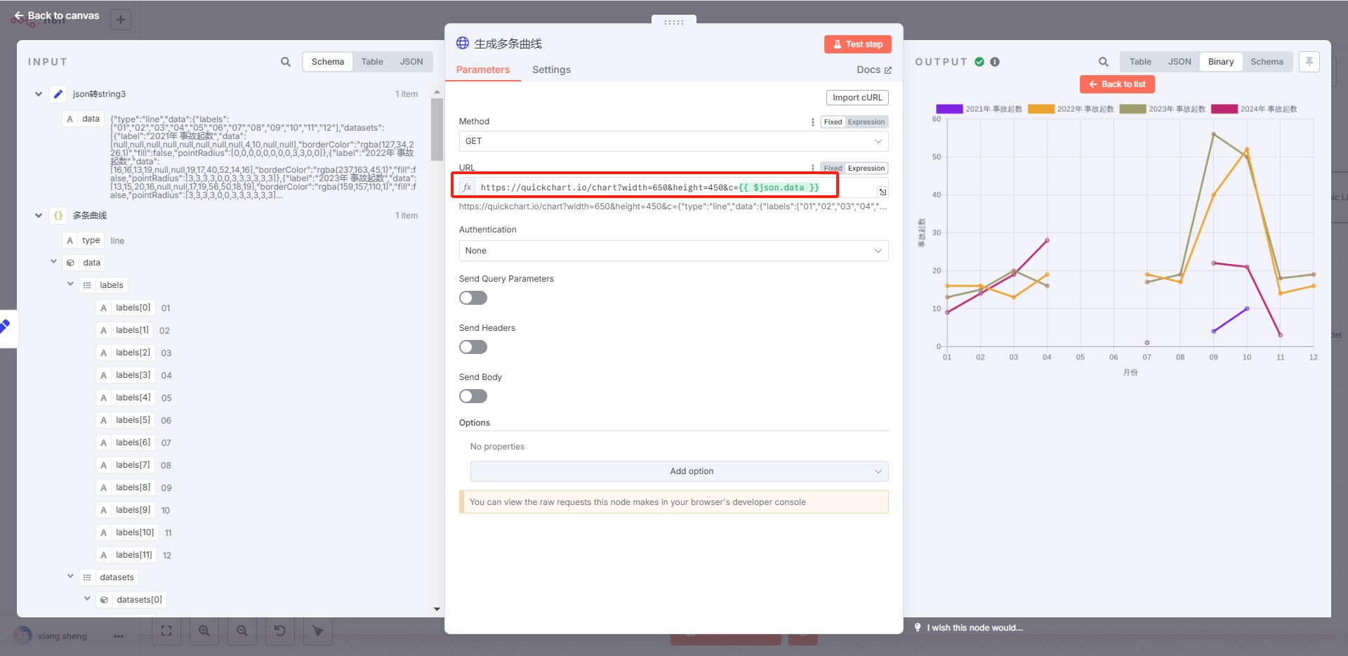
注:通过https://quickchart.io/chart?width=650&height=450&c={{ $json.data }}实现图片的生成,图中红框部分。
通过 QuickChart节点,最后也是转成url地址。因此不能在无互联网的环境下生成图片,希望有缘人提供更好的思路。
2.1.5QuickChart节点:
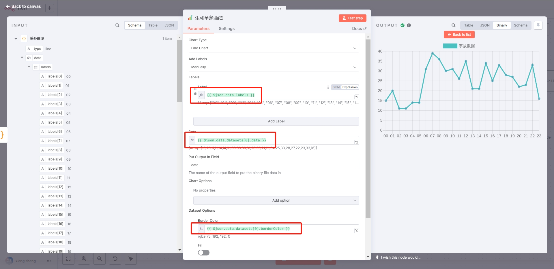
注:生成单曲线,单柱状图,通过 QuickChart节点没有问题,如果有上传多条曲线,则无法实现,只能通过https://quickchart.io/chart?width=650&height=450&c={{ $json.data }}方式实现。