一、CSS3变形(Transform)是一些效果的集合,有以下几种:
- 平移(Translate):元素沿水平或垂直方向移动。
- 旋转(Rotate):元素绕某点旋转一定的角度。
- 缩放(Scale):元素按一定比例放大或缩小。
- 倾斜(Skew):元素在水平或垂直方向上倾斜。
这些变形效果可以通过CSS属性来实现,例如transform属性。通过使用这些变形效果,可以创建各种动态的视觉效果和动画。
二、Transform语法
transform: none | <transform-function> [<transform-function>]*;
核心变换函数(transform-function)
2D变换函数:
translate(x, y)/translateX(x)/translateY(y)
移动元素(单位:px/%)scale(x, y)/scaleX(x)/scaleY(y)
缩放元素(无单位,1=原始大小)rotate(angle)
旋转元素(单位:deg/rad)skew(x-angle, y-angle)/skewX(angle)/skewY(angle)
倾斜元素(单位:deg)matrix(a, b, c, d, tx, ty)
2D矩阵变换
3D变换函数:
translate3d(x, y, z)
3D位移scale3d(x, y, z)
3D缩放rotate3d(x, y, z, angle)
自定义轴旋转matrix3d(...)
16参数的3D矩阵
三、2D位移
四、应用
1、translate平移
<!DOCTYPE html>
<html lang="zh-CN">

<head>
    <meta charset="UTF-8">
    <meta name="viewport" content="width=device-width, initial-scale=1.0">
    <title>位移变换(Translate)</title>
    <style>
        body {
            background: #f0f0f0;
            font-family: Arial, sans-serif;
            display: flex;
            justify-content: center;
            align-items: center;
            margin: 0;
            padding: 0;

        }

        .box {
            width: 100px;
            height: 100px;
            background: #e441c0;
            border-radius: 10px;
            transition: transform 0.5s; /* 变换过渡时间0.5s */
            margin: 50px auto;
            line-height: 100px;
            text-align: center;
            color: #f0f0f0;
        }

        /* 鼠标悬停时向右移动 */
        .box.bh:hover {
            transform: translateX(200px);
        }

        /* 鼠标悬停时向下移动 */
        .box.bv:hover {

            transform: translateY(200px);
        }

        /* 向右下角移动 */
        .box.move-diag:hover {
            transform: translate(200px, 200px);
        }
    </style>
</head>

<body>
    <div class="box bh">悬停左右</div>
    <div class="box bv">悬停上下</div>
    <div class="box move-diag">悬停右下</div>
</body>

</html>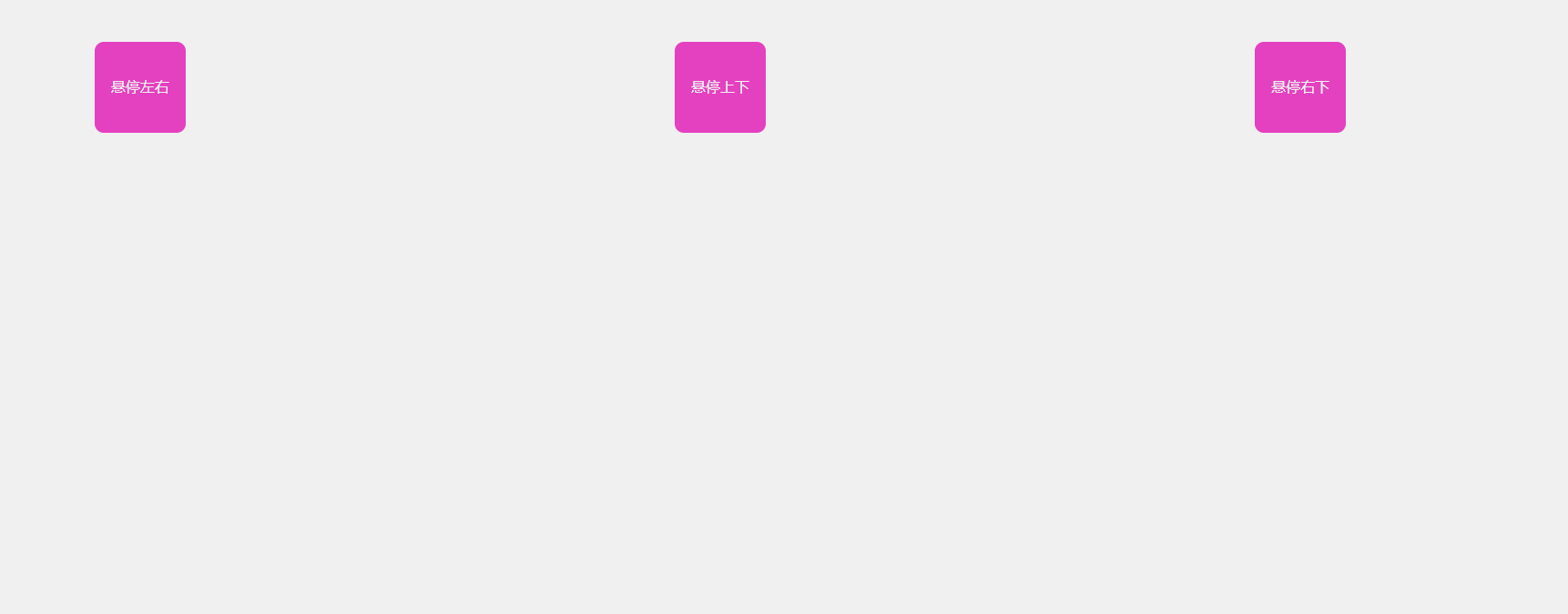
2、scale缩放
<!DOCTYPE html>
<html lang="zh-CN">

<head>
    <meta charset="UTF-8">
    <meta name="viewport" content="width=device-width, initial-scale=1.0">
    <title>scale 缩放案例</title>
    <style>
        body {
            display: flex; /* 设置为弹性布局 */
            justify-content: center; /* 水平居中 */
            align-items: center; /* 垂直居中 */
            height: 100vh; /* 设置高度为视口高度 */
        }

        .box {
            width: 120px;
            height: 120px;
            background: #ff9800;
            border-radius: 16px;
            margin: 60px auto;
            color: #fff;
            font-size: 20px;
            text-align: center;
            line-height: 120px;
            transition: transform 0.4s; /* 设置过渡效果 */
            box-shadow: 0 4px 16px rgba(0, 0, 0, 0.15);
        }

        /* 设置悬停时的缩放效果 */
        .box.big:hover {
            transform: scale(2.5);
        }

        .box.small:hover {
            transform: scale(0.5);
        }
    </style>
</head>

<body>
    <div class="box big">悬停放大</div>
    <div class="box small">悬停缩小</div>


</body>

</html>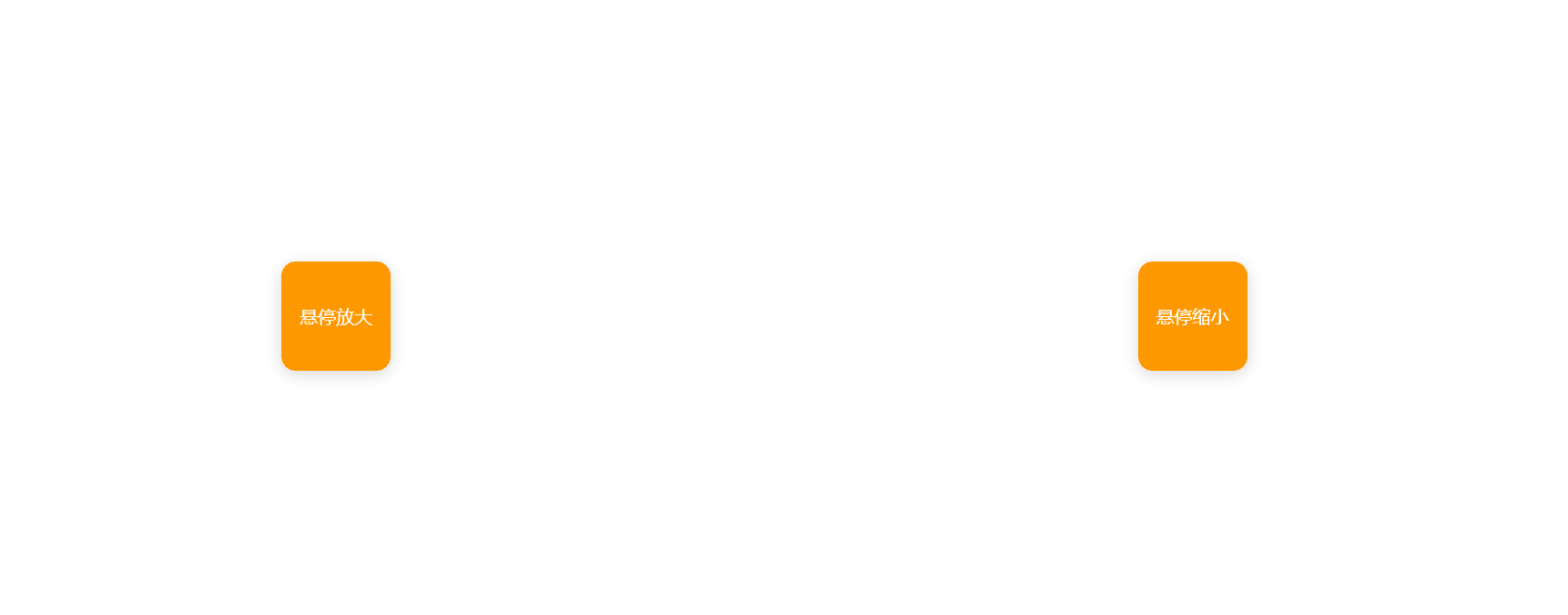
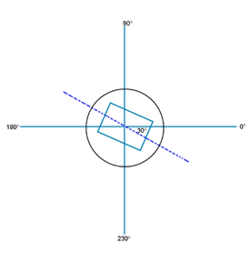
3、rotate旋转
rotate(a) :参数a取正值时元素相对原来中心顺时针旋转
<!DOCTYPE html>
<html lang="zh-CN">
<head>
    <meta charset="UTF-8">
    <meta name="viewport" content="width=device-width, initial-scale=1.0">
    <title>rotate 旋转案例</title>
    <style>

         img:hover {
            transform: rotate(360deg);
            transition: transform 1s;
         }
    </style>
</head>
<body>
    <div>悬停旋转360度</div>
    <img src="imgs/cat.png" alt="" width="500" height="500">
</body>
</html>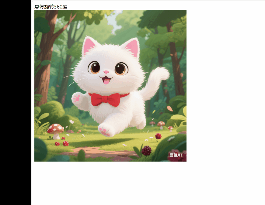
4、skew 倾斜
<!DOCTYPE html>
<html lang="zh-CN">
<head>
    <meta charset="UTF-8">
    <meta name="viewport" content="width=device-width, initial-scale=1.0">
    <title>skew 倾斜案例</title>
    <style>
        .skew-box {
            width: 300px;
            height: 120px;
            background: #b6ca6e;
            color: #fff;
            font-size: 28px;
            font-weight: bold;
            display: flex;
            align-items: center;
            justify-content: center;
            margin: 80px auto;
            border-radius: 16px;
            transition: transform 0.5s;
            box-shadow: inset 8px 16px 16px rgba(0,0,0,0.15);
        }
        .skew-box:hover {
            transform: skew(25deg, 15deg);
        }
    </style>
</head>
<body>
    <div class="skew-box">悬停倾斜</div>
</body>
</html>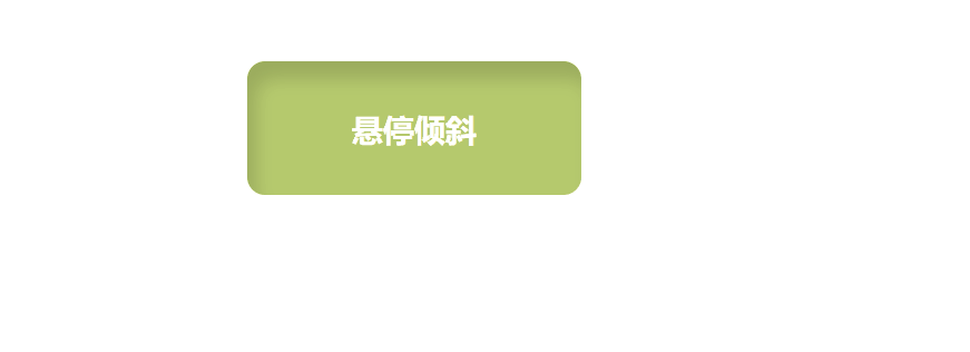
综合案例:
1.制作旋转按钮
<!DOCTYPE html>
<html lang="zh-CN">
<head>
    <meta charset="UTF-8">
    <title>制作旋转按钮</title>
    <style>
        .btn-list {
            display: flex; /* 使用flex布局 */
            gap: 60px; /* 按钮之间的间距 */
            margin: 40px 0px;

        }
        .btn-link {
            display: flex;
            flex-direction: column;
            align-items: center;
            text-decoration: none;
            color: #222;
            font-size: 20px;
            font-weight: bold;
            transition: color 0.3s; /* 文字颜色的过渡时间 */
        }
        .btn-link img {
            width: 48px;
            height: 48px;
            transition: transform 0.6s; /* 旋转和缩放的过渡时间 */
            display: block; /* 使图片独占一行 */
            margin-bottom: 8px;
        }
        /* 设置图片旋转360度,放大1.5倍*/
        .btn-link:hover img {
            transform: rotate(360deg) scale(1.5);
        }

        .btn-link:hover {
            color: #009fe8;
        }
    </style>
</head>
<body>
    <h1 style="color:#009fe8;font-size:40px;font-weight:bold;">制作旋转按钮</h1>
    <div class="btn-list">
        <a href="#" class="btn-link">
            <img src="https://cdn.jsdelivr.net/gh/twitter/twemoji@14.0.2/assets/72x72/1f4a1.png" alt="灯泡">
            灯泡
        </a>
        <a href="#" class="btn-link">
            <img src="https://cdn.jsdelivr.net/gh/twitter/twemoji@14.0.2/assets/72x72/1f680.png" alt="火箭">
            火箭
        </a>
        <a href="#" class="btn-link">
            <img src="https://cdn.jsdelivr.net/gh/twitter/twemoji@14.0.2/assets/72x72/1f525.png" alt="火焰">
            火焰
        </a>
    </div>
</body>
</html> 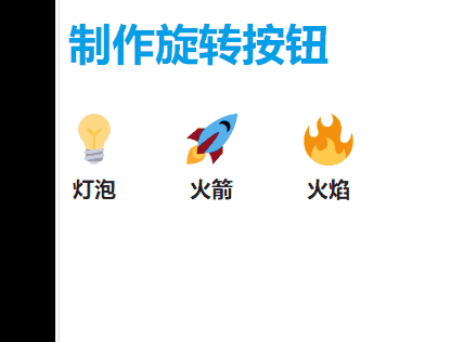
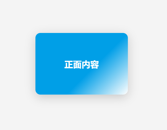
2. 3D卡片翻转特效
<!DOCTYPE html>
<html lang="zh-CN">
<head>
    <meta charset="UTF-8">
    <title>3D卡片翻转特效</title>
    <style>
        body {
            background: #f4f4f4;
            display: flex; /* 设置为弹性布局 */
            justify-content: center; /* 水平居中 */
            align-items: center; /* 垂直居中 */
            height: 100vh; /* 设置高度为视口高度 */
        }
        .card-container {
            perspective: 1000px; /* 设置透视效果 */
        }
        .card {
            width: 300px;
            height: 200px;
            position: relative;
            transform-style: preserve-3d;
            transition: transform 0.7s cubic-bezier(.23,1.02,.64,.98); /* 过渡效果 */
            cursor: pointer;
        }
        .card-container:hover .card {
            transform: rotateY(180deg);
        }

        .card-face {
            position: absolute;
            width: 100%;
            height: 100%;
            left: 0;
            top: 0;
            backface-visibility: hidden; /* 隐藏背面 */
            border-radius: 16px;
            box-shadow: 0 8px 32px rgba(0,0,0,0.18);
            display: flex;
            align-items: center;
            justify-content: center;
            font-size: 28px;
            font-weight: bold;
        }
        /* 正面和背面的样式 */
        .card-front {
            background: linear-gradient(135deg, #009fe8 60%, #fff 100%);
            color: #fff;
        }
        .card-back {
            background: linear-gradient(135deg, #ff9800 60%, #fff 100%);
            color: #fff;
            transform: rotateY(180deg); /* 翻转背面 */
        }
    </style>
</head>
<body>
    <div class="card-container">
        <div class="card">
            <div class="card-face card-front">正面内容</div>
            <div class="card-face card-back">背面内容</div>
        </div>
    </div>
</body>
</html>