本系列可作为前端学习系列的笔记,代码的运行环境是在HBuilder中,小编会将代码复制下来,大家复制下来就可以练习了,方便大家学习。
HTML和CSS系列文章 已经收录在前端专栏,有需要的宝宝们可以点击前端专栏查看!
点赞关注不迷路!您的点赞、关注和收藏是对小编最大的支持和鼓励!
系列文章目录
JavaScript- 1.1 行内、内部、外部三种引用方式
JavaScript- 3.1 定时器函数 window.settimeout & window.settinterval
JavaScript- 3.2 JavaScript实现不同显示器尺寸的响应式主题和页面
JavaScript- 4.1 DOM-document对象
目录
一、JavaScript实现不同显示器尺寸的响应式主题和页面
前言
小编作为新晋码农一枚,会定期整理一些写的比较好的代码,作为自己的学习笔记,会试着做一下批注和补充,如转载或者参考他人文献会标明出处,非商用,如有侵权会删改!欢迎大家斧正和讨论!
一、JavaScript实现不同显示器尺寸的响应式主题和页面
在JavaScript中,可以通过检测视口(viewport)大小来实现针对不同显示器尺寸应用不同的主题和页面布局。以下是几种实现方法:
1. 使用CSS媒体查询(推荐基础方案)
虽然这不是纯JavaScript方案,但通常是首选方法:
css
/* 默认主题 - 移动设备 */
:root {
  --primary-color: #4285f4;
  --background: #ffffff;
  --text-color: #333333;
}

/* 中等屏幕 - 平板 */
@media (min-width: 768px) {
  :root {
    --primary-color: #34a853;
    --background: #f8f9fa;
  }
}

/* 大屏幕 - 桌面 */
@media (min-width: 1024px) {
  :root {
    --primary-color: #ea4335;
    --background: #ffffff;
  }
}
2. 纯JavaScript实现
方法一:使用window.matchMedia()
javascript
function applyThemeBasedOnScreenSize() {
  const screenWidth = window.innerWidth;
  const body = document.body;

  // 移除所有现有主题类
  body.classList.remove('theme-mobile', 'theme-tablet', 'theme-desktop');

  if (screenWidth < 768) {
    body.classList.add('theme-mobile');
    // 可以在这里加载移动端特定的JS逻辑
  } else if (screenWidth >= 768 && screenWidth < 1024) {
    body.classList.add('theme-tablet');
    // 加载平板特定的JS逻辑
  } else {
    body.classList.add('theme-desktop');
    // 加载桌面特定的JS逻辑
  }
}

// 初始应用
applyThemeBasedOnScreenSize();

// 监听窗口大小变化
window.addEventListener('resize', applyThemeBasedOnScreenSize);
方法二:使用ResizeObserver(现代浏览器)
javascript
const observer = new ResizeObserver(entries => {
  for (let entry of entries) {
    const width = entry.contentRect.width;
    applyThemeBasedOnScreenSize(width);
  }
});

observer.observe(document.body);

function applyThemeBasedOnScreenSize(width) {
  // 实现与上面类似的逻辑
}
3. 动态加载不同资源
对于需要加载不同CSS或JS文件的情况:
javascript
function loadThemeResources() {
  const screenWidth = window.innerWidth;

  // 移除现有主题链接
  document.querySelectorAll('link[data-theme]').forEach(link => link.remove());

  let themeFile;
  if (screenWidth < 768) {
    themeFile = 'mobile-theme.css';
  } else if (screenWidth >= 768 && screenWidth < 1024) {
    themeFile = 'tablet-theme.css';
  } else {
    themeFile = 'desktop-theme.css';
  }

  // 动态加载CSS
  const link = document.createElement('link');
  link.rel = 'stylesheet';
  link.href = themeFile;
  link.setAttribute('data-theme', 'true');
  document.head.appendChild(link);
}

// 初始加载
loadThemeResources();

// 监听窗口变化
window.addEventListener('resize', debounce(loadThemeResources, 200));

// 防抖函数,避免频繁重绘
function debounce(func, wait) {
  let timeout;
  return function() {
    clearTimeout(timeout);
    timeout = setTimeout(func, wait);
  };
}
4. 结合CSS变量和JavaScript
更灵活的方案是使用CSS变量配合JavaScript:
javascript
// 定义不同屏幕尺寸的主题配置
const themes = {
  mobile: {
    primary: '#4285f4',
    background: '#ffffff',
    text: '#333333',
    layout: 'vertical'
  },
  tablet: {
    primary: '#34a853',
    background: '#f8f9fa',
    text: '#222222',
    layout: 'grid'
  },
  desktop: {
    primary: '#ea4335',
    background: '#ffffff',
    text: '#111111',
    layout: 'horizontal'
  }
};

function applyTheme() {
  const screenWidth = window.innerWidth;
  let theme;

  if (screenWidth < 768) {
    theme = themes.mobile;
  } else if (screenWidth >= 768 && screenWidth < 1024) {
    theme = themes.tablet;
  } else {
    theme = themes.desktop;
  }

  // 应用CSS变量
  const root = document.documentElement;
  Object.keys(theme).forEach(key => {
    root.style.setProperty(`--${key}`, theme[key]);
  });

  // 根据布局调整页面结构
  applyLayout(theme.layout);
}

function applyLayout(layout) {
  // 实现布局调整逻辑
  console.log(`Applying ${layout} layout`);
}

// 初始应用和监听
applyTheme();
window.addEventListener('resize', debounce(applyTheme, 200));
5. 使用CSS框架的响应式工具
如果你使用Bootstrap等框架,可以利用其内置的响应式工具:
javascript
// 使用Bootstrap的断点检测
function isMobile() {
  return window.matchMedia('(max-width: 767px)').matches;
}

function isTablet() {
  return window.matchMedia('(min-width: 768px) and (max-width: 1023px)').matches;
}

function isDesktop() {
  return window.matchMedia('(min-width: 1024px)').matches;
}

// 根据设备类型执行不同逻辑
if (isMobile()) {
  // 移动端逻辑
} else if (isTablet()) {
  // 平板逻辑
} else if (isDesktop()) {
  // 桌面逻辑
}
6.最佳实践建议
- 移动优先:先设计移动端体验,再逐步增强大屏幕体验
- 使用CSS媒体查询为主:尽可能用CSS解决布局问题,JS用于复杂逻辑
- 防抖处理:resize事件频繁触发,务必使用防抖
- 考虑服务器端渲染:对于关键内容,可在服务器端根据设备类型返回不同HTML
- 测试实际设备:不要仅依赖浏览器缩放,在实际设备上测试
通过以上方法,你可以创建适应不同显示器尺寸的响应式主题和页面布局。
二、代码实践
1、获取屏幕大小
HTML
<!DOCTYPE html>
<html>
<head>
<meta charset="utf-8">
<title>BOM--navigator\screen</title>
</head>
<body>
<script type="text/javascript">
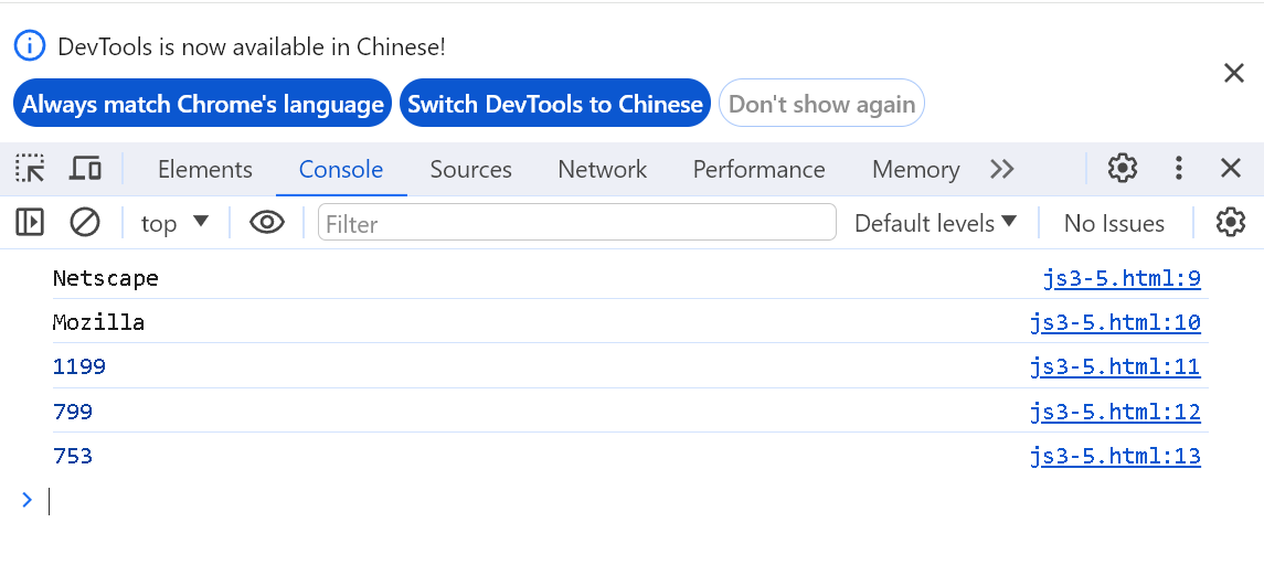
console.log(navigator.appName);
console.log(navigator.appCodeName);
console.log(screen.width);
console.log(screen.height);
console.log(screen.availHeight);
</script>
</body>
</html>
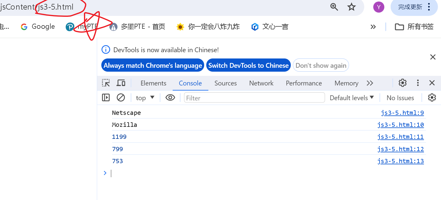
代码运行如下:
2、屏幕的高度和宽度不同时,显示不同的页面
代码如下:
<!DOCTYPE html>
<html>
	<head>
		<meta charset="utf-8">
		<title>不同大小的显示器不同主题</title>
	</head>
	<body>
		<script type="text/javascript">
			var h,w;
			h=screen.availHeight;
			w=screen.availWidth;
			// test1 当屏幕的高度和宽度不同时,显示不同的页面
			if(h>800 && w>1200){
				console.log(location.href);
				location.href="js3-4.html";
				}
			else{
					location.href="js3-5.html";
				}

			//test2 当屏幕的高度和宽度不同时,打印不同的内容
			// if(h > 800 && w > 1200) {
			// 	console.log("高度大于800且宽度大于1200");
			//
			// 	} else {
			// 	console.log("高度小于等于800或宽度小于等于1200");
			//
			// 	}

		</script>
	</body>
</html>
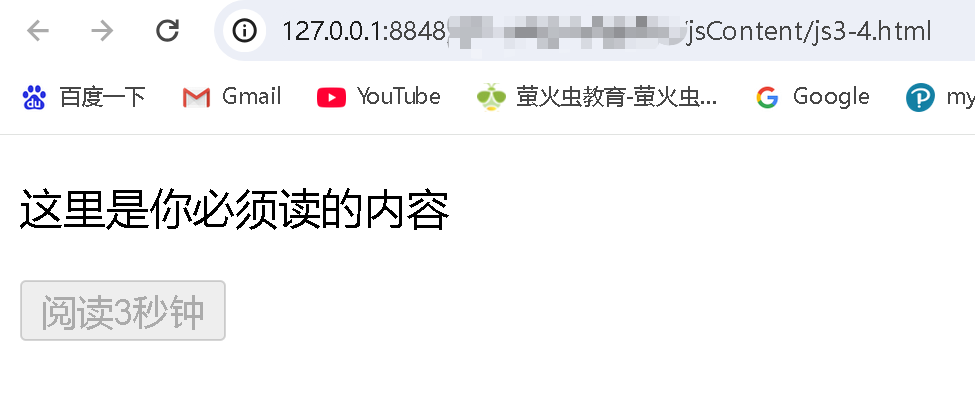
代码运行如下:
可以看到高度小于800,且宽度也小于1200,显示 js3-5.html
这里如果把两个条件调换,可以看到变成了js3-4.html页面
3、屏幕的高度和宽度不同时,打印不同的内容
代码如下:
<!DOCTYPE html>
<html>
	<head>
		<meta charset="utf-8">
		<title>不同大小的显示器不同主题</title>
	</head>
	<body>
		<script type="text/javascript">
			var h,w;
			h=screen.availHeight;
			w=screen.availWidth;
			// test1 当屏幕的高度和宽度不同时,显示不同的页面
			// if(h>800 && w>1200){
			// 	console.log(location.href);
			// 	location.href="js3-5.html";
			// 	// location.href="js3-4.html";
			// 	}
			// else{
			// 		// location.href="js3-5.html";
			// 		location.href="js3-4.html";
			// 	}

			// test2 当屏幕的高度和宽度不同时,打印不同的内容
			if(h > 800 && w > 1200) {
				console.log("高度大于800且宽度大于1200");

				} else {
				console.log("高度小于等于800或宽度小于等于1200");

				}

		</script>
	</body>
</html>
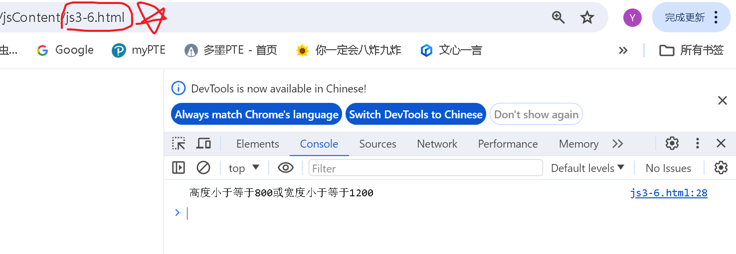
代码运行如下:
总结
以上就是今天要讲的内容,本文简单记录了JavaScript实现不同显示器尺寸的响应式主题和页面 ,仅作为一份简单的笔记使用,大家根据注释理解