一、搜索空
css:
.search-container {
    padding: 10px 15px;
}

.search-input {
    height: 40px;
    width: 100%;
    justify-content: center;
    align-items: center;
    border-radius: 6px;
    border: 0.5px solid #ee742f;
}

.search-input-image {
    width: 20px;
    height: 20px;
}

.search-input-text {
    font-size: 12px;
    font-weight: 100;
}

.index-inner-bg {
    background-color: #fff;
}

.cate-inner-bg {
    background-color: #f2f2f2;
    border-width: 0;
}

.index-outer-bg {
    background-color: #f2f2f2;
}

.cate-outer-bg {
    background-color: #fff;
}
hml:
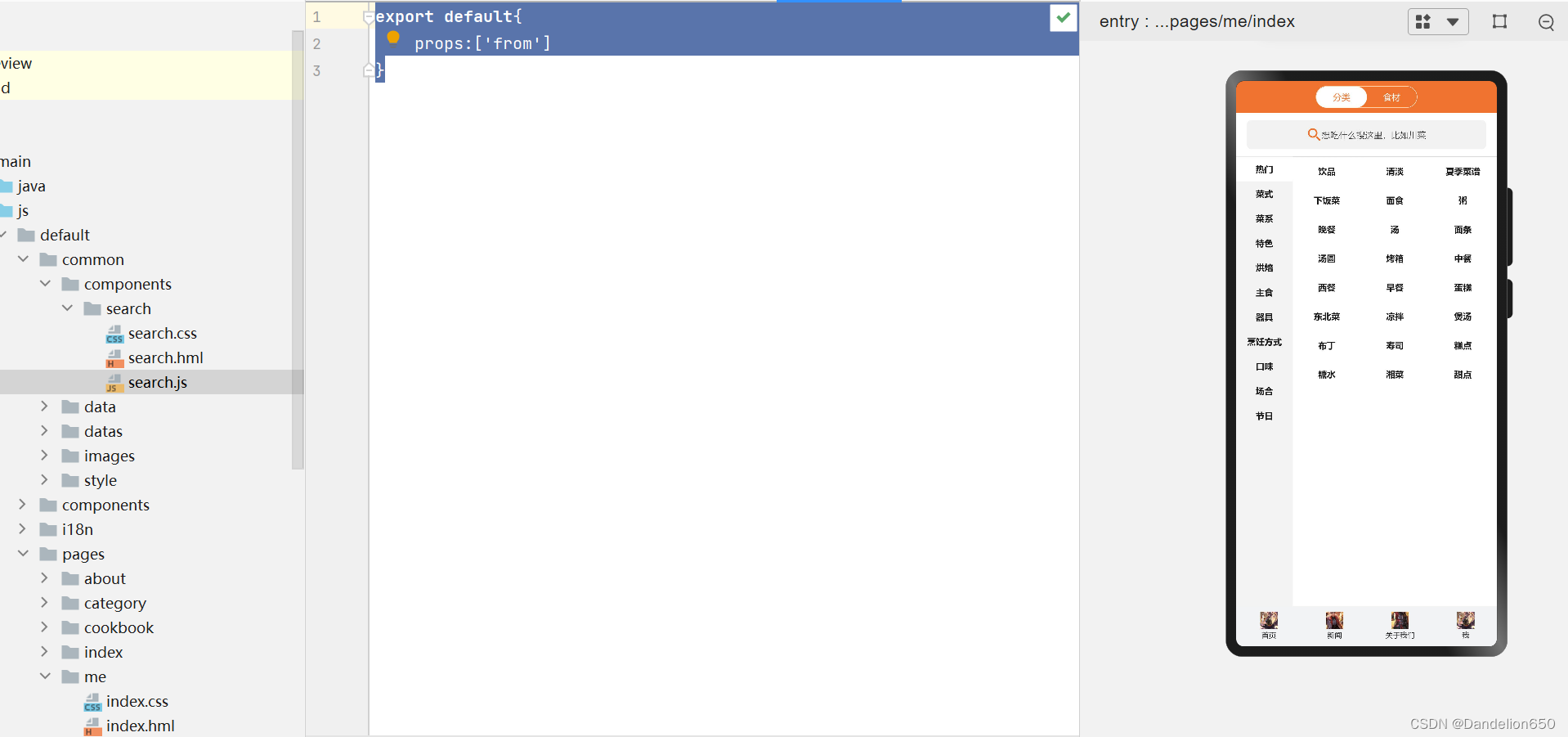
<div class="search-container {{from==='cate'?'cate-outer-bg':'index-outer-bg'}}">
    <div class="search-input {{from==='cate'?'cate-inner-bg':'index-inner-bg'}}">
        <image class="search-input-image" src="/common/images/search.png"></image>
        <text class="search-input-text">想吃什么搜这里,比如川菜</text>
    </div>
</div>
js:
export default{
    props:['from']
}
二、清单:
css:
.container {
    flex-direction: column;
    justify-content: center;
    align-items: center;
    width: 100%;
    height: 100%;
}

.title {
    font-size: 40px;
    color: #000000;
    opacity: 0.9;
}

.cate-container {
    flex-direction: column;
}

.cate-header {
    width: 100%;
    height: 44px;
    background-color: #ee742f;
    justify-content: center;
    align-items: center;
}

.cate-header-nav {
    width: 140px;
    height: 30px;
    border-radius: 30px;
    border: 0.5px solid #FFF;
    position: relative;
    z-index: 1;
}

.cate-header-nav-item {
    flex: 1;
    justify-content: center;
    align-items: center;
    height: 30px;
}

.item-text {
    font-size: 12px;
    color: #FFF;
}

.cate-header-nav-slider {
    position: absolute;
    left: 0;
    border-radius: 30px;
    width: 70px;
    height: 30px;
    background-color: #FFF;
    z-index: 0;
    justify-content: center;
    align-items: center;
    transition: left 200ms ease-in;
}

.slider-text {
    font-size: 12px;
    color: #ee742f;
}

.move {
    left: 70px;
}


@media screen and (device-type: tablet) and (orientation: landscape) {
    .title {
        font-size: 100px;
    }
}

@media screen and (device-type: wearable) {
    .title {
        font-size: 28px;
        color: #FFFFFF;
    }
}

@media screen and (device-type: tv) {
    .container {
        background-image: url("/common/images/Wallpaper.png");
        background-size: cover;
        background-repeat: no-repeat;
        background-position: center;
    }

    .title {
        font-size: 100px;
        color: #FFFFFF;
    }
}

@media screen and (device-type: phone) and (orientation: landscape) {
    .title {
        font-size: 60px;
    }
}
hml:
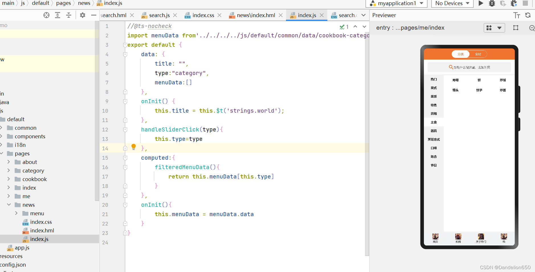
<element name='comp' src='../../components/tabbar/tabbar.hml'></element>
<element name="cb-menu" src="./menu/menu"></element>
<element name="cb-search" src="../../common/components/search/search"></element>
<div class="cate-container">
    <div class="cate-header">
        <div class="cate-header-nav">
            <div class="cate-header-nav-item"@click="handleSliderClick('category')">
                <text class="item-text">
                    分类
                </text>
            </div>
            <div class="cate-header-nav-item"@click="handleSliderClick('material')">
                <text class="item-text">
                    食材
                </text>
            </div>
            <div if="{{type==='category'}}" class="cate-header-nav-slider">
                <text class="slider-text">
                    分类
                </text>
            </div>
            <div else class="cate-header-nav-slider move">
                <text class="slider-text">
                    食材
                </text>
            </div>
        </div>
    </div>
    <cb-search from="cate"></cb-search>
    <cb-menu menu-data="{{filteredMenuData}}" first-item="{{type==='category'?'热门':'肉类'}}"></cb-menu>
    <comp index="1"></comp>
</div>
js:
//@ts-nocheck
import menuData from'../../../../js/default/common/data/cookbook-category.json'
export default {
    data: {
        title: "",
        type:"category",
        menuData:[]
    },
    onInit() {
        this.title = this.$t('strings.world');
    },
    handleSliderClick(type){
        this.type=type
    },
    computed:{
        filteredMenuData(){
            return this.menuData[this.type]
        }
    },
    onInit(){
        this.menuData = menuData.data
    }
}
本文含有隐藏内容,请 开通VIP 后查看