TextInput文本输入组件,用于接收用户输入的文本内容。
1、TextInput组件的参数
TextInput(value?:{placeholder?: string|Resource , text?: string|Resource})
- placeholder属性用于设置无输入时的提示文本
- text用于设置输入框当前的文本内容
@Entry
@Component
struct textInput {
  @State isOn: boolean = true;

  build() {
    Column({ space: 10 }) {
      Text('文本输入框 TextInput').fontSize(25)
      TextInput({'placeholder':'输入文本内容','text':''}).width(200).height(50)
    }
    .width('100%')
    .height("100%")
    .justifyContent(FlexAlign.Center)
  }
}
2、常用属性及事件
- 输入框类型
- 光标样式
- 文本样式
- change事件
- 焦点事件
2.1 输入框类型
可通过type()方法设置输入框的类型,该方法的参数为InputType枚举类型,可选的枚举值有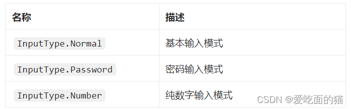
@Entry
@Component
struct textInput {
  @State isOn: boolean = true;

  build() {
    Column({ space: 10 }) {
      Text('文本输入框 TextInput').fontSize(25)
      TextInput({'placeholder':'基本输入','text':''}).type(InputType.Normal).width(200).height(50)
      TextInput({'placeholder':'数字','text':''}).type(InputType.Number).width(200).height(50)
      TextInput({'placeholder':'密码','text':''}).type(InputType.Password).width(200).height(50)
    }
    .width('100%')
    .height("100%")
    .justifyContent(FlexAlign.Center)
  }
}
2.2 placeholder样式
placeholder样式还可通过placeholderFont()和placeholderColor()方法设置 placeholder 的样式,其中placeholderFont()用于设置字体,包括字体大小、字体粗细等,placeholderColor()用于设置字体颜色
@Entry
@Component
struct textInput {
  @State isOn: boolean = true;

  build() {
    Column({ space: 10 }) {
      Text('文本输入框 TextInput').fontSize(25)
      TextInput({'placeholder':'基本输入','text':''})
        .placeholderFont({weight:'800'})
        .placeholderColor(Color.Orange)
        .type(InputType.Normal)
        .width(200)
        .height(50)

    }
    .width('100%')
    .height("100%")
    .justifyContent(FlexAlign.Center)
  }
}
2.3 光标样式
可通过caretColor()方法设置光标的颜色
TextInput({'placeholder':'光标颜色','text':''}).type(InputType.Normal).caretColor(Color.Blue).width(200).height(50)2.4 文本样式
输入文本的样式可通过fontSize()、fontWeight()、fontColor()等通用属性方法进行设置
2.5 change事件
每当输入的内容发生变化,就会触发 change 事件,开发者可使用onChange()方法为TextInput组件绑定 change 事件。
@Entry
@Component
struct textInput {
  @State isOn: boolean = true;

  build() {
    Column({ space: 10 }) {
      Text('文本输入框 TextInput').fontSize(25)
      TextInput({ 'placeholder': '光标颜色', 'text': '' })
        .type(InputType.Normal)
        .caretColor(Color.Blue)
        .onChange((content) => {
          console.log(content);
        })
        .width(200)
        .height(50)
    }
    .width('100%')
    .height("100%")
    .justifyContent(FlexAlign.Center)
  }
}
2.6 焦点事件
焦点事件包括获得焦点和失去焦点两个事件,当输入框获得焦点时,会触发 focus 事件,失去焦点时,会触发 blur 事件,开发者可使用onFocus()和onBlur()方法为 TextInput 组件绑定相关事件。
@Entry
@Component
struct textInput {
  @State isOn: boolean = true;

  build() {
    Column({ space: 10 }) {
      Text('文本输入框 TextInput').fontSize(25)
      TextInput({ 'placeholder': '光标颜色', 'text': '' })
        .type(InputType.Normal)
        .caretColor(Color.Blue)
        .onChange((content) => {
          console.log(content);
        })
        .onFocus(() => {
          console.log('输入框获得焦点');
        })
        .onBlur(() => {
          console.log('输入框失去焦点');
        })
        .width(200)
        .height(50)

      TextInput({ 'placeholder': '测试', 'text': '' })
        .width(200)
        .height(50)

    }
    .width('100%')
    .height("100%")
    .justifyContent(FlexAlign.Center)
  }
}
本文含有隐藏内容,请 开通VIP 后查看