本文实现了三种移动端实现一像素边框的方法
思路
- 给准备给加边框的加伪元素,给伪元素加边框
- 判断当前设备dpr,根据不同设备宽高放大两倍或者三倍
- 再根据当前像素比进行缩放0.5或者0.33333
vue中可使用stylus或者sass实现一像素边框
stylus版
$border(width = 0, color = #ccc, style = solid, radius = 0)
  position relative
  border-radius radius
  &::after
    pointer-events none
    position absolute
    z-index 999
    top 0
    left 0
    content ""
    border-color color
    border-style style
    border-width width

    @media (max--moz-device-pixel-ratio: 1.49),
      (-webkit-max-device-pixel-ratio: 1.49),
      (max-device-pixel-ratio: 1.49),
      (max-resolution: 143dpi),
      (max-resolution: 1.49dppx)
      width 100%
      height 100%
      transform scale(1)
      border-radius radius

    @media (min--moz-device-pixel-ratio: 1.5) and (max--moz-device-pixel-ratio: 2.49),
      (-webkit-min-device-pixel-ratio: 1.5) and (-webkit-max-device-pixel-ratio: 2.49),
      (min-device-pixel-ratio: 1.5) and (max-device-pixel-ratio: 2.49),
      (min-resolution: 144dpi) and (max-resolution: 239dpi),
      (min-resolution: 1.5dppx) and (max-resolution: 2.49dppx)
      width 200%
      height 200%
      transform scale(0.5)
      border-radius radius \* 2

    @media (min--moz-device-pixel-ratio: 2.5),
      (-webkit-min-device-pixel-ratio: 2.5),
      (min-device-pixel-ratio: 2.5),
      (min-resolution: 240dpi),
      (min-resolution: 2.5dppx)
      width 300%
      height 300%
      transform scale(0.3333333)
      border-radius radius \* 3

    transform-origin 0 0
使用:
@import '~assets/border.styl'
div
	$border(1px 0 0 0, #eee)
sass版
封装一个mixin方法
@mixin border\_1px($color) {
  position: relative;
  @media (-webkit-min-device-pixel-ratio: 1.5), (min-device-pixel-ratio: 1.5) {
    &::before {
      content: " ";
      position: absolute;
      left: 0px;
      top: 0px;
      background-color: $color;
      transform: scaleY(0.667);
      height: 1px;
      width: 100%;
    }
  }

  @media (-webkit-min-device-pixel-ratio: 2), (min-device-pixel-ratio: 2) {
    &::before {
      content: " ";
      position: absolute;
      left: 0px;
      top: 0px;
      background-color: $color;
      transform: scaleY(0.5);
      height: 1px;
      width: 100%;
    }
  }

  @media (-webkit-min-device-pixel-ratio: 3), (min-device-pixel-ratio: 3) {
    &::before {
      content: " ";
      position: absolute;
      left: 0px;
      top: 0px;
      background-color: $color;
      transform: scaleY(0.333);
      height: 1px;
      width: 100%;
    }
  }
}
使用方法:直接在css里面设置即可
@include border\_1px(rgb(211, 208, 208));
react使用styled-components实现一像素边框
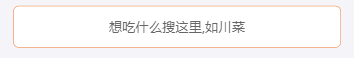
实现效果
文件夹创建如下
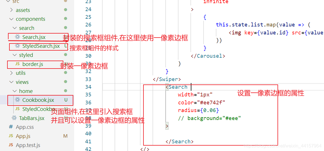
- Cookbook.jsx是一个页面组件,需要引入搜索框的组件Search.js
- Search.js是一个搜索框的组件,从StyledSearch.js中导入了SearchContainer,InputContainer两个styled-compoenet样式设置当前搜索框的样式
- border.js是封装一像素边框的一个文件,哪个组件引用它就会给哪个组件添加一像素边框
border.js
border是一个高阶组件,这里需要传过来一个组件,返回的是一个设置完一像素边框的组件
border设置了一些默认属性,color style width radius ,如果不传值的话则会显示默认的属性
安装 styled-componentsyarn add styled-components -S
import styled from "styled-components"
const border = (StyledComp) => {
return styled(StyledComp)`
position:relative;
border-radius:${props=>props.radius || 0}rem;
&::after{
pointer-events:none;
position:absolute;
z-index:999;
top: 0;
left: 0;
content: "";
border-color: ${props=>props.color || "#ccc"};
border-style: ${props=>props.style || "solid"};
border-width: ${props=>props.width || 0};
@media (max--moz-device-pixel-ratio: 1.49),
(-webkit-max-device-pixel-ratio: 1.49),
(max-device-pixel-ratio: 1.49),
(max-resolution: 143dpi),
(max-resolution: 1.49dppx){
width: 100%;
height :100%;
transform: scale(1);
border-radius: ${props=>props.radius || 0}rem;
}
@media (min--moz-device-pixel-ratio: 1.5) and (max--moz-device-pixel-ratio: 2.49),
(-webkit-min-device-pixel-ratio: 1.5) and (-webkit-max-device-pixel-ratio: 2.49),
(min-device-pixel-ratio: 1.5) and (max-device-pixel-ratio: 2.49),
(min-resolution: 144dpi) and (max-resolution: 239dpi),
(min-resolution: 1.5dppx) and (max-resolution: 2.49dppx){
width: 200%;
height: 200%;
transform: scale(0.5);
border-radius: ${props=>props.radius\*2 || 0}rem;
}
@media (min--moz-device-pixel-ratio: 2.5),
(-webkit-min-device-pixel-ratio: 2.5),
(min-device-pixel-ratio: 2.5),
(min-resolution: 240dpi),
(min-resolution: 2.5dppx){
width :300%;
height :300%;
transform :scale(0.3333333);
border-radius: ${props=>props.radius\*3 || 0}rem;
}
### 最后
除了简历做到位,面试题也必不可少,整理了些题目,前面有117道汇总的面试到的题目,后面包括了HTML、CSS、JS、ES6、vue、微信小程序、项目类问题、笔试编程类题等专题。