这个页面采用了现代化的 UI 设计,包括卡片式布局、微交互动画、分层设计和响应式结构。页面结构清晰,包含导航栏、英雄区域、功能介绍、产品特性、用户评价和联系表单等完整组件,可作为企业官网或产品介绍页面的基础模板。
<!DOCTYPE html>
<html lang="zh-CN">
<head>
<meta charset="UTF-8">
<meta name="viewport" content="width=device-width, initial-scale=1.0">
<title>创新科技 | 领先的解决方案</title>
<script src="https://cdn.tailwindcss.com"></script>
<link href="https://cdnjs.cloudflare.com/ajax/libs/font-awesome/6.7.2/css/all.min.css" rel="stylesheet">
<script>
tailwind.config = {
theme: {
extend: {
colors: {
primary: '#165DFF',
secondary: '#36CFC9',
accent: '#FF7D00',
dark: '#1D2129',
light: '#F2F3F5'
},
fontFamily: {
inter: ['Inter', 'system-ui', 'sans-serif'],
},
}
}
}
</script>
<style type="text/tailwindcss">
@layer utilities {
.content-auto {
content-visibility: auto;
}
.text-shadow {
text-shadow: 0 2px 4px rgba(0,0,0,0.1);
}
.transition-custom {
transition: all 0.3s cubic-bezier(0.4, 0, 0.2, 1);
}
.hover-scale {
@apply hover:scale-105 transition-all duration-300;
}
.card-shadow {
box-shadow: 0 10px 25px -5px rgba(0, 0, 0, 0.05), 0 8px 10px -6px rgba(0, 0, 0, 0.02);
}
}
</style>
</head>
<body class="font-inter bg-white text-dark">
<!-- 导航栏 -->
<header id="navbar" class="fixed w-full top-0 z-50 transition-all duration-300 bg-white/95 backdrop-blur-sm shadow-sm">
<div class="container mx-auto px-4 sm:px-6 lg:px-8">
<div class="flex justify-between items-center h-16">
<div class="flex items-center">
<a href="#" class="flex items-center">
<i class="fa-solid fa-cube text-primary text-2xl mr-2"></i>
<span class="text-xl font-bold text-primary">创新科技</span>
</a>
</div>
<!-- 桌面导航 -->
<nav class="hidden md:flex space-x-8">
<a href="#features" class="text-dark hover:text-primary transition-colors font-medium">功能</a>
<a href="#products" class="text-dark hover:text-primary transition-colors font-medium">产品</a>
<a href="#testimonials" class="text-dark hover:text-primary transition-colors font-medium">评价</a>
<a href="#contact" class="text-dark hover:text-primary transition-colors font-medium">联系我们</a>
</nav>
<div class="hidden md:flex items-center space-x-4">
<a href="#" class="px-4 py-2 text-primary border border-primary rounded-lg hover:bg-primary/5 transition-colors">登录</a>
<a href="#" class="px-4 py-2 bg-primary text-white rounded-lg hover:bg-primary/90 transition-colors shadow-md hover:shadow-lg">注册</a>
</div>
<!-- 移动端菜单按钮 -->
<div class="md:hidden">
<button id="menu-toggle" class="text-dark hover:text-primary">
<i class="fa-solid fa-bars text-xl"></i>
</button>
</div>
</div>
</div>
<!-- 移动端导航菜单 -->
<div id="mobile-menu" class="hidden md:hidden bg-white border-t">
<div class="container mx-auto px-4 py-3 space-y-2">
<a href="#features" class="block py-2 text-dark hover:text-primary">功能</a>
<a href="#products" class="block py-2 text-dark hover:text-primary">产品</a>
<a href="#testimonials" class="block py-2 text-dark hover:text-primary">评价</a>
<a href="#contact" class="block py-2 text-dark hover:text-primary">联系我们</a>
<div class="pt-2 flex flex-col space-y-2">
<a href="#" class="py-2 text-center text-primary border border-primary rounded-lg hover:bg-primary/5 transition-colors">登录</a>
<a href="#" class="py-2 text-center bg-primary text-white rounded-lg hover:bg-primary/90 transition-colors">注册</a>
</div>
</div>
</div>
</header>
<!-- 英雄区域 -->
<section class="pt-24 pb-16 md:pt-32 md:pb-24 bg-gradient-to-br from-primary/5 to-secondary/5">
<div class="container mx-auto px-4 sm:px-6 lg:px-8">
<div class="flex flex-col lg:flex-row items-center">
<div class="w-full lg:w-1/2 mb-10 lg:mb-0">
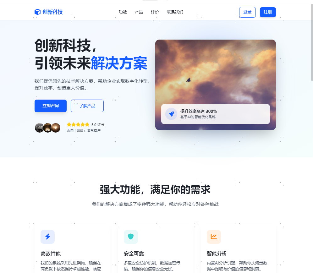
<h1 class="text-[clamp(2rem,5vw,3.5rem)] font-bold leading-tight text-dark mb-6">
创新科技,<br>引领未来<span class="text-primary">解决方案</span>
</h1>
<p class="text-lg text-gray-600 mb-8 max-w-xl">
我们提供领先的技术解决方案,帮助企业实现数字化转型,提升效率,创造更大价值。
</p>
<div class="flex flex-col sm:flex-row space-y-4 sm:space-y-0 sm:space-x-4">
<a href="#contact" class="px-8 py-3 bg-primary text-white rounded-lg hover:bg-primary/90 transition-all shadow-lg hover:shadow-xl hover:-translate-y-0.5 text-center">
立即咨询
</a>
<a href="#products" class="px-8 py-3 border border-primary text-primary rounded-lg hover:bg-primary/5 transition-all text-center">
了解产品
</a>
</div>
<div class="mt-10 flex items-center space-x-6">
<div class="flex -space-x-2">
<img src="https://picsum.photos/seed/user1/40/40" alt="用户头像" class="w-10 h-10 rounded-full border-2 border-white">
<img src="https://picsum.photos/seed/user2/40/40" alt="用户头像" class="w-10 h-10 rounded-full border-2 border-white">
<img src="https://picsum.photos/seed/user3/40/40" alt="用户头像" class="w-10 h-10 rounded-full border-2 border-white">
</div>
<div>
<div class="flex items-center mb-1">
<div class="flex">
<i class="fa-solid fa-star text-yellow-400"></i>
<i class="fa-solid fa-star text-yellow-400"></i>
<i class="fa-solid fa-star text-yellow-400"></i>
<i class="fa-solid fa-star text-yellow-400"></i>
<i class="fa-solid fa-star text-yellow-400"></i>
</div>
<span class="ml-2 text-sm font-medium">5.0 评分</span>
</div>
<p class="text-sm text-gray-600">来自 1000+ 满意客户</p>
</div>
</div>
</div>
<div class="w-full lg:w-1/2 relative">
<div class="relative rounded-2xl overflow-hidden shadow-2xl transform hover:scale-[1.01] transition-all duration-500">
<img src="https://picsum.photos/seed/tech/800/600" alt="创新科技解决方案" class="w-full h-auto">
<div class="absolute inset-0 bg-gradient-to-t from-primary/30 to-transparent"></div>
<div class="absolute bottom-6 left-6 right-6 bg-white/90 backdrop-blur-sm p-4 rounded-xl shadow-lg">
<div class="flex items-center space-x-3">
<div class="w-12 h-12 rounded-full bg-primary/10 flex items-center justify-center">
<i class="fa-solid fa-rocket text-primary text-xl"></i>
</div>
<div>
<h3 class="font-semibold">提升效率高达 300%</h3>
<p class="text-sm text-gray-600">基于AI的智能优化系统</p>
</div>
</div>
</div>
</div>
<!-- 装饰元素 -->
<div class="absolute -z-10 top-1/2 left-1/2 -translate-x-1/2 -translate-y-1/2 w-96 h-96 bg-primary/20 rounded-full blur-3xl"></div>
<div class="absolute -z-10 top-10 right-10 w-32 h-32 bg-secondary/30 rounded-full blur-xl"></div>
</div>
</div>
</div>
</section>
<!-- 功能介绍 -->
<section id="features" class="py-16 md:py-24">
<div class="container mx-auto px-4 sm:px-6 lg:px-8">
<div class="text-center max-w-3xl mx-auto mb-16">
<h2 class="text-[clamp(1.8rem,4vw,2.5rem)] font-bold mb-4">强大功能,满足你的需求</h2>
<p class="text-gray-600 text-lg">我们的解决方案集成了多种强大功能,帮助你轻松应对各种挑战</p>
</div>
<div class="grid grid-cols-1 md:grid-cols-2 lg:grid-cols-3 gap-8">
<!-- 功能卡片 1 -->
<div class="bg-white rounded-xl p-6 card-shadow hover-scale">
<div class="w-14 h-14 rounded-xl bg-primary/10 flex items-center justify-center mb-6">
<i class="fa-solid fa-bolt text-primary text-2xl"></i>
</div>
<h3 class="text-xl font-bold mb-3">高效性能</h3>
<p class="text-gray-600">我们的系统采用先进架构,确保在高负载下依然保持卓越性能,响应迅速。</p>
</div>
<!-- 功能卡片 2 -->
<div class="bg-white rounded-xl p-6 card-shadow hover-scale">
<div class="w-14 h-14 rounded-xl bg-secondary/10 flex items-center justify-center mb-6">
<i class="fa-solid fa-shield text-secondary text-2xl"></i>
</div>
<h3 class="text-xl font-bold mb-3">安全可靠</h3>
<p class="text-gray-600">多重安全防护机制,数据加密传输,确保你的信息安全无忧。</p>
</div>
<!-- 功能卡片 3 -->
<div class="bg-white rounded-xl p-6 card-shadow hover-scale">
<div class="w-14 h-14 rounded-xl bg-accent/10 flex items-center justify-center mb-6">
<i class="fa-solid fa-chart-line text-accent text-2xl"></i>
</div>
<h3 class="text-xl font-bold mb-3">智能分析</h3>
<p class="text-gray-600">内置AI分析引擎,帮助你从海量数据中提取有价值的信息和洞察。</p>
</div>
<!-- 功能卡片 4 -->
<div class="bg-white rounded-xl p-6 card-shadow hover-scale">
<div class="w-14 h-14 rounded-xl bg-primary/10 flex items-center justify-center mb-6">
<i class="fa-solid fa-cogs text-primary text-2xl"></i>
</div>
<h3 class="text-xl font-bold mb-3">易于集成</h3>
<p class="text-gray-600">提供全面的API和SDK,支持多种平台,轻松与现有系统集成。</p>
</div>
<!-- 功能卡片 5 -->
<div class="bg-white rounded-xl p-6 card-shadow hover-scale">
<div class="w-14 h-14 rounded-xl bg-secondary/10 flex items-center justify-center mb-6">
<i class="fa-solid fa-mobile text-secondary text-2xl"></i>
</div>
<h3 class="text-xl font-bold mb-3">移动支持</h3>
<p class="text-gray-600">跨平台移动应用支持,随时随地管理和监控你的业务。</p>
</div>
<!-- 功能卡片 6 -->
<div class="bg-white rounded-xl p-6 card-shadow hover-scale">
<div class="w-14 h-14 rounded-xl bg-accent/10 flex items-center justify-center mb-6">
<i class="fa-solid fa-headphones text-accent text-2xl"></i>
</div>
<h3 class="text-xl font-bold mb-3">24/7支持</h3>
<p class="text-gray-600">专业的技术支持团队,随时为你解决问题,确保系统稳定运行。</p>
</div>
</div>
</div>
</section>
<!-- 产品特性 -->
<section id="products" class="py-16 md:py-24 bg-gradient-to-br from-light to-white">
<div class="container mx-auto px-4 sm:px-6 lg:px-8">
<div class="text-center max-w-3xl mx-auto mb-16">
<h2 class="text-[clamp(1.8rem,4vw,2.5rem)] font-bold mb-4">产品特性</h2>
<p class="text-gray-600 text-lg">探索我们产品的核心特性,为你的业务带来革命性的变化</p>
</div>
<div class="grid grid-cols-1 lg:grid-cols-2 gap-12 items-center">
<div class="order-2 lg:order-1">
<div class="space-y-8">
<div class="flex space-x-4">
<div class="flex-shrink-0 w-12 h-12 rounded-full bg-primary/10 flex items-center justify-center">
<i class="fa-solid fa-check text-primary"></i>
</div>
<div>
<h3 class="text-xl font-bold mb-2">实时数据处理</h3>
<p class="text-gray-600">毫秒级数据处理能力,实时监控和响应业务变化,助你把握每一个机会。</p>
</div>
</div>
<div class="flex space-x-4">
<div class="flex-shrink-0 w-12 h-12 rounded-full bg-primary/10 flex items-center justify-center">
<i class="fa-solid fa-check text-primary"></i>
</div>
<div>
<h3 class="text-xl font-bold mb-2">可定制化工作流程</h3>
<p class="text-gray-600">根据你的业务需求定制工作流程,提高团队协作效率,减少重复劳动。</p>
</div>
</div>
<div class="flex space-x-4">
<div class="flex-shrink-0 w-12 h-12 rounded-full bg-primary/10 flex items-center justify-center">
<i class="fa-solid fa-check text-primary"></i>
</div>
<div>
<h3 class="text-xl font-bold mb-2">先进的机器学习模型</h3>
<p class="text-gray-600">内置多种机器学习模型,提供预测分析、异常检测等高级功能,助力决策。</p>
</div>
</div>
<div class="flex space-x-4">
<div class="flex-shrink-0 w-12 h-12 rounded-full bg-primary/10 flex items-center justify-center">
<i class="fa-solid fa-check text-primary"></i>
</div>
<div>
<h3 class="text-xl font-bold mb-2">多租户架构</h3>
<p class="text-gray-600">支持多租户环境,为不同客户提供独立的空间和资源,保障数据隔离。</p>
</div>
</div>
</div>
</div>
<div class="order-1 lg:order-2 relative">
<div class="relative rounded-xl overflow-hidden shadow-xl">
<img src="https://picsum.photos/seed/dashboard/800/600" alt="产品仪表盘" class="w-full h-auto">
<div class="absolute inset-0 bg-gradient-to-t from-primary/20 to-transparent"></div>
<!-- 悬浮卡片 -->
<div class="absolute -bottom-6 -left-6 bg-white rounded-lg p-4 shadow-lg max-w-xs hover-scale">
<div class="flex items-center space-x-3">
<div class="w-10 h-10 rounded-full bg-green-100 flex items-center justify-center">
<i class="fa-solid fa-arrow-up text-green-600"></i>
</div>
<div>
<p class="text-sm text-gray-600">业务增长</p>
<p class="font-bold">+27.5%</p>
</div>
</div>
</div>
<div class="absolute -top-6 -right-6 bg-white rounded-lg p-4 shadow-lg max-w-xs hover-scale">
<div class="flex items-center space-x-3">
<div class="w-10 h-10 rounded-full bg-blue-100 flex items-center justify-center">
<i class="fa-solid fa-users text-blue-600"></i>
</div>
<div>
<p class="text-sm text-gray-600">活跃用户</p>
<p class="font-bold">12,548</p>
</div>
</div>
</div>
</div>
<!-- 装饰元素 -->
<div class="absolute -z-10 -bottom-10 -right-10 w-40 h-40 bg-secondary/20 rounded-full blur-2xl"></div>
<div class="absolute -z-10 -top-10 -left-10 w-40 h-40 bg-primary/20 rounded-full blur-2xl"></div>
</div>
</div>
</div>
</section>
<!-- 用户评价 -->
<section id="testimonials" class="py-16 md:py-24">
<div class="container mx-auto px-4 sm:px-6 lg:px-8">
<div class="text-center max-w-3xl mx-auto mb-16">
<h2 class="text-[clamp(1.8rem,4vw,2.5rem)] font-bold mb-4">用户评价</h2>
<p class="text-gray-600 text-lg">听听我们的客户如何评价我们的产品和服务</p>
</div>
<div class="grid grid-cols-1 md:grid-cols-2 lg:grid-cols-3 gap-8">
<!-- 评价卡片 1 -->
<div class="bg-white rounded-xl p-6 card-shadow hover-scale">
<div class="flex items-center mb-4">
<img src="https://picsum.photos/seed/person1/60/60" alt="用户头像" class="w-12 h-12 rounded-full mr-4">
<div>
<h4 class="font-bold">李明</h4>
<p class="text-sm text-gray-600">技术总监 @ 科技公司</p>
</div>
</div>
<div class="flex text-yellow-400 mb-4">
<i class="fa-solid fa-star"></i>
<i class="fa-solid fa-star"></i>
<i class="fa-solid fa-star"></i>
<i class="fa-solid fa-star"></i>
<i class="fa-solid fa-star"></i>
</div>
<p class="text-gray-600 italic">"创新科技的解决方案帮助我们提升了30%的工作效率,系统稳定性非常出色,技术支持团队也很专业。"</p>
</div>
<!-- 评价卡片 2 -->
<div class="bg-white rounded-xl p-6 card-shadow hover-scale">
<div class="flex items-center mb-4">
<img src="https://picsum.photos/seed/person2/60/60" alt="用户头像" class="w-12 h-12 rounded-full mr-4">
<div>
<h4 class="font-bold">王芳</h4>
<p class="text-sm text-gray-600">市场经理 @ 电商平台</p>
</div>
</div>
<div class="flex text-yellow-400 mb-4">
<i class="fa-solid fa-star"></i>
<i class="fa-solid fa-star"></i>
<i class="fa-solid fa-star"></i>
<i class="fa-solid fa-star"></i>
<i class="fa-solid fa-star"></i>
</div>
<p class="text-gray-600 italic">"数据分析功能非常强大,帮助我们更好地了解用户行为,优化营销策略,带来了显著的业务增长。"</p>
</div>
<!-- 评价卡片 3 -->
<div class="bg-white rounded-xl p-6 card-shadow hover-scale">
<div class="flex items-center mb-4">
<img src="https://picsum.photos/seed/person3/60/60" alt="用户头像" class="w-12 h-12 rounded-full mr-4">
<div>
<h4 class="font-bold">张伟</h4>
<p class="text-sm text-gray-600">CEO @ 初创企业</p>
</div>
</div>
<div class="flex text-yellow-400 mb-4">
<i class="fa-solid fa-star"></i>
<i class="fa-solid fa-star"></i>
<i class="fa-solid fa-star"></i>
<i class="fa-solid fa-star"></i>
<i class="fa-solid fa-star-half-stroke"></i>
</div>
<p class="text-gray-600 italic">"作为初创企业,我们需要快速部署和灵活扩展的解决方案,创新科技完全满足了我们的需求,性价比极高。"</p>
</div>
</div>
</div>
</section>
<!-- 联系表单 -->
<section id="contact" class="py-16 md:py-24 bg-gradient-to-br from-primary/5 to-secondary/5">
<div class="container mx-auto px-4 sm:px-6 lg:px-8">
<div class="grid grid-cols-1 lg:grid-cols-2 gap-12 items-center">
<div>
<h2 class="text-[clamp(1.8rem,4vw,2.5rem)] font-bold mb-6">联系我们</h2>
<p class="text-gray-600 text-lg mb-8">有任何问题或需求?请填写表单与我们联系,我们的团队将尽快回复你。</p>
<div class="space-y-6">
<div class="flex items-start space-x-4">
<div class="flex-shrink-0 w-10 h-10 rounded-full bg-primary/10 flex items-center justify-center mt-1">
<i class="fa-solid fa-map-marker text-primary"></i>
</div>
<div>
<h4 class="font-bold mb-1">地址</h4>
<p class="text-gray-600">北京市海淀区中关村科技园区8号楼</p>
</div>
</div>
<div class="flex items-start space-x-4">
<div class="flex-shrink-0 w-10 h-10 rounded-full bg-primary/10 flex items-center justify-center mt-1">
<i class="fa-solid fa-phone text-primary"></i>
</div>
<div>
<h4 class="font-bold mb-1">电话</h4>
<p class="text-gray-600">+86 10 8888 8888</p>
</div>
</div>
<div class="flex items-start space-x-4">
<div class="flex-shrink-0 w-10 h-10 rounded-full bg-primary/10 flex items-center justify-center mt-1">
<i class="fa-solid fa-envelope text-primary"></i>
</div>
<div>
<h4 class="font-bold mb-1">邮箱</h4>
<p class="text-gray-600">contact@chuangxinkeji.com</p>
</div>
</div>
</div>
<div class="mt-10">
<h4 class="font-bold mb-4">关注我们</h4>
<div class="flex space-x-4">
<a href="#" class="w-10 h-10 rounded-full bg-primary/10 flex items-center justify-center text-primary hover:bg-primary hover:text-white transition-colors">
<i class="fa-brands fa-weixin"></i>
</a>
<a href="#" class="w-10 h-10 rounded-full bg-primary/10 flex items-center justify-center text-primary hover:bg-primary hover:text-white transition-colors">
<i class="fa-brands fa-weibo"></i>
</a>
<a href="#" class="w-10 h-10 rounded-full bg-primary/10 flex items-center justify-center text-primary hover:bg-primary hover:text-white transition-colors">
<i class="fa-brands fa-linkedin"></i>
</a>
<a href="#" class="w-10 h-10 rounded-full bg-primary/10 flex items-center justify-center text-primary hover:bg-primary hover:text-white transition-colors">
<i class="fa-brands fa-github"></i>
</a>
</div>
</div>
</div>
<div>
<form class="bg-white rounded-xl p-8 shadow-xl">
<div class="mb-6">
<label for="name" class="block text-gray-700 font-medium mb-2">姓名</label>
<input type="text" id="name" class="w-full px-4 py-3 rounded-lg border border-gray-300 focus:border-primary focus:ring focus:ring-primary/20 outline-none transition-all" placeholder="请输入您的姓名">
</div>
<div class="mb-6">
<label for="email" class="block text-gray-700 font-medium mb-2">邮箱</label>
<input type="email" id="email" class="w-full px-4 py-3 rounded-lg border border-gray-300 focus:border-primary focus:ring focus:ring-primary/20 outline-none transition-all" placeholder="请输入您的邮箱">
</div>
<div class="mb-6">
<label for="subject" class="block text-gray-700 font-medium mb-2">主题</label>
<select id="subject" class="w-full px-4 py-3 rounded-lg border border-gray-300 focus:border-primary focus:ring focus:ring-primary/20 outline-none transition-all">
<option value="">请选择咨询主题</option>
<option value="product">产品咨询</option>
<option value="pricing">价格咨询</option>
<option value="support">技术支持</option>
<option value="other">其他问题</option>
</select>
</div>
<div class="mb-6">
<label for="message" class="block text-gray-700 font-medium mb-2">留言</label>
<textarea id="message" rows="4" class="w-full px-4 py-3 rounded-lg border border-gray-300 focus:border-primary focus:ring focus:ring-primary/20 outline-none transition-all" placeholder="请输入您的留言内容"></textarea>
</div>
<button type="submit" class="w-full bg-primary text-white py-3 px-6 rounded-lg hover:bg-primary/90 transition-colors shadow-md hover:shadow-lg">
发送消息
</button>
</form>
</div>
</div>
</div>
</section>
<!-- 页脚 -->
<footer class="bg-dark text-white py-12">
<div class="container mx-auto px-4 sm:px-6 lg:px-8">
<div class="grid grid-cols-1 md:grid-cols-2 lg:grid-cols-4 gap-8">
<div>
<div class="flex items-center mb-6">
<i class="fa-solid fa-cube text-primary text-2xl mr-2"></i>
<span class="text-xl font-bold">创新科技</span>
</div>
<p class="text-gray-400 mb-6">创新科技致力于为企业提供领先的技术解决方案,帮助企业实现数字化转型。</p>
<div class="flex space-x-4">
<a href="#" class="text-gray-400 hover:text-primary transition-colors">
<i class="fa-brands fa-weixin"></i>
</a>
<a href="#" class="text-gray-400 hover:text-primary transition-colors">
<i class="fa-brands fa-weibo"></i>
</a>
<a href="#" class="text-gray-400 hover:text-primary transition-colors">
<i class="fa-brands fa-linkedin"></i>
</a>
<a href="#" class="text-gray-400 hover:text-primary transition-colors">
<i class="fa-brands fa-github"></i>
</a>
</div>
</div>
<div>
<h4 class="text-lg font-bold mb-6">产品</h4>
<ul class="space-y-3">
<li><a href="#" class="text-gray-400 hover:text-primary transition-colors">数据分析平台</a></li>
<li><a href="#" class="text-gray-400 hover:text-primary transition-colors">人工智能解决方案</a></li>
<li><a href="#" class="text-gray-400 hover:text-primary transition-colors">云计算服务</a></li>
<li><a href="#" class="text-gray-400 hover:text-primary transition-colors">物联网平台</a></li>
<li><a href="#" class="text-gray-400 hover:text-primary transition-colors">安全解决方案</a></li>
</ul>
</div>
<div>
<h4 class="text-lg font-bold mb-6">资源</h4>
<ul class="space-y-3">
<li><a href="#" class="text-gray-400 hover:text-primary transition-colors">博客</a></li>
<li><a href="#" class="text-gray-400 hover:text-primary transition-colors">文档中心</a></li>
<li><a href="#" class="text-gray-400 hover:text-primary transition-colors">API参考</a></li>
<li><a href="#" class="text-gray-400 hover:text-primary transition-colors">开发者社区</a></li>
<li><a href="#" class="text-gray-400 hover:text-primary transition-colors">帮助中心</a></li>
</ul>
</div>
<div>
<h4 class="text-lg font-bold mb-6">公司</h4>
<ul class="space-y-3">
<li><a href="#" class="text-gray-400 hover:text-primary transition-colors">关于我们</a></li>
<li><a href="#" class="text-gray-400 hover:text-primary transition-colors">加入我们</a></li>
<li><a href="#" class="text-gray-400 hover:text-primary transition-colors">合作伙伴</a></li>
<li><a href="#" class="text-gray-400 hover:text-primary transition-colors">隐私政策</a></li>
<li><a href="#" class="text-gray-400 hover:text-primary transition-colors">服务条款</a></li>
</ul>
</div>
</div>
<div class="border-t border-gray-800 mt-12 pt-8 text-center text-gray-500">
<p>© 2025 创新科技有限公司. 保留所有权利.</p>
</div>
</div>
</footer>
<script>
// 导航栏滚动效果
const navbar = document.getElementById('navbar');
window.addEventListener('scroll', () => {
if (window.scrollY > 50) {
navbar.classList.add('shadow-md');
navbar.classList.remove('bg-white/95');
navbar.classList.add('bg-white');
} else {
navbar.classList.remove('shadow-md');
navbar.classList.add('bg-white/95');
navbar.classList.remove('bg-white');
}
});
// 移动端菜单切换
const menuToggle = document.getElementById('menu-toggle');
const mobileMenu = document.getElementById('mobile-menu');
menuToggle.addEventListener('click', () => {
mobileMenu.classList.toggle('hidden');
if (mobileMenu.classList.contains('hidden')) {
menuToggle.innerHTML = '<i class="fa-solid fa-bars text-xl"></i>';
} else {
menuToggle.innerHTML = '<i class="fa-solid fa-xmark text-xl"></i>';
}
});
// 平滑滚动
document.querySelectorAll('a[href^="#"]').forEach(anchor => {
anchor.addEventListener('click', function (e) {
e.preventDefault();
const targetId = this.getAttribute('href');
if (targetId === '#') return;
const targetElement = document.querySelector(targetId);
if (targetElement) {
window.scrollTo({
top: targetElement.offsetTop - 80,
behavior: 'smooth'
});
// 如果是移动端,点击导航后关闭菜单
if (!mobileMenu.classList.contains('hidden')) {
mobileMenu.classList.add('hidden');
menuToggle.innerHTML = '<i class="fa-solid fa-bars text-xl"></i>';
}
}
});
});
// 添加动画效果
const animateOnScroll = () => {
const elements = document.querySelectorAll('.card-shadow');
elements.forEach(element => {
const elementPosition = element.getBoundingClientRect().top;
const windowHeight = window.innerHeight;
if (elementPosition < windowHeight - 100) {
element.classList.add('animate-fadeIn');
}
});
};
window.addEventListener('scroll', animateOnScroll);
window.addEventListener('load', animateOnScroll);
</script>
</body>
</html>- 1.
- 2.
- 3.
- 4.
- 5.
- 6.
- 7.
- 8.
- 9.
- 10.
- 11.
- 12.
- 13.
- 14.
- 15.
- 16.
- 17.
- 18.
- 19.
- 20.
- 21.
- 22.
- 23.
- 24.
- 25.
- 26.
- 27.
- 28.
- 29.
- 30.
- 31.
- 32.
- 33.
- 34.
- 35.
- 36.
- 37.
- 38.
- 39.
- 40.
- 41.
- 42.
- 43.
- 44.
- 45.
- 46.
- 47.
- 48.
- 49.
- 50.
- 51.
- 52.
- 53.
- 54.
- 55.
- 56.
- 57.
- 58.
- 59.
- 60.
- 61.
- 62.
- 63.
- 64.
- 65.
- 66.
- 67.
- 68.
- 69.
- 70.
- 71.
- 72.
- 73.
- 74.
- 75.
- 76.
- 77.
- 78.
- 79.
- 80.
- 81.
- 82.
- 83.
- 84.
- 85.
- 86.
- 87.
- 88.
- 89.
- 90.
- 91.
- 92.
- 93.
- 94.
- 95.
- 96.
- 97.
- 98.
- 99.
- 100.
- 101.
- 102.
- 103.
- 104.
- 105.
- 106.
- 107.
- 108.
- 109.
- 110.
- 111.
- 112.
- 113.
- 114.
- 115.
- 116.
- 117.
- 118.
- 119.
- 120.
- 121.
- 122.
- 123.
- 124.
- 125.
- 126.
- 127.
- 128.
- 129.
- 130.
- 131.
- 132.
- 133.
- 134.
- 135.
- 136.
- 137.
- 138.
- 139.
- 140.
- 141.
- 142.
- 143.
- 144.
- 145.
- 146.
- 147.
- 148.
- 149.
- 150.
- 151.
- 152.
- 153.
- 154.
- 155.
- 156.
- 157.
- 158.
- 159.
- 160.
- 161.
- 162.
- 163.
- 164.
- 165.
- 166.
- 167.
- 168.
- 169.
- 170.
- 171.
- 172.
- 173.
- 174.
- 175.
- 176.
- 177.
- 178.
- 179.
- 180.
- 181.
- 182.
- 183.
- 184.
- 185.
- 186.
- 187.
- 188.
- 189.
- 190.
- 191.
- 192.
- 193.
- 194.
- 195.
- 196.
- 197.
- 198.
- 199.
- 200.
- 201.
- 202.
- 203.
- 204.
- 205.
- 206.
- 207.
- 208.
- 209.
- 210.
- 211.
- 212.
- 213.
- 214.
- 215.
- 216.
- 217.
- 218.
- 219.
- 220.
- 221.
- 222.
- 223.
- 224.
- 225.
- 226.
- 227.
- 228.
- 229.
- 230.
- 231.
- 232.
- 233.
- 234.
- 235.
- 236.
- 237.
- 238.
- 239.
- 240.
- 241.
- 242.
- 243.
- 244.
- 245.
- 246.
- 247.
- 248.
- 249.
- 250.
- 251.
- 252.
- 253.
- 254.
- 255.
- 256.
- 257.
- 258.
- 259.
- 260.
- 261.
- 262.
- 263.
- 264.
- 265.
- 266.
- 267.
- 268.
- 269.
- 270.
- 271.
- 272.
- 273.
- 274.
- 275.
- 276.
- 277.
- 278.
- 279.
- 280.
- 281.
- 282.
- 283.
- 284.
- 285.
- 286.
- 287.
- 288.
- 289.
- 290.
- 291.
- 292.
- 293.
- 294.
- 295.
- 296.
- 297.
- 298.
- 299.
- 300.
- 301.
- 302.
- 303.
- 304.
- 305.
- 306.
- 307.
- 308.
- 309.
- 310.
- 311.
- 312.
- 313.
- 314.
- 315.
- 316.
- 317.
- 318.
- 319.
- 320.
- 321.
- 322.
- 323.
- 324.
- 325.
- 326.
- 327.
- 328.
- 329.
- 330.
- 331.
- 332.
- 333.
- 334.
- 335.
- 336.
- 337.
- 338.
- 339.
- 340.
- 341.
- 342.
- 343.
- 344.
- 345.
- 346.
- 347.
- 348.
- 349.
- 350.
- 351.
- 352.
- 353.
- 354.
- 355.
- 356.
- 357.
- 358.
- 359.
- 360.
- 361.
- 362.
- 363.
- 364.
- 365.
- 366.
- 367.
- 368.
- 369.
- 370.
- 371.
- 372.
- 373.
- 374.
- 375.
- 376.
- 377.
- 378.
- 379.
- 380.
- 381.
- 382.
- 383.
- 384.
- 385.
- 386.
- 387.
- 388.
- 389.
- 390.
- 391.
- 392.
- 393.
- 394.
- 395.
- 396.
- 397.
- 398.
- 399.
- 400.
- 401.
- 402.
- 403.
- 404.
- 405.
- 406.
- 407.
- 408.
- 409.
- 410.
- 411.
- 412.
- 413.
- 414.
- 415.
- 416.
- 417.
- 418.
- 419.
- 420.
- 421.
- 422.
- 423.
- 424.
- 425.
- 426.
- 427.
- 428.
- 429.
- 430.
- 431.
- 432.
- 433.
- 434.
- 435.
- 436.
- 437.
- 438.
- 439.
- 440.
- 441.
- 442.
- 443.
- 444.
- 445.
- 446.
- 447.
- 448.
- 449.
- 450.
- 451.
- 452.
- 453.
- 454.
- 455.
- 456.
- 457.
- 458.
- 459.
- 460.
- 461.
- 462.
- 463.
- 464.
- 465.
- 466.
- 467.
- 468.
- 469.
- 470.
- 471.
- 472.
- 473.
- 474.
- 475.
- 476.
- 477.
- 478.
- 479.
- 480.
- 481.
- 482.
- 483.
- 484.
- 485.
- 486.
- 487.
- 488.
- 489.
- 490.
- 491.
- 492.
- 493.
- 494.
- 495.
- 496.
- 497.
- 498.
- 499.
- 500.
- 501.
- 502.
- 503.
- 504.
- 505.
- 506.
- 507.
- 508.
- 509.
- 510.
- 511.
- 512.
- 513.
- 514.
- 515.
- 516.
- 517.
- 518.
- 519.
- 520.
- 521.
- 522.
- 523.
- 524.
- 525.
- 526.
- 527.
- 528.
- 529.
- 530.
- 531.
- 532.
- 533.
- 534.
- 535.
- 536.
- 537.
- 538.
- 539.
- 540.
- 541.
- 542.
- 543.
- 544.
- 545.
- 546.
- 547.
- 548.
- 549.
- 550.
- 551.
- 552.
- 553.
- 554.
- 555.
- 556.
- 557.
- 558.
- 559.
- 560.
- 561.
- 562.
- 563.
- 564.
- 565.
- 566.
- 567.
- 568.
- 569.
- 570.
- 571.
- 572.
- 573.
- 574.
- 575.
- 576.
- 577.
- 578.
- 579.
- 580.
- 581.
- 582.
- 583.
- 584.
- 585.
- 586.
- 587.
- 588.
- 589.
- 590.
- 591.
- 592.
- 593.
- 594.
- 595.
- 596.
- 597.
- 598.
- 599.
- 600.
- 601.
- 602.
- 603.
- 604.
- 605.
- 606.
- 607.
- 608.
- 609.
- 610.
- 611.
- 612.
- 613.
- 614.
- 615.
- 616.
所有元素都添加了适当的动画和过渡效果,如卡片悬停放大、导航栏滚动变化等,增强了用户体验。同时,页面在各种屏幕尺寸下都能保持良好的显示效果,从手机到桌面设备都有优化的布局。