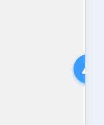
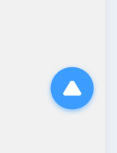
置顶功能实现,默认右边半隐藏,点击一次移出来,点击二次置顶,一段时间不操隐藏。
代码:
<template>
	<view>
		<view class="topBtn" :class="{ 'topBtn--show': isShow }" @click="handleClick">
			<u-icon name="arrow-up-fill" color="#fff" size="28"></u-icon>
		</view>
	</view>
</template>

<script>
	export default {
		props: {},
		data() {
			return {
				isShow: false, // 控制按钮是否完全显示
				isFirstClick: true, // 标记是否是首次点击
				hideTimer: null // 自动隐藏定时器
			}
		},
		mounted() {},
		beforeDestroy() {
			if (this.hideTimer) clearTimeout(this.hideTimer);
		},
		methods: {
			handleClick() {
				// 清除现有定时器,避免冲突
				if (this.hideTimer) {
					clearTimeout(this.hideTimer);
				}
				// 首次点击:只显示按钮,不执行置顶
				if (this.isFirstClick) {
					this.isShow = true;
					this.isFirstClick = false; // 标记为已点击过
					// 5秒内未再次点击则自动隐藏(恢复半隐藏)
					this.hideTimer = setTimeout(() => {
						this.isShow = false;
						this.isFirstClick = true; // 重置状态,下次点击视为首次
					}, 5000); // 可调整超时时间,单位ms
				}
				// 二次点击:执行置顶并隐藏
				else {
					// 执行滚动到顶部
					uni.pageScrollTo({
						scrollTop: 0,
						duration: 300,
						success: () => {
							// 置顶后延迟0.5秒隐藏,提升体验
							setTimeout(() => {
								this.isShow = false;
								this.isFirstClick = true; // 重置状态
							}, 500);
						}
					});
				}
			},
		},
	}
</script>

<style lang="scss" scoped>
	/* 基础样式增加 !important 确保优先级 */
	.topBtn {
		position: fixed !important;
		// bottom: 160rpx !important;
		bottom: 20vh !important;
		right: -60rpx !important;
		/* 半隐藏位置 */
		z-index: 999 !important;
		background: #3c9cff !important;
		border-radius: 50% !important;
		width: 100rpx !important;
		height: 100rpx !important;
		display: flex !important;
		align-items: center !important;
		justify-content: center !important;
		box-shadow: 0 4rpx 12rpx rgba(60, 156, 255, 0.6) !important;
		transition: right 0.3s ease !important;
		/* 确保过渡生效 */
		cursor: pointer !important;
		/* 防止被其他样式覆盖显示 */
		opacity: 1 !important;
		visibility: visible !important;
	}

	/* 激活状态:完全显示 */
	.topBtn--show {
		right: 30rpx !important;
		/* 优先级最高,确保覆盖基础样式 */
	}

	.topBtn__icon {
		width: 48rpx !important;
		height: 48rpx !important;
		color: #fff !important;
	}
</style>
main.js
//全局组件
import toTop from "@/components/toTop.vue"
Vue.component("toTop",toTop)
使用:
<toTop></toTop>