html源码
<!DOCTYPE html>
<html lang="zh-CN">
<head>
<meta charset="UTF-8">
<meta name="viewport" content="width=device-width, initial-scale=1.0">
<title>西安工程大学</title>
<link rel="stylesheet" href="./style.css">
</head>
<body>
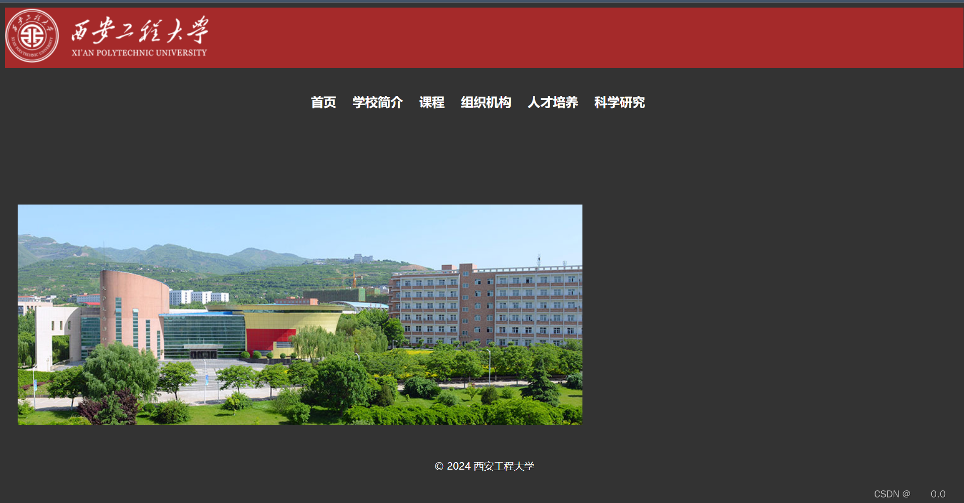
<div id="logo" ><img src="./images/logo.png" alt="欢迎来到西安工程大学!"></div>
<header>
<nav>
<ul>
<li><a href="#">首页</a></li>
<li><a href="#">学校简介</a></li>
<li><a href="#">课程</a></li>
<li><a href="#">组织机构</a></li>
<li><a href="#">人才培养</a></li>
<li><a href="#">科学研究</a></li>
</ul>
</nav>
</header>
<main>
<section>
<h2>欢迎来到西安工程大学!</h2>
<img src="./images/banner.jpg">
</section>
</main>
<footer>
<p>© 2024 西安工程大学</p>
</footer>
</body>
</html>
页面效果:
/* 设置背景颜色 */
body {
    background-color:#333;
}

/* 页头样式 */
#logo{
background-color: brown;
}
header {
    background-color: #333;
    color: #fff;
    padding: 20px;
    text-align: center;
}

/* 导航菜单样式 */
nav ul {
    list-style: none;
    padding: 0;
}

nav ul li {
    display: inline-block;
    margin-right: 20px;
}

nav ul li a {
    text-decoration: none;
    font-weight: bold;
    color: white;
}

/* 主要内容样式 */
main {
    padding: 20px;
}

/* 欢迎信息样式 */
h2 {
    color: #333;
}

p {
    font-size: 16px;
    line-height: 1.5;
}

/* 页脚样式 */
footer {
    background-color: #333;
    color: #fff;
    text-align: center;
    padding: 10px;
}

/* 动画 淡出 并且变大 向上移动*/
@keyframes active {
    0% {
        transform: translateY(0px) scale(1);
        background-color: brown;
        opacity: 0.5;

    }
    100% {
        transform: translateY(-25px)  scale(2);
        background-color: #333;
        opacity: 1;
    }
  }
ul li:hover{
    animation: active 5s infinite alternate;
}
最终效果:从棕色到水泥色
本文含有隐藏内容,请 开通VIP 后查看